> For the complete documentation index, see [llms.txt](https://docs.powermonitor.com.br/llms.txt). Markdown versions of documentation pages are available by appending `.md` to page URLs; this page is available as [Markdown](https://docs.powermonitor.com.br/en/power-monitor/dashboards/dashboard-de-capacidade.md).

# Capacity Dashboard

Executive view of Capacity Units consumption and the health of Microsoft Fabric capacities: today × yesterday, usage curve, consumer rankings, consumption by item kind, weekly heatmap and operations d

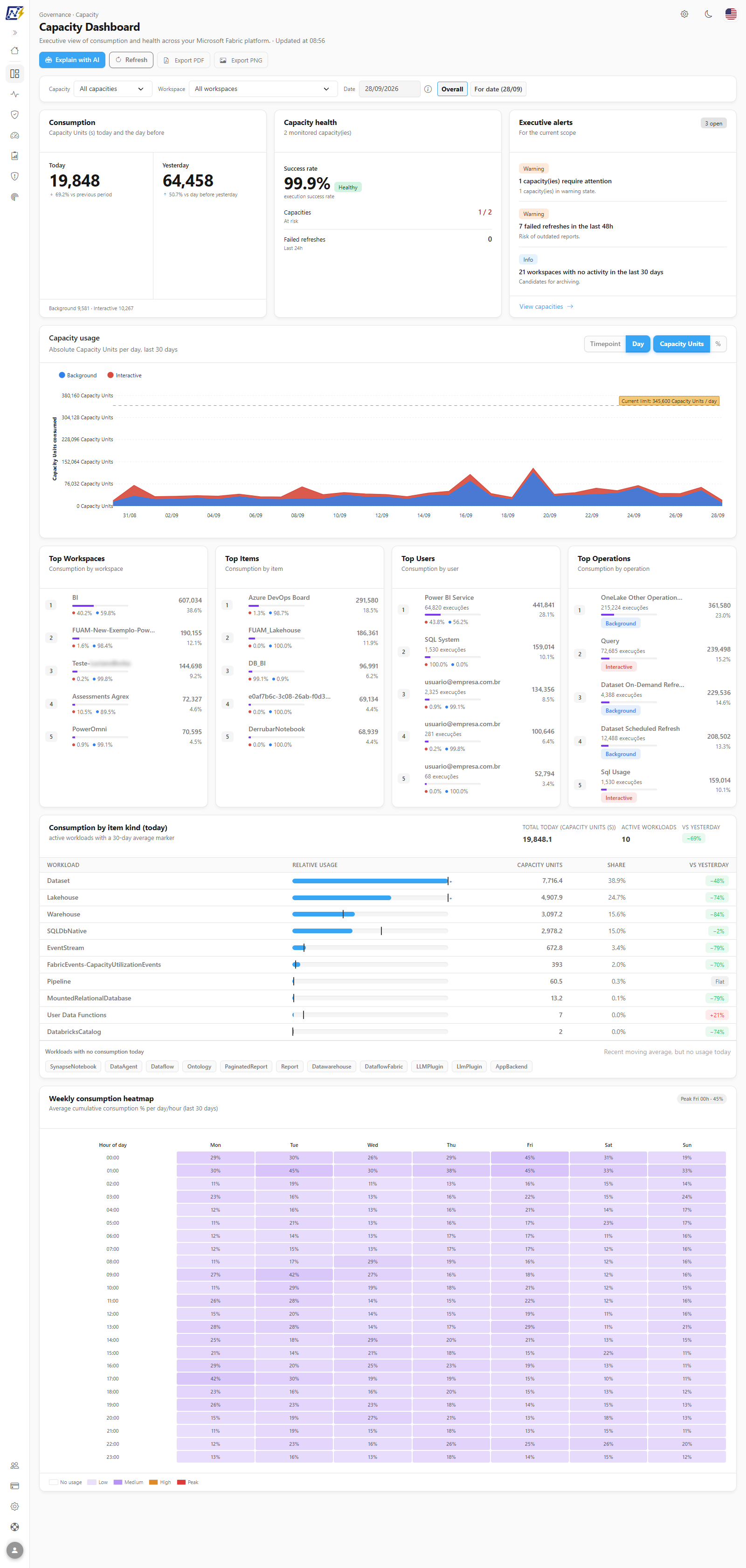
The **Capacity Dashboard** shows, on a single page, how much the monitored Microsoft Fabric capacities are consuming, how that consumption is distributed between **Interactive** and **Background** workloads, who the top consumers are and whether any capacity is at risk. From the usage chart, you can open the operations that were running at a specific point in time.

**How to access:** menu *Dashboards › Capacity Dashboard*. The same screen also appears in the *Capacities* menu domain. It is visible to all user profiles; the numbers respect the user's **workspace scope**. The **Refresh** button is exclusive to administrators.

<figure><picture><source srcset="/files/tQ1VbFaIpagDGeEEPPg9" media="(prefers-color-scheme: dark)"><img src="https://3938213054-files.gitbook.io/~/files/v0/b/gitbook-x-prod.appspot.com/o/spaces%2FH2bFRBmIfyK3kwVKbldl%2Fuploads%2Fgit-blob-e3d060b4740e8142837dc50e917542ec724dc750%2Fpm-dashboards-capacidade-en.png?alt=media" alt="Capacity Dashboard with consumption and health cards, executive alerts and usage chart"></picture><figcaption><p>Capacity Dashboard</p></figcaption></figure>

## What it is for

* **Diagnosing slowness and throttling:** finding out whether the 9 AM peak came from report queries (Interactive) or from scheduled refreshes and pipelines (Background).
* **Following the day:** comparing today's consumption with yesterday's and seeing whether there is a peak above the week's average.
* **Finding the top consumers:** workspaces, items, users and operations that spend the most Capacity Units.
* **Supporting SKU decisions:** comparing the usage curve with the capacity limit before scaling up, scaling down or redistributing workloads.

The page is organized from top to bottom: header with the actions, filter bar, the **Consumption**, **Capacity health** and **Executive alerts** cards, the **Capacity usage** chart, the four rankings, **Consumption by item kind (today)** and the **Weekly consumption heatmap**.

## Features

### Header and data time

**What it is:** the screen title with the subtitle "Executive view of consumption and health across your Microsoft Fabric platform" followed by **Updated at** *hh:mm*, and the row of buttons **Explain with AI**, **Refresh** (administrators only), **Export PDF** and **Export PNG**.

**What it is for:** knowing when the displayed numbers are from and accessing the screen's actions.

<figure><picture><source srcset="/files/D8O06y0jj6rVXV863Aan" media="(prefers-color-scheme: dark)"><img src="https://3938213054-files.gitbook.io/~/files/v0/b/gitbook-x-prod.appspot.com/o/spaces%2FH2bFRBmIfyK3kwVKbldl%2Fuploads%2Fgit-blob-01118ecd4ecfd49d5e806bd467d80b5306ca4e7c%2Fpm-dashboards-capacidade-cabecalho-en.png?alt=media" alt="Capacity Dashboard header with Updated at and the Explain with AI, Refresh, Export PDF and Export PNG buttons"></picture><figcaption><p>Header with the data time and the actions</p></figcaption></figure>

**How it works:** **Updated at** is the time when the displayed result was generated. To keep the screen fast, the result for each filter combination is reused for up to **60 seconds**; therefore, right after a collection, it may take up to a minute for the numbers to change.

### Explain with AI

**What it is:** the **Explain with AI** button, which generates a text analysis of the consumption in the current view (same filters as the screen) and displays it in the **AI analysis** panel, above the cards.

**What it is for:** getting an interpreted reading of the numbers (what changed, where the peak is, what to investigate) for those who do not want to read each chart.

**How to use:**

1. Apply the filters for the view you want to analyze.
2. Click **Explain with AI**. While the analysis is being generated, the button shows **Analyzing…**. If the button is disabled, hover over it to see the reason (for example, AI not configured or spending limit reached).
3. Read the text in the **AI analysis** panel. The panel's notice reminds you that the content is generated by AI from the view's telemetry: check the numbers before acting. Close the panel when you no longer need it.

**How it works:** it uses the provider configured in *Settings › AI* and respects the monthly AI spending limit. The button is only available with data loaded and at least one monitored capacity.

### Refresh (administrators only)

**What it is:** the **Refresh** button, which immediately schedules the collections of capacities, capacity consumption and per-item operation metrics.

**What it is for:** bringing more recent data without waiting for the next automatic collection cycle, for example while investigating a peak.

**How to use:**

1. Click **Refresh** in the header. The button shows **Refreshing...** and the message *"Refresh scheduled. Data will update shortly."* confirms the scheduling.
2. The screen is reloaded a few seconds later. Collections run in the background; wait a few minutes and check the time in **Updated at**.

**How it works:** the button only appears for the **Administrator** profile. It schedules the collections; the new data appears as soon as they finish, which depends on the Capacity Metrics App.

### Export PDF and Export PNG

**What it is:** the **Export PDF** and **Export PNG** buttons, which save the entire page to a file.

**What it is for:** attaching a snapshot of consumption to a report, e-mail or presentation.

**How to use:**

1. Apply the filters you want.
2. Click **Export PDF** or **Export PNG**. While the file is being generated, the button shows **Exporting…**. The `dashboard-capacidade-AAAA-MM-DD` file is downloaded by the browser.

**How it works:** the entire page is saved, including the header with the **Updated at** time; the action buttons do not appear in the file.

### Filters

**What it is:** the bar with the **Capacity**, **Workspace** and **Period** filters.

**What it is for:** analyzing a specific capacity or workspace and choosing the time window of the charts, rankings and analyses.

<figure><picture><source srcset="/files/hxxwcqH7RhsPe7YpOznn" media="(prefers-color-scheme: dark)"><img src="https://3938213054-files.gitbook.io/~/files/v0/b/gitbook-x-prod.appspot.com/o/spaces%2FH2bFRBmIfyK3kwVKbldl%2Fuploads%2Fgit-blob-1fb4b415af8f0e3a9827ce31690a14892e982cfe%2Fpm-dashboards-capacidade-filtros-en.png?alt=media" alt="Filter bar with Capacity, Workspace and Period"></picture><figcaption><p>Filter bar</p></figcaption></figure>

| Filter        | Description                                                                                                                                                                                                                                                      |
| ------------- | ---------------------------------------------------------------------------------------------------------------------------------------------------------------------------------------------------------------------------------------------------------------- |
| **Capacity**  | *All capacities* or a specific capacity. The list contains only the capacities with **active monitoring** in the organization.                                                                                                                                   |
| **Workspace** | *All workspaces* or a specific workspace. With a workspace selected, some components become unavailable (see below).                                                                                                                                             |
| **Period**    | **Today**, **Yesterday**, **Last 7, 14, 30 (default), 60, 90 or 180 days** or **Custom** (**From** and **To**). It is a **single filter** for the screen: it governs the usage chart, the rankings, the insight cards, consumption by item kind and the heatmap. |

**How to use:**

{% stepper %}
{% step %}

### Choose the capacity

In **Capacity**, keep **All capacities** or select a monitored capacity. Selecting a capacity unlocks the **Timepoint** granularity of the chart (for a single-day period).
{% endstep %}

{% step %}

### Choose the workspace (optional)

In **Workspace**, select a workspace to see only its consumption. With a workspace selected, **Timepoint**, **Capacities: At risk**, **Top Workspaces** and the heatmap become unavailable (*"Not available with workspace filter active"*).
{% endstep %}

{% step %}

### Choose the period

In **Period**, choose the range. The **Consumption** and **Capacity health** cards and the executive alerts **do not change**: they always show today.
{% endstep %}
{% endstepper %}

{% hint style="info" %}
The reference day and the **Overall** / **Of the day** buttons no longer exist: the **Period** replaced them. Consumption, health and alerts always reflect today's state; the information icon next to the filter reminds you of this rule.
{% endhint %}

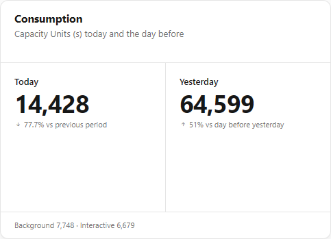
### Consumption card

**What it is:** the **Consumption** card (*Capacity Units (s) today and the day before*).

**What it is for:** seeing at a glance whether the day is consuming more or less than the previous one and how much of it is interactive load.

<figure><picture><source srcset="/files/aIRJpbyawCL9ADnTLZzh" media="(prefers-color-scheme: dark)"><img src="https://3938213054-files.gitbook.io/~/files/v0/b/gitbook-x-prod.appspot.com/o/spaces%2FH2bFRBmIfyK3kwVKbldl%2Fuploads%2Fgit-blob-5a5b67418ce9f14ad28d3ecbce0af5460e01124b%2Fpm-dashboards-capacidade-consumo-en.png?alt=media" alt="Consumption card with Today, Yesterday, variations and the Background and Interactive breakdown"></picture><figcaption><p>Consumption card</p></figcaption></figure>

| Value                               | Calculation                                                                                                              |
| ----------------------------------- | ------------------------------------------------------------------------------------------------------------------------ |
| **Today**                           | Sum of the Capacity Units (s) of all operations today, with the percentage variation **vs previous period** (yesterday). |
| **Yesterday**                       | Sum of the previous day, with the variation **vs day before yesterday**.                                                 |
| **Background / Interactive footer** | Breakdown of today's consumption between background and interactive operations.                                          |

**How it works:** variations are displayed in a neutral color (the arrow indicates the direction): more consumption is not always bad, it may mean more product usage.

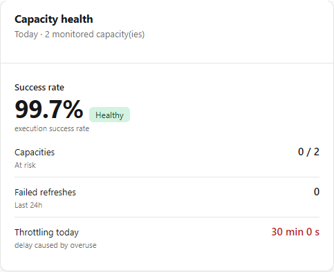
### Capacity health card

**What it is:** the **Capacity health** card, whose subtitle shows how many capacities are monitored.

**What it is for:** knowing whether executions are failing and whether any capacity is close to its limit.

<figure><picture><source srcset="/files/wucyBrneZRHGutEkxYh6" media="(prefers-color-scheme: dark)"><img src="https://3938213054-files.gitbook.io/~/files/v0/b/gitbook-x-prod.appspot.com/o/spaces%2FH2bFRBmIfyK3kwVKbldl%2Fuploads%2Fgit-blob-c68bc9347c9ade81bfc02127344192911f70f87f%2Fpm-dashboards-capacidade-saude-en.png?alt=media" alt="Capacity health card with Success rate, Capacities at risk and Failed refreshes"></picture><figcaption><p>Capacity health card</p></figcaption></figure>

| Value                                            | Calculation                                                                                                                                                                                        |
| ------------------------------------------------ | -------------------------------------------------------------------------------------------------------------------------------------------------------------------------------------------------- |
| **Success rate**                                 | Percentage of the day's operations with status *Success* out of the total operations with a reported status. The card's badge is **Healthy** (≥ 95%), **Warning** (≥ 80%) or **Critical** (< 80%). |
| **Capacities: At risk**                          | Number of capacities whose **latest measurement** of cumulative Capacity Units usage is at **80% or more**, out of the total monitored capacities. Unavailable with the workspace filter.          |
| **Failed refreshes: Last 24h**                   | Number of refresh executions (scheduled or on-demand semantic model refreshes, pipeline runs and scheduled notebook runs) that ended in failure in the last 24 hours.                              |
| **Throttling today** (*delay caused by overuse*) | Total time Fabric delayed operations today because the capacity went over the limit (official Capacity Metrics App counter), in seconds, minutes or hours.                                         |

**Capacities: At risk**, **Failed refreshes** and **Throttling today** turn red when they are greater than zero. With the workspace filter, **Capacities: At risk** shows a dash and the unavailability message instead of the number.

### Executive alerts

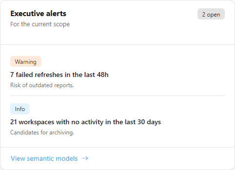
**What it is:** the **Executive alerts** card (*For the current scope*), with the alerts calculated on the applied filters. Each alert has a severity badge (**Critical**, **Warning** or **Informative**), a title and a context sentence; the badge in the card title shows how many are open ("*N* open").

**What it is for:** knowing, without reading the charts, whether something requires action today.

<figure><picture><source srcset="/files/y3lL5nLqHVf1J1sMDn4e" media="(prefers-color-scheme: dark)"><img src="https://3938213054-files.gitbook.io/~/files/v0/b/gitbook-x-prod.appspot.com/o/spaces%2FH2bFRBmIfyK3kwVKbldl%2Fuploads%2Fgit-blob-af060377545883e728021c819e05aa5b1a1daf85%2Fpm-dashboards-capacidade-alertas-en.png?alt=media" alt="Executive alerts card with alerts and severity badges"></picture><figcaption><p>Executive alerts card</p></figcaption></figure>

| Alert                                                   | When it appears                                                                         | Severity                                                 | Destination                                   |
| ------------------------------------------------------- | --------------------------------------------------------------------------------------- | -------------------------------------------------------- | --------------------------------------------- |
| **{n} capacity(ies) require attention**                 | There are capacities in a degraded or unhealthy state in capacity monitoring.           | Critical if at least one is critical; otherwise Warning. | **View capacities** (Monitoring › Capacities) |
| **{n} failed refreshes in the last 48h**                | 5 or more semantic model refreshes with errors in the last 48 h.                        | Critical from 20; Warning from 5 to 19.                  | **View semantic models**                      |
| **Today's consumption is {x}% above the 7-day average** | Today's consumption is greater than **1.5 ×** the daily average of the previous 7 days. | Warning                                                  | None                                          |
| **{n} workspaces with no activity in the last 30 days** | 10 or more workspaces with no operation recorded on the capacities in the last 30 days. | Informative                                              | **View workspaces** (Governance › Workspaces) |

**How to use:**

1. Read the title and context of each alert, starting with those with a **Critical** badge.
2. Click the link in the card footer to investigate. The card shows **a single link**, that of the **most severe** alert that has a destination (for example, **View semantic models** when there are critical failed refreshes).
3. For the other alerts, open the corresponding screens from the menu.

**How it works:** when there is no alert, the card shows "No alerts in this period."

### Capacity usage chart

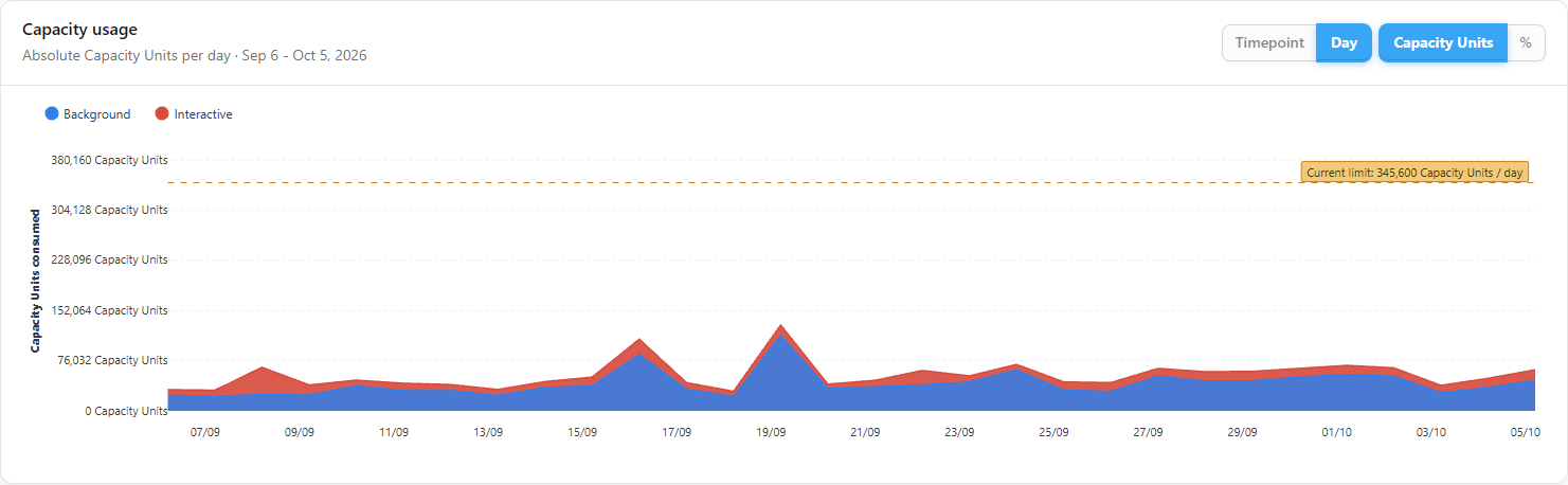
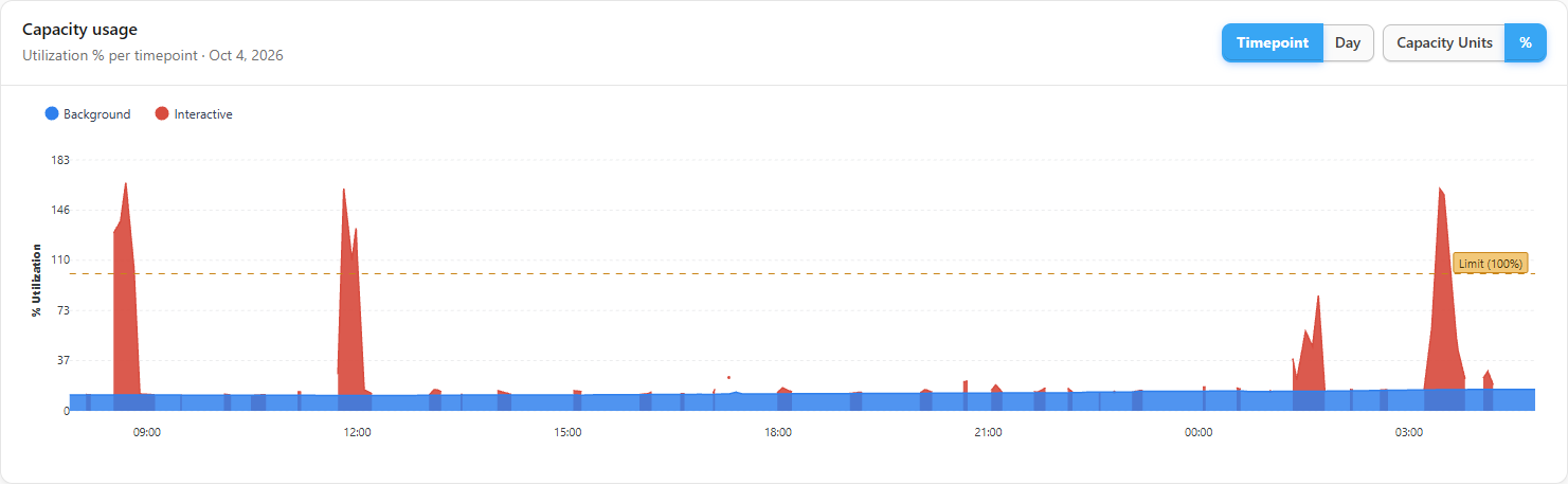
**What it is:** a stacked column chart of **Background** (blue) and **Interactive** (red), with the capacity **limit** line and the **Granularity** and **Unit** selectors.

**What it is for:** seeing the consumption curve over time, comparing it with the SKU limit and locating the peaks.

<figure><picture><source srcset="/files/q28trnia3EdmHYc5WNpT" media="(prefers-color-scheme: dark)"><img src="https://3938213054-files.gitbook.io/~/files/v0/b/gitbook-x-prod.appspot.com/o/spaces%2FH2bFRBmIfyK3kwVKbldl%2Fuploads%2Fgit-blob-bd0541b53a3674600d6de35a165caaa0fc38c448%2Fpm-dashboards-capacidade-uso-en.png?alt=media" alt="Capacity usage chart with Background and Interactive columns, limit line and the Granularity and Unit selectors"></picture><figcaption><p>Capacity usage chart</p></figcaption></figure>

| Control         | Options                                                                                                                                                                                                                                                                                                                                                                                                                           |
| --------------- | --------------------------------------------------------------------------------------------------------------------------------------------------------------------------------------------------------------------------------------------------------------------------------------------------------------------------------------------------------------------------------------------------------------------------------- |
| **Granularity** | **Day** (default): daily totals for the period. **Timepoint**: 30-second samples from **a single day**; requires a selected capacity, a one-day period (**Today**, **Yesterday** or a one-day custom range) and does not work with the workspace filter. When the selection no longer allows Timepoint (for example, going back to *All capacities* or choosing a longer period), the screen switches back to **Day** on its own. |
| **Unit**        | **Capacity Units** (absolute values) or **%** (capacity utilization percentage; available only in the Timepoint granularity, as it is the utilization measure that Fabric publishes per timepoint).                                                                                                                                                                                                                               |

<figure><picture><source srcset="/files/ppHcQ15Ux6fXS4U2Ca54" media="(prefers-color-scheme: dark)"><img src="https://3938213054-files.gitbook.io/~/files/v0/b/gitbook-x-prod.appspot.com/o/spaces%2FH2bFRBmIfyK3kwVKbldl%2Fuploads%2Fgit-blob-5b3a67465b506a5576b96079908557efdde3b57b%2Fpm-dashboards-capacidade-uso-timepoint-en.png?alt=media" alt="Capacity usage chart with a capacity selected in the Timepoint granularity and percentage unit"></picture><figcaption><p>One capacity in Timepoint, % unit</p></figcaption></figure>

**How to use:**

1. In **Granularity**, choose **Timepoint** or **Day**. If **Timepoint** is disabled, hover over it to see the reason (select a capacity, remove the workspace filter or choose a one-day period).
2. In **Unit**, choose **Capacity Units** or **%** (the **%** mode requires **Timepoint**).
3. Hover over a column to see the tooltip; click the column to open the operations at that point (see *Operations in the period*).

**How it works / rules:**

* **Limit line:** calculated from the SKU. For one capacity, it is the SKU limit (e.g.: F64 = 64 Capacity Units per second, that is, 64 × 30 per timepoint and 64 × 86,400 per day). With *All capacities*, it is the sum of the limits of the active capacities. **F** and **FTL** SKUs count directly; **A** (Power BI Embedded, A1 to A8), **EM**, **P** and **FT** SKUs count through the equivalence with the F SKU published by Microsoft (for example, A4 ≈ F64, A7 ≈ F512, A8 ≈ F1024, P1 ≈ F64). When any equivalence enters the calculation, the line is named **Theoretical limit (with equivalences)** and the badge "Theoretical limit includes equivalences: *SKU ≈ F SKU*" lists which ones were used; the equivalence is a reference and does not guarantee identical limits. **F0** (on-demand) capacities have no CU limit and are left out of the line. SKUs with no limit and no known equivalence are left out, with the badge "Limit covers X of Y capacities (SKUs without a known equivalence are left out)"; if no capacity has a limit, "Limit not available for this platform's SKUs" appears.
* **Tooltip:** shows billable Background and Interactive, cumulative usage, available SKU Capacity Units and % available; with several capacities, it details each one and the TOTAL.
* **Subtitle:** describes the unit and granularity and ends with the range of the loaded period.
* **Automation markers:** in the Timepoint granularity, executed pauses, resumes and SKU changes (gray) and failed ones (red) appear as labeled vertical lines (*Pause*, *Resume*, *SKU ↑*, *SKU ↓*, *... (failed)*). See the **Capacity automation** card.
* While reloading after a period or granularity change, the chart shows the loading state instead of old numbers.
* With no data in the period, the chart shows "No capacity usage data for the period."

### Operations in the period

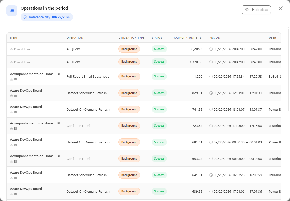
**What it is:** the **Operations in the period** modal, opened by clicking a column in the usage chart. It shows the **Reference instant** (Timepoint) or the **Reference day** (Day) and the paginated list of related operations, sorted by highest consumption.

**What it is for:** finding out exactly which reports, refreshes or notebooks caused a peak.

<figure><picture><source srcset="/files/bAeOnD034gDX5io4PWfO" media="(prefers-color-scheme: dark)"><img src="https://3938213054-files.gitbook.io/~/files/v0/b/gitbook-x-prod.appspot.com/o/spaces%2FH2bFRBmIfyK3kwVKbldl%2Fuploads%2Fgit-blob-14572e89539fd22feb91fddee55aeeb96d1486d5%2Fpm-dashboards-capacidade-modal-operacoes-en.png?alt=media" alt="Operations in the period modal with the Item, Operation, Utilization Type, Status, Capacity Units (s), Period and User columns"></picture><figcaption><p>Operations in the period modal</p></figcaption></figure>

| Column                 | Description                                                    |
| ---------------------- | -------------------------------------------------------------- |
| **Item**               | Item name and type, with the workspace.                        |
| **Operation**          | Operation name (e.g.: scheduled refresh, query, notebook run). |
| **Utilization Type**   | Interactive or Background.                                     |
| **Status**             | Result of the operation.                                       |
| **Capacity Units (s)** | Consumption of the operation.                                  |
| **Period**             | Start and end of the operation.                                |
| **User**               | Identity that triggered the operation.                         |

**How to use:**

{% stepper %}
{% step %}

### Select the capacity

Choose the capacity in **Capacity** and leave **Workspace** as **All workspaces**.
{% endstep %}

{% step %}

### Adjust the chart

In the **Capacity usage** chart, in **Granularity**, choose **Timepoint** (30-second samples) for a one-day period. To see the days of the period, choose **Day**.
{% endstep %}

{% step %}

### Locate the peak

Find the tallest column and compare it with the limit line. Hover over the column to see Background, Interactive, cumulative usage and % available.
{% endstep %}

{% step %}

### Open the operations

Click the column. The **Operations in the period** modal opens with the operations at that point, from most to least expensive. Use the pagination to see the others and close the modal to go back to the chart.
{% endstep %}
{% endstepper %}

**How it works / rules:**

* **Timepoint granularity:** **interactive** operations that were running at that instant and **background** operations started in the previous 24 hours (Fabric spreads background cost over 24 h, which is why they still weigh on the clicked instant).
* **Day granularity:** all operations of the day.
* **Pagination:** 20 operations per page by default; the **Items per page** selector allows 10, 25, 50 or 100, and changing it goes back to the first page.
* **Hide data:** the **Hide data** button in the modal header (it becomes **Show data**) masks the e-mails in the **User** column. It is a convenience for sharing the screen, not an access control; the choice applies to every screen that has the button.
* The modal respects the screen's capacity and workspace filters. With no operations, it shows "No operations found for this point."

### Consumer rankings

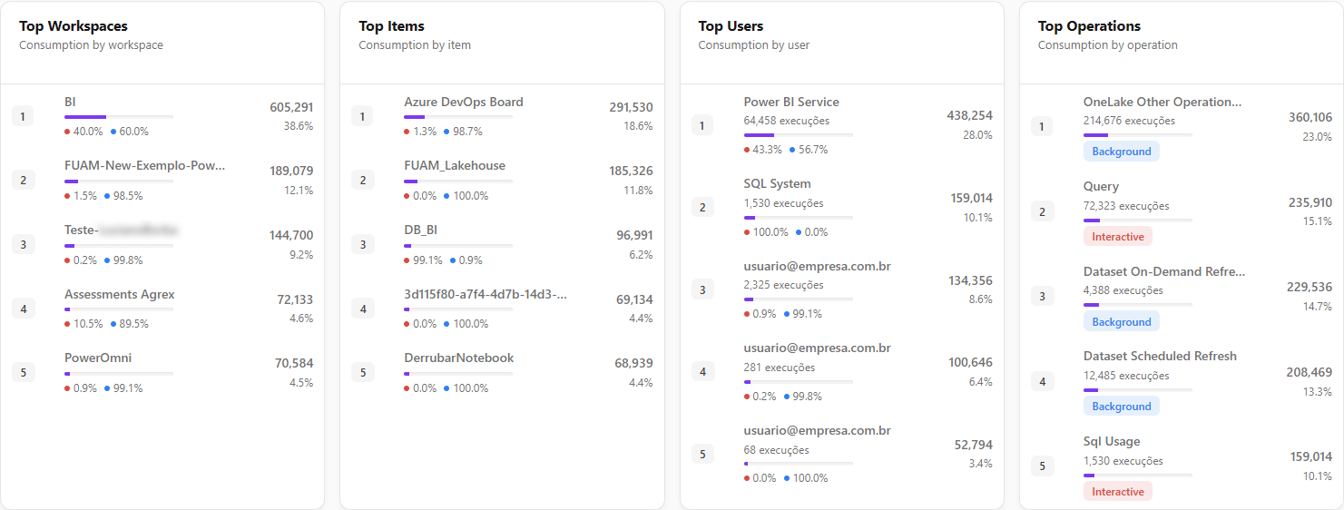
**What it is:** four cards with the **top 5 consumers**: **Top Workspaces**, **Top Items**, **Top Users** and **Top Operations**. Each row shows the consumption in Capacity Units (s), the share of the scope total and a proportional bar.

**What it is for:** quickly finding where to optimize: the workspace that spends the most, the most expensive item, the heaviest user and the dominant operation type.

<figure><picture><source srcset="/files/TLQ0N9xbVa1zff7eu8xy" media="(prefers-color-scheme: dark)"><img src="https://3938213054-files.gitbook.io/~/files/v0/b/gitbook-x-prod.appspot.com/o/spaces%2FH2bFRBmIfyK3kwVKbldl%2Fuploads%2Fgit-blob-94f257aaeb94f27426e1b1fbd4e853fa2205bcb8%2Fpm-dashboards-capacidade-rankings-en.png?alt=media" alt="Top Workspaces, Top Items, Top Users and Top Operations cards"></picture><figcaption><p>Consumer rankings</p></figcaption></figure>

| Ranking            | Note                                                                                                                                  |
| ------------------ | ------------------------------------------------------------------------------------------------------------------------------------- |
| **Top Workspaces** | Consumption by workspace. Unavailable with the workspace filter.                                                                      |
| **Top Items**      | Consumption by item.                                                                                                                  |
| **Top Users**      | Consumption by user, with the number of executions.                                                                                   |
| **Top Operations** | Consumption by operation type, with the number of executions and a badge with the predominant usage type (Interactive or Background). |

**How to use:** in **Top Workspaces**, **Top Items** and **Top Users**, hover over the percentages line below the bar to see the Interactive × Background split. Hover over a truncated name to read it in full. Use **Overall** / **For date** in the filter bar to change the rankings' period.

**How it works:** the share is calculated on the total of the scope (filtered capacity/workspace) for the **selected period**. With no data, the card shows "No data in this period."

### Consumption by item kind

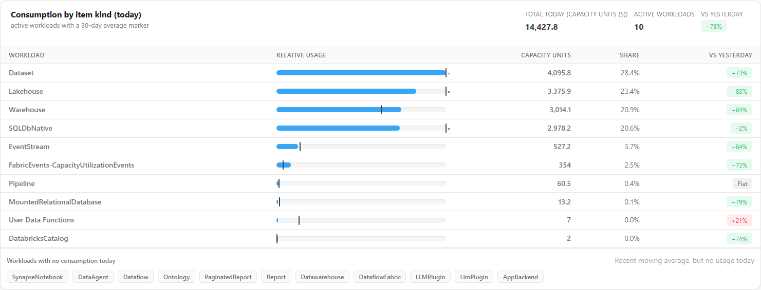
**What it is:** the **Consumption by item kind** card, which lists the **workloads** (item types: semantic model, notebook, pipeline, lakehouse and so on) with the consumption of the **selected period against the previous period**.

**What it is for:** noticing which kind of load is weighing and whether it went up or down compared with the previous period.

<figure><picture><source srcset="/files/VsT8M4Or6aYnWaoCfrYQ" media="(prefers-color-scheme: dark)"><img src="https://3938213054-files.gitbook.io/~/files/v0/b/gitbook-x-prod.appspot.com/o/spaces%2FH2bFRBmIfyK3kwVKbldl%2Fuploads%2Fgit-blob-68065f7210dec4f7f3876e417803bbbe33e0f969%2Fpm-dashboards-capacidade-tipo-item-en.png?alt=media" alt="Consumption by item kind card with the Workload, Relative usage, Period, Previous period, Share and Change columns"></picture><figcaption><p>Consumption by item kind</p></figcaption></figure>

| Column                           | Description                                                                                                         |
| -------------------------------- | ------------------------------------------------------------------------------------------------------------------- |
| **Workload**                     | Item type.                                                                                                          |
| **Relative usage**               | Bar proportional to the period's consumption, with a marker for the **previous period**.                            |
| **Period** / **Previous period** | Capacity Units (s) in each.                                                                                         |
| **Share**                        | Share of the period's total consumption.                                                                            |
| **Change**                       | Change against the previous period (**New** when there was no consumption before, **Flat** when it did not change). |

**How to use:** hover over the **Relative usage** bar to see both consumptions and the difference. When the previous period is larger than the period's largest consumption, the marker is pinned to the end of the range.

**How it works:** the card shows **Period total**, **Previous period** and **Active workloads**, plus the **Workloads with no consumption in the period** section (they consumed in the previous period but not in the selected one). If the period includes today (an unfinished day) and the previous one only has complete days, the screen warns that the comparison tends to look like a drop.

### Weekly consumption heatmap

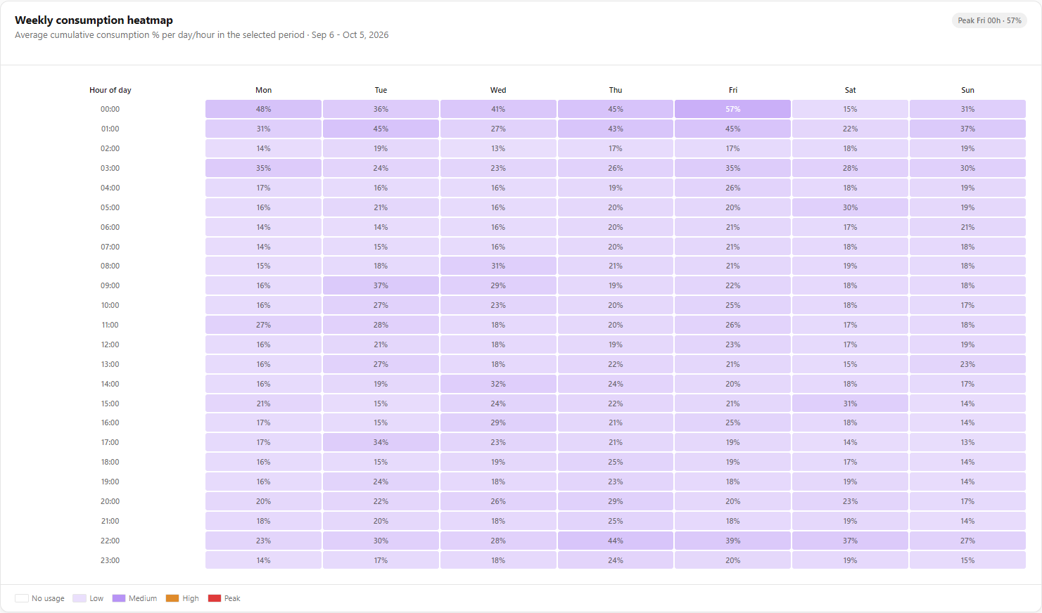
**What it is:** a day of week × hour of day grid with the **average cumulative consumption %** of the capacities over the **selected period** (the subtitle shows the range), in the organization's time zone. The scale goes from **No usage** to **Peak** (**Low**, **Medium**, **High**), and the highlight indicates the peak time (e.g.: "Peak Mon 09h · 87%").

**What it is for:** choosing refresh windows outside the busiest times.

<figure><picture><source srcset="/files/0hvHt83sHbQgA9wVBURc" media="(prefers-color-scheme: dark)"><img src="https://3938213054-files.gitbook.io/~/files/v0/b/gitbook-x-prod.appspot.com/o/spaces%2FH2bFRBmIfyK3kwVKbldl%2Fuploads%2Fgit-blob-b1c272625cb00a1d4aa1211a14dd8df253a5bc99%2Fpm-dashboards-capacidade-heatmap-en.png?alt=media" alt="Weekly consumption heatmap by day of week and hour of day with the scale legend"></picture><figcaption><p>Weekly consumption heatmap</p></figcaption></figure>

**How to use:**

1. With **Workspace** set to **All workspaces**, scroll down to the **Weekly consumption heatmap** (with the workspace filter, it is unavailable).
2. Use the scale legend to find cells in the **No usage** or **Low** ranges on the desired day of the week and hour. The highlight *"Peak {day} {hour} · {value}%"* indicates the busiest time, which should be avoided.
3. Reschedule heavy refreshes to the lower-usage ranges (in the Fabric/Power BI portal) and follow the effect over the next days.

### Insight cards

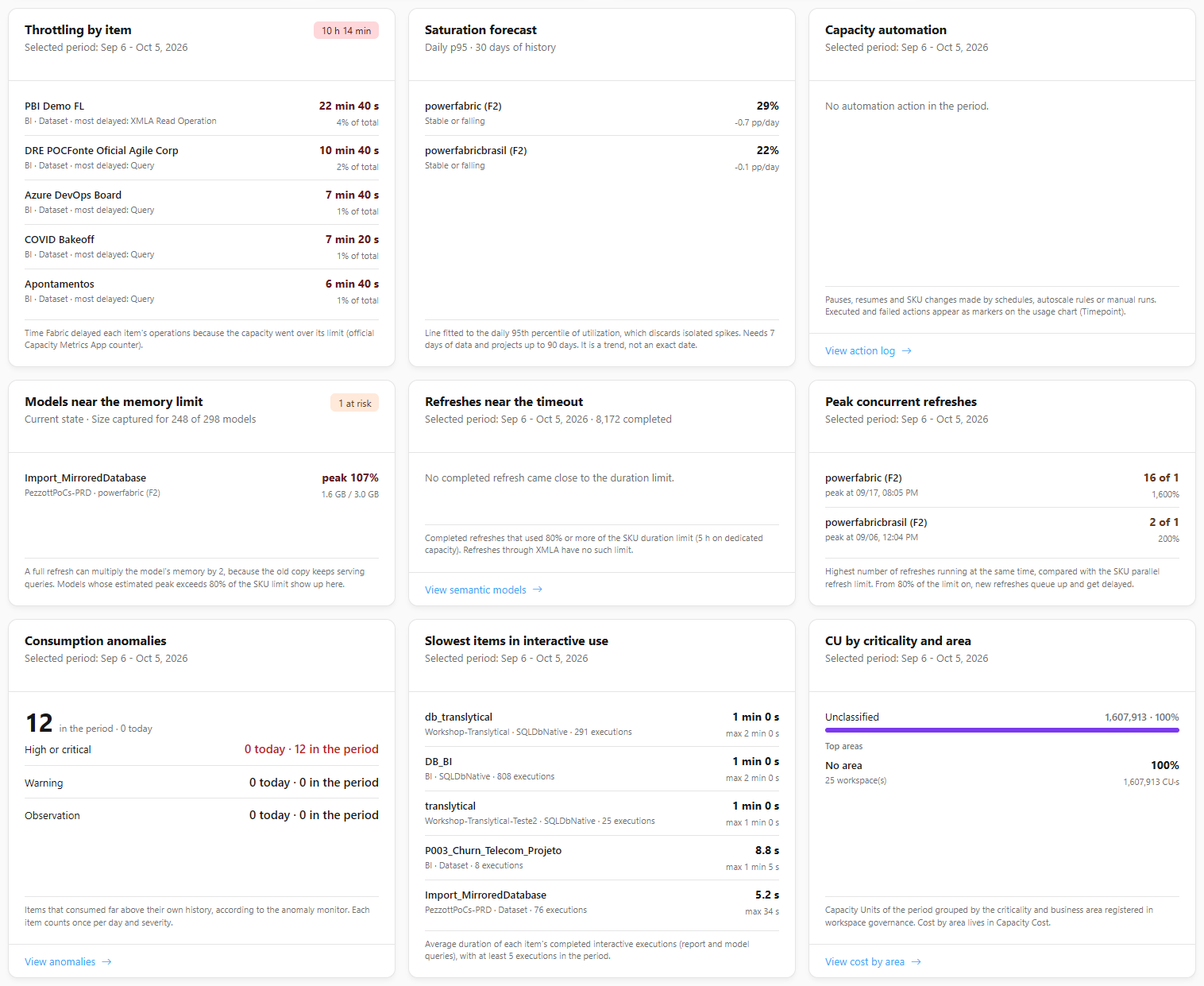
**What it is:** nine cards after the rankings, in three rows, each loaded on its own (if one fails, the rest of the screen keeps working). All respect the chosen **Capacity** and, except **Models near the memory limit** (current state), the **Period**. **Saturation forecast**, **Capacity automation** and **Peak concurrent refreshes** are unavailable with the workspace filter, because they are measured per capacity.

**What it is for:** anticipating capacity problems and finding what weighs the most, without opening several screens.

<figure><picture><source srcset="/files/8lm2YULLwWDhVZyu8Ukc" media="(prefers-color-scheme: dark)"><img src="https://3938213054-files.gitbook.io/~/files/v0/b/gitbook-x-prod.appspot.com/o/spaces%2FH2bFRBmIfyK3kwVKbldl%2Fuploads%2Fgit-blob-30022df3fd0148776ebfb6af60e50bff48fd5ee4%2Fpm-dashboards-capacidade-cartoes-analise-en.png?alt=media" alt="Nine insight cards: throttling, saturation forecast, automation, models near the memory limit, refreshes near the timeout, peak concurrent refreshes, anomalies, slowest items and CU by criticality"></picture><figcaption><p>Insight cards</p></figcaption></figure>

| Row                | Card                                 | What it shows                                                                                                                                                                                                                                                                                                                                                                                                                                                                                                              |
| ------------------ | ------------------------------------ | -------------------------------------------------------------------------------------------------------------------------------------------------------------------------------------------------------------------------------------------------------------------------------------------------------------------------------------------------------------------------------------------------------------------------------------------------------------------------------------------------------------------------- |
| Capacity risk      | **Throttling by item**               | The items whose operations were most delayed because the capacity went over the limit (official Capacity Metrics App counter), with delay time, share of the total and the most delayed operation. The card badge shows the total delay. If the metrics of the selection do not carry the counter yet, the card says so instead of claiming there was no throttling                                                                                                                                                        |
|                    | **Saturation forecast**              | For each capacity (up to 5 rows, most urgent first), a line fitted to the daily 95th percentile of utilization over the last 28 days: *Reaches 100% in N days (date)*, *Rising, but not reaching 100% within 90 days*, *Stable or falling*, *The trend is already at 100% or above*, *Not enough data: X of 7 days* or *Not forecast (trial or Premium Per User)*. It shows the latest 95th percentile and the trend in percentage points per day. It is a trend, not an exact date. Unavailable with the workspace filter |
|                    | **Capacity automation**              | A table with **Today** and **In the period** for pauses, resumes, SKU increases, SKU decreases, skipped ones (the capacity was already in the requested state) and failures, done by schedule, auto-scale rule or manual run. The badge shows the failures. Actions appear as markers on the usage chart (Timepoint). The **View action log** link appears only for administrators. Unavailable with the workspace filter                                                                                                  |
| Models and refresh | **Models near the memory limit**     | Models whose estimated full refresh peak (captured model size multiplied by 2, because the old copy keeps serving queries) exceeds 80% of the SKU per-model memory limit; the value turns red from 100%. Each row shows the peak in % and the size over the limit in GB. The subtitle reports coverage (*Size captured for X of Y models*) and a note warns when some capacities have no published memory limit. It is the only card that does **not** follow the Period: it shows the **Current state**                   |
|                    | **Refreshes near the timeout**       | Completed refreshes that used 80% or more of the SKU duration limit (5 h on dedicated capacity; XMLA refresh has no such limit), with duration and % of the limit (red from 100%) and the **View semantic models** link                                                                                                                                                                                                                                                                                                    |
|                    | **Peak concurrent refreshes**        | Per capacity (up to 5 rows), the largest number of refreshes at the same time against the SKU parallel refresh limit and the time of the peak; from 80% of the limit on, the next ones queue up and are delayed (amber row). When the volume exceeds the read cap, the peak shown is a minimum. Unavailable with the workspace filter                                                                                                                                                                                      |
| Usage              | **Consumption anomalies**            | Total of items that consumed far above their own history in the period (and how many today), by severity (**High or critical**, **Warning**, **Observation**), with the **View anomalies** link                                                                                                                                                                                                                                                                                                                            |
|                    | **Slowest items in interactive use** | The 5 items with the highest average duration of completed interactive runs (report and model queries), with the maximum duration, requiring at least 5 runs in the period                                                                                                                                                                                                                                                                                                                                                 |
|                    | **CU by criticality and area**       | A bar with the Capacity Units of the period by workspace criticality (**Critical**, **High**, **Medium**, **Low**, **Unclassified**) and the **Top areas** (up to 5, with share, Capacity Units and number of workspaces; *No area* groups the ones not registered), from the workspace governance, with the **View cost by area** link                                                                                                                                                                                    |

**How it works:** each card has a footer sentence that explains the calculation and thresholds, and says when there is no data (for example, *No item was throttled in the period*). If a card fails, it shows *Could not load this card.* and the others keep working. The **Refresh** button reloads the cards.

### No-data states

**What it is:** the notices that replace the cards when there is nothing to show.

**What it is for:** understanding why the screen is empty and what to do.

**How to use:**

1. If the screen shows **No capacity has monitoring enabled**, an **Administrator** clicks **Configure capacity monitoring**, enables the desired capacities and waits for the next collection (every 5 minutes). Other users see guidance to ask an administrator. See [Enable capacity monitoring](/en/power-monitor/monitoramento/capacidades/ativar-monitoramento-de-capacidade.md).
2. If "Could not load the dashboard." appears, click **Try again**.

## Rules and behavior

* **Monitored capacities only:** the screen considers only capacities with monitoring enabled. With none, the filter bar and the cards give way to the **No capacity has monitoring enabled** notice.
* **Data source:** consumption and operation metrics come from the **Microsoft Fabric Capacity Metrics App** configured for the organization (see [Enable capacity monitoring](/en/power-monitor/monitoramento/capacidades/ativar-monitoramento-de-capacidade.md)). Capacity health and alerts come from capacity monitoring; 48 h failures come from the semantic model refresh history.
* **Time zone:** "today", "yesterday" and the chart days are days in the **organization's time zone**.
* **Cache:** the result of each filter combination is reused for up to **60 seconds**.
* **Workspace filter:** timepoint consumption and percentage usage are measured per capacity and cannot be split by workspace. With a workspace selected, the Timepoint granularity, the capacities at risk, the workspace ranking and the heatmap are unavailable.

## Frequently asked questions

<details>

<summary>Why is the Timepoint option disabled?</summary>

Timepoint is the 30-second sample of **one** capacity. Select a specific capacity and remove the workspace filter.

</details>

<details>

<summary>Why doesn't the limit line appear?</summary>

The limit is only calculated for F and FTL SKUs. Premium (P) or Embedded (A) capacities do not have the limit displayed.

</details>

<details>

<summary>I clicked Refresh and the numbers did not change.</summary>

The button only schedules the collections. They run in the background and depend on the Capacity Metrics App; wait a few minutes and reload the page.

</details>

<details>

<summary>The capacity I want does not appear in the filter.</summary>

Only capacities with monitoring enabled appear. Ask an administrator to enable it in *Settings › Monitoring*.

</details>

<details>

<summary>There are two alerts with a destination, but the card only shows one link.</summary>

This is intentional: the footer leads to the **most severe** alert that has a destination. To investigate the others, open the corresponding screen from the menu (for example, *Governance › Workspaces*).

</details>

## Related pages

* [Dashboards](/en/power-monitor/dashboards.md)
* [Capacity Overview](/en/power-monitor/dashboards/visao-geral-de-capacidades.md)
* [Capacity Cost](/en/power-monitor/dashboards/custo-de-capacidade.md)
* [Efficiency Dashboard](/en/power-monitor/dashboards/dashboard-de-eficiencia.md)
* [Capacity monitoring](/en/power-monitor/monitoramento/capacidades.md)
* [Consumption metrics](/en/power-monitor/monitoramento/metricas-de-consumo.md)
* [Consumption history](/en/power-monitor/monitoramento/historico-de-consumo.md)


---

# Agent Instructions
This documentation is published with GitBook. GitBook is the documentation platform designed so that both humans and AI agents can read, navigate, and reason over technical content effectively. Learn more at gitbook.com.

## Querying This Documentation
If you need additional information that is not directly available in this page, you can query the documentation by asking a question.

Perform an HTTP GET request on the following URL with the `ask` and `goal` query parameters:

```
GET https://docs.powermonitor.com.br/en/power-monitor/dashboards/dashboard-de-capacidade.md?ask=<question>&goal=<user_goal>
```

`ask` is the immediate question: it should be specific, self-contained, and written in natural language.
`goal` is what the user is ultimately trying to achieve, the reason they need the answer. Sharing it helps GitBook give you a better, more relevant answer. A goal is most helpful when it describes the outcome the user wants rather than restating the question. For example, with `ask=how do I create an API token`, a goal like `automate deployments from our CI pipeline` lets GitBook tailor the answer to that use case.

The response will contain a direct answer to the question and relevant excerpts and sources from the documentation.

Use this mechanism when the answer is not explicitly present in the current page, you need clarification or additional context, or you want to retrieve related documentation sections.