> For the complete documentation index, see [llms.txt](https://docs.powermonitor.com.br/llms.txt). Markdown versions of documentation pages are available by appending `.md` to page URLs; this page is available as [Markdown](https://docs.powermonitor.com.br/en/power-monitor/dashboards/dashboard-de-eficiencia.md).

# Efficiency Dashboard

FinOps and phantom artifacts: cross-references Capacity Units consumption with actual accesses to point out reports and semantic models that spend capacity without delivering value.

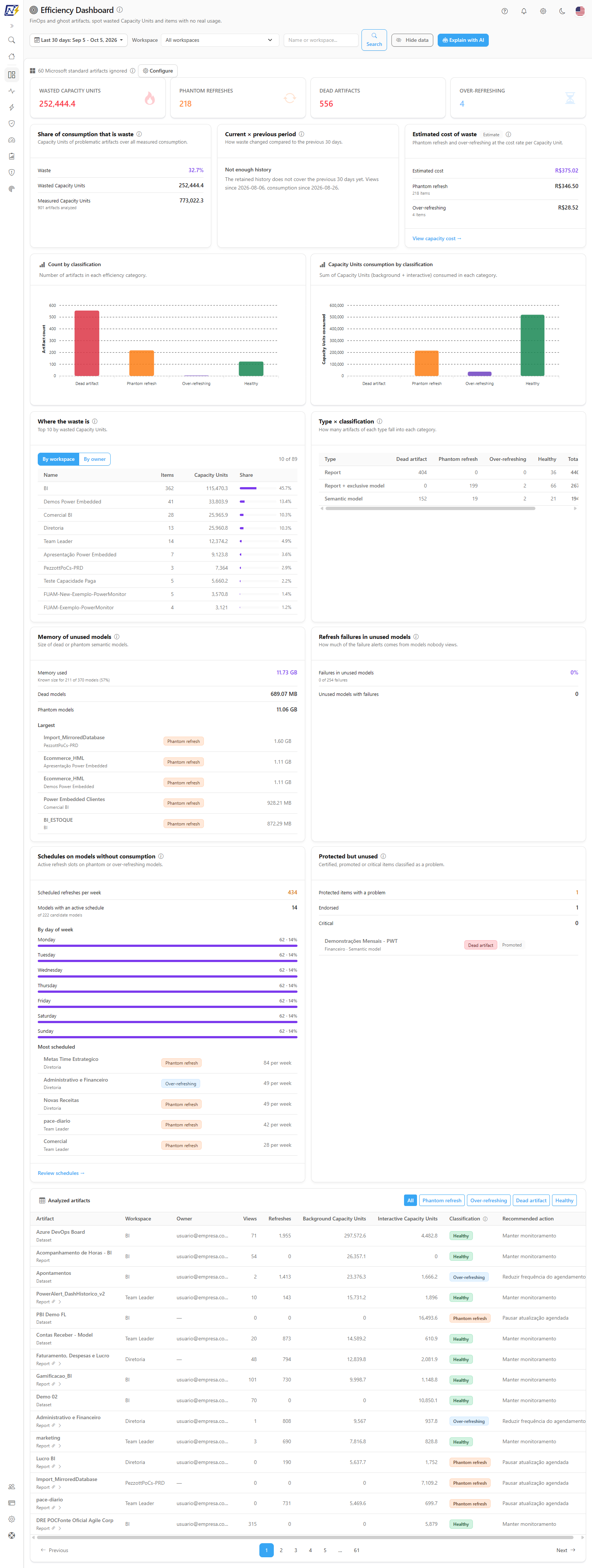
The **Efficiency Dashboard** cross-references the Capacity Units (CU) consumption of each report and semantic model with the actual accesses it received, and classifies each artifact into one of four categories: **Dead artifact**, **Phantom refresh**, **Over-refreshing** or **Healthy**. It is Power Monitor's FinOps screen: it shows where capacity is being spent with no return and what action to take.

**How to access:** menu *Dashboards › Efficiency Dashboard*. The screen is visible to all user profiles; what each person sees respects their **workspace scope** (those with restricted visibility see only the artifacts of the workspaces they have access to). If an administrator has blocked the page for your user, it does not appear in the menu.

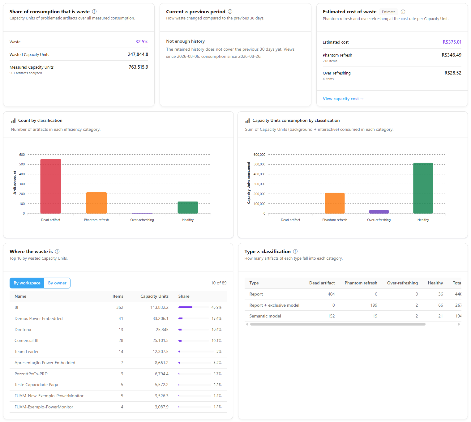
<figure><picture><source srcset="/files/klL68OjrLPCLaza2jxKq" media="(prefers-color-scheme: dark)"><img src="https://3938213054-files.gitbook.io/~/files/v0/b/gitbook-x-prod.appspot.com/o/spaces%2FH2bFRBmIfyK3kwVKbldl%2Fuploads%2Fgit-blob-b11f44fc0bf7834b7f61d4fa06d51965cb5c14ba%2Fpm-dashboards-eficiencia-en.png?alt=media" alt="Efficiency Dashboard with KPIs, charts by classification and artifacts table"></picture><figcaption><p>Efficiency Dashboard</p></figcaption></figure>

## What it is for

* **Cutting capacity waste:** finding semantic models that refresh several times a day while nobody opens the reports that depend on them.
* **Cleaning up the environment:** listing reports and models that nobody accesses and that consume nothing, candidates for archiving.
* **Adjusting schedules:** identifying refreshes at a frequency disproportionate to usage (many refreshes, very few accesses).
* **Supporting FinOps decisions:** knowing how many Capacity Units in the period were consumed by artifacts classified as inefficient.

The page has, in the header, the filters, the **Hide data** button and the **Explain with AI** button; below, the four KPIs, the three waste summary cards, the two charts by classification, the six analysis cards and the **Analyzed artifacts** table. The information icon next to the title summarizes the four categories.

## Features

### Period, workspace and search filters

**What it is:** the header filter row: the **Period** selector, the **Workspace** list and the **Search** field with the **Search** button.

**What it is for:** defining the analysis range (for example, only the workspace of a business area in the last month) and finding a specific artifact.

<figure><picture><source srcset="/files/6ptMtq3PrrrHgrpG9JDv" media="(prefers-color-scheme: dark)"><img src="https://3938213054-files.gitbook.io/~/files/v0/b/gitbook-x-prod.appspot.com/o/spaces%2FH2bFRBmIfyK3kwVKbldl%2Fuploads%2Fgit-blob-8f803d2b657916fadcdc6df9300bd53cf152db8f%2Fpm-dashboards-eficiencia-filtros-en.png?alt=media" alt="Efficiency Dashboard header with the period selector, the Workspace list, the Search field and the Explain with AI button"></picture><figcaption><p>Efficiency Dashboard filters</p></figcaption></figure>

| Filter        | Description                                                                                                                                                                                                                                                                                                                                                        |
| ------------- | ------------------------------------------------------------------------------------------------------------------------------------------------------------------------------------------------------------------------------------------------------------------------------------------------------------------------------------------------------------------ |
| **Period**    | **Last 7, 14, 30 (default), 60, 90 or 180 days** or **Custom** (**From** and **To**, from 7 to 366 days). It is a **single filter**: it affects KPIs, charts, analyses and the table. There is no "Today" or "Yesterday", because the minimum window is 7 days. Each **Last N days** option goes from N days ago until today (the selector shows the exact range). |
| **Workspace** | *All workspaces* or a specific workspace. It affects KPIs, charts and the table (the estimated cost of waste card is always for the whole organization).                                                                                                                                                                                                           |
| **Search**    | Free text applied to the **artifact or workspace name**. It affects **only the table**.                                                                                                                                                                                                                                                                            |

**How to use:**

1. In **Period**, choose one of the ranges or **Custom** and enter the dates.
2. In **Workspace**, keep **All workspaces** or select a workspace.
3. To find an artifact, type part of the artifact or workspace name in the **Name or workspace...** field and press **Enter** or click **Search**.
4. KPIs, charts and the table are recalculated for the period and workspace; the search filters only the table.

### Hide data

**What it is:** the **Hide data** button in the filter row (it becomes **Show data**).

**What it is for:** sharing the screen, for example in a meeting, without exposing people: it masks the e-mails in the **Owner** column of the table and the owner names in the **Where the waste is** card.

**How it works:** it is a presentation convenience, not an access control. The choice applies to every screen that has the button.

### Explain with AI

**What it is:** the **Explain with AI** button, which generates a text analysis of the inefficient artifacts in the current scope (period and workspace), comparing the three problematic groups and citing the top offenders with the recommended action. The result appears in the **AI efficiency analysis** panel, above the KPIs.

**What it is for:** getting an executive summary of the waste, ready to discuss with the workspace owners.

**How to use:**

1. Set **Period** and **Workspace**.
2. Click **Explain with AI**. While the analysis is being generated, the button shows **Analyzing…**. If the button is disabled, hover over it to see the reason (for example, *"No inefficient artifacts in the period: there is nothing to analyze."*).
3. Read the analysis in the **AI efficiency analysis** panel and close the panel when you are done.

**How it works / rules:**

* It uses the AI provider configured in *Settings › AI* and respects the organization's monthly AI spending limit.
* It is disabled when there are no inefficient artifacts in the period or when the spending limit has been reached; the button's tooltip explains the reason.
* The classification tab and the table search are **not** sent to the AI: the analysis always considers the three groups.

{% hint style="info" %}
The analysis is generated by AI from the screen's own numbers. Check it before acting.
{% endhint %}

### Waste KPIs

**What it is:** the four cards at the top of the page.

**What it is for:** sizing the problem at once: how much capacity was spent with no return and how many artifacts there are in each problematic category.

<figure><picture><source srcset="/files/2nviLzZ0QfzCGLzivZvG" media="(prefers-color-scheme: dark)"><img src="https://3938213054-files.gitbook.io/~/files/v0/b/gitbook-x-prod.appspot.com/o/spaces%2FH2bFRBmIfyK3kwVKbldl%2Fuploads%2Fgit-blob-2f6bd7efb5f197f069eb1899b21eb7c06bb2445e%2Fpm-dashboards-eficiencia-kpis-en.png?alt=media" alt="Wasted Capacity Units, Phantom refreshes, Dead artifacts and Over-refreshing KPIs"></picture><figcaption><p>Waste KPIs</p></figcaption></figure>

| KPI                       | What it shows                                                            | How it is calculated                                                                                                                                                                                                                                           |
| ------------------------- | ------------------------------------------------------------------------ | -------------------------------------------------------------------------------------------------------------------------------------------------------------------------------------------------------------------------------------------------------------- |
| **Wasted Capacity Units** | Total capacity consumption of the inefficient artifacts in the period.   | Sum of the Capacity Units (Background + Interactive) of all artifacts classified as Dead artifact, Phantom refresh or Over-refreshing. In practice, it comes from Phantom refresh and Over-refreshing, because a dead artifact, by definition, consumes no CU. |
| **Phantom refreshes**     | Number of artifacts that consume capacity or refresh, but had no access. | Count of artifacts in the Phantom refresh category.                                                                                                                                                                                                            |
| **Dead artifacts**        | Number of artifacts with no access and no consumption.                   | Count of artifacts in the Dead artifact category.                                                                                                                                                                                                              |
| **Over-refreshing**       | Number of artifacts that refresh too much for the usage they have.       | Count of artifacts in the Over-refreshing category.                                                                                                                                                                                                            |

**How it works:** the KPIs consider the **entire** set of artifacts for the selected period and workspace (not just the visible page of the table) and are not affected by the search or the table tab.

### Charts by classification

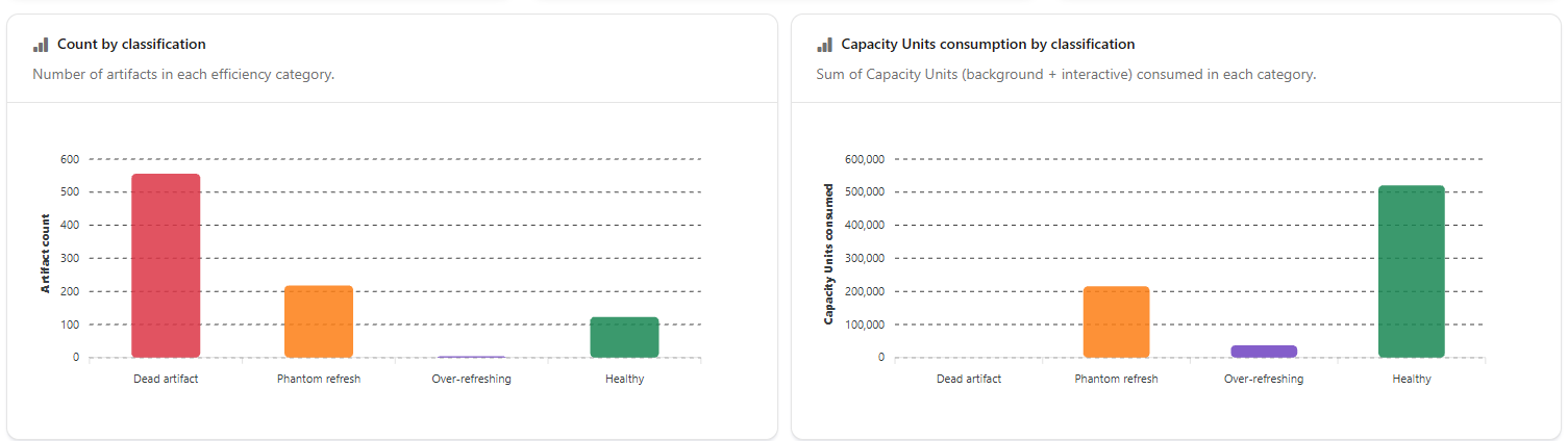
**What it is:** two bar charts, **Count by classification** (number of artifacts in each category) and **Capacity Units consumption by classification** (sum of the background + interactive Capacity Units consumed in each category).

**What it is for:** comparing the weight of each category in number of artifacts and in consumption, and going straight to the list of a category.

<figure><picture><source srcset="/files/D1nxoVafOKaOiBlNlkQ6" media="(prefers-color-scheme: dark)"><img src="https://3938213054-files.gitbook.io/~/files/v0/b/gitbook-x-prod.appspot.com/o/spaces%2FH2bFRBmIfyK3kwVKbldl%2Fuploads%2Fgit-blob-62bc29b2b1d3b72926f452d203e89950cc8ebb29%2Fpm-dashboards-eficiencia-graficos-en.png?alt=media" alt="Count by classification and Capacity Units consumption by classification charts"></picture><figcaption><p>Charts by classification</p></figcaption></figure>

**How to use:**

1. Hover over a bar to see the exact value.
2. Click a bar in either chart to apply that classification as a filter on the **Analyzed artifacts** table (the corresponding tab is selected).

{% hint style="info" %}
The **Capacity Units consumption by classification** chart is calculated over **all** artifacts of the period and workspace (it is not a sample) and adds up every category, **Healthy** included. That is why the chart total is higher than the **Wasted Capacity Units** KPI, which adds up only the inefficient categories.
{% endhint %}

With no artifacts in the scope, the charts show "No artifacts to display for the selected period."

### Table classification tabs

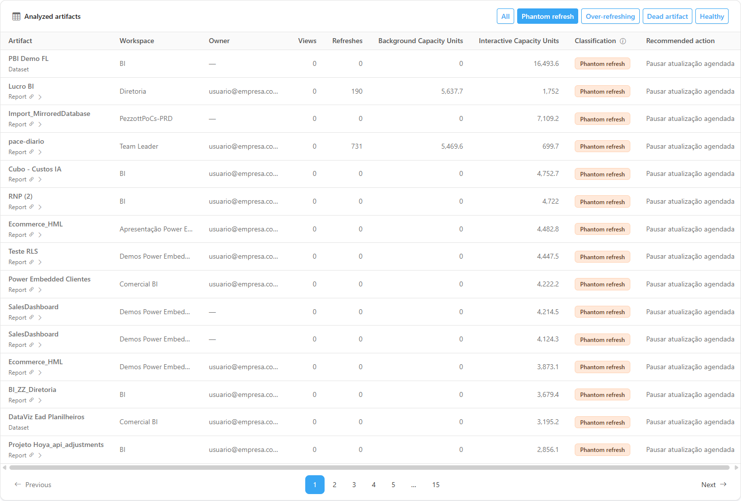
**What it is:** the **All**, **Phantom refresh**, **Over-refreshing**, **Dead artifact** and **Healthy** tabs, in the header of the **Analyzed artifacts** card.

**What it is for:** working on one category at a time, for example building the list of phantom refreshes to pause.

<figure><picture><source srcset="/files/ziuNpX81r8JPxSNt5j4T" media="(prefers-color-scheme: dark)"><img src="https://3938213054-files.gitbook.io/~/files/v0/b/gitbook-x-prod.appspot.com/o/spaces%2FH2bFRBmIfyK3kwVKbldl%2Fuploads%2Fgit-blob-66dd57ab3d32dc611a3d8c02540569edb03d9138%2Fpm-dashboards-eficiencia-abas-en.png?alt=media" alt="Analyzed artifacts table with the Phantom refresh tab selected"></picture><figcaption><p>Table filtered by the Phantom refresh tab</p></figcaption></figure>

**How to use:**

1. Click the tab of the category you want. Hover over the tab to see the category's rule (on the **All** tab, all rules).
2. To see all rules at once, hover over the information icon of the **Classification** header (**Classification rules**).
3. Click **All** to return to the full list.

### Waste analyses

**What it is:** two sets of cards that go deeper into **how much, where and why** there is waste: three summary cards right below the KPIs (share, current × previous period and estimated cost) and six cards between the charts and the table. Each card loads on its own (if one fails, it shows *Could not load this analysis.* with **Try again**), and the information icon next to the title explains the calculation. Those using monetary values show the **Estimate** badge. All follow the **Period** and **Workspace** filters (except the estimated cost, which always covers the whole organization).

**What it is for:** turning the list of problematic artifacts into a prioritized action plan.

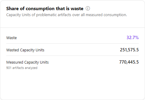
<figure><picture><source srcset="/files/3Gjj6gHLSP4B40M1TOPQ" media="(prefers-color-scheme: dark)"><img src="https://3938213054-files.gitbook.io/~/files/v0/b/gitbook-x-prod.appspot.com/o/spaces%2FH2bFRBmIfyK3kwVKbldl%2Fuploads%2Fgit-blob-f087384ff568c63317b98660b2557372deb388d1%2Fpm-dashboards-eficiencia-resumo-desperdicio-en.png?alt=media" alt="Three summary cards: share of consumption that is waste, current x previous period and estimated cost of waste"></picture><figcaption><p>Waste summary cards</p></figcaption></figure>

| Card                                   | What it shows                                                                                                                                                                                        | How to read it                                                                                                                                                                                                                                                                                                                                                                                                   |
| -------------------------------------- | ---------------------------------------------------------------------------------------------------------------------------------------------------------------------------------------------------- | ---------------------------------------------------------------------------------------------------------------------------------------------------------------------------------------------------------------------------------------------------------------------------------------------------------------------------------------------------------------------------------------------------------------- |
| **Share of consumption that is waste** | **Waste** (%), **Wasted Capacity Units** and **Measured Capacity Units**, with the count of analyzed artifacts                                                                                       | Capacity Units of artifacts with phantom refresh or over-refreshing divided by the consumption of **all** analyzed artifacts, healthy ones included. Uses the full set, not a sample. Dead artifacts consume nothing, so they do not count. With no measured consumption, the card says *No Capacity Units consumption measured in the period.*                                                                  |
| **Current × previous period**          | **Wasted Capacity Units** (% change and the *before* and *now* values), **Waste share** (change in percentage points) and **Items consuming without use** (change and the *before* and *now* values) | Classifies the artifacts again over a window of the same size right before the current one and compares. Dead artifacts are left out of the compared count. If the previous period had no waste, it shows *No waste before*. When the retained history of views and consumption does not cover the previous period, the card shows **Not enough history** and since when views and consumption are recorded      |
| **Estimated cost of waste**            | Total **Estimated cost**, with **Phantom refresh** and **Over-refreshing** (value and number of items of each)                                                                                       | Applies to each item the same real cost rate per Capacity Unit used by the cost-per-item tabs. It is not billed cost and must never be added to real cost. It covers the whole organization: with a workspace selected, a note says the filter does not apply. **View capacity cost →** link to [Capacity Cost](/en/power-monitor/dashboards/custo-de-capacidade.md). With no cost, it shows *No estimated cost* |

<figure><picture><source srcset="/files/0Zl5bbR6jwcqnO0bdXAo" media="(prefers-color-scheme: dark)"><img src="https://3938213054-files.gitbook.io/~/files/v0/b/gitbook-x-prod.appspot.com/o/spaces%2FH2bFRBmIfyK3kwVKbldl%2Fuploads%2Fgit-blob-b6ec6364d2b8d8119f86ac00d0c433a7d6c58f37%2Fpm-dashboards-eficiencia-analises-en.png?alt=media" alt="Six waste analysis cards: where the waste is, type x classification, memory of unused models, refresh failures, schedules and protected but unused"></picture><figcaption><p>Waste analyses</p></figcaption></figure>

The six cards between the charts and the table, in pairs:

| Card                                        | What it shows                                                                                                                                                                                                                             | How to read it                                                                                                                                                                                                                                                                                                    |
| ------------------------------------------- | ----------------------------------------------------------------------------------------------------------------------------------------------------------------------------------------------------------------------------------------- | ----------------------------------------------------------------------------------------------------------------------------------------------------------------------------------------------------------------------------------------------------------------------------------------------------------------- |
| **Where the waste is**                      | Ranking of the top 10 by wasted Capacity Units, with **Name**, **Items**, **Capacity Units** and **Share** (bar and %). The **By workspace** and **By owner** buttons switch the grouping; *X of Y* says how many appear out of the total | The owner is the technical owner registered in the workspace governance; when missing, the **Owner not defined** row groups the items. No e-mail is shown, and the **Hide data** button also masks owner names                                                                                                    |
| **Type × classification**                   | One row per type (**Report**, **Report + exclusive model**, **Semantic model**) with the columns **Dead artifact**, **Phantom refresh**, **Over-refreshing**, **Healthy**, **Total** and **Wasted CU**                                    | *Report + exclusive model* is the unified row of a report with a model of its own (classified together). Dataflows are not classified, for lack of a reliable access signal                                                                                                                                       |
| **Memory of unused models**                 | **Memory used** (with *Known size for X of Y models* and the coverage %), **Dead models**, **Phantom models** and the list of the 5 **Largest**                                                                                           | Adds up the in-memory size of models with no views in the period. Size is only captured in dedicated-capacity workspaces the Service Principal can access, so coverage is partial and a model without a size is not included in the sum. With no captured size, the card says so                                  |
| **Refresh failures in unused models**       | **Failures in unused models** (% and *X of Y failures*), **Unused models with failures** and the 5 models with **Most failures**                                                                                                          | A high share means alerts that are noise: fixing or pausing these models cuts work without affecting users                                                                                                                                                                                                        |
| **Schedules on models without consumption** | **Scheduled refreshes per week**, **Models with an active schedule** (*of N candidate models*), the **By day of week** distribution and the 5 **Most scheduled**                                                                          | Counts the enabled slots of the Power BI weekly schedule of phantom or over-refreshing models; each slot of each day is one refresh per week. Pausing or spacing out these schedules is the most direct saving. **Review schedules →** link to [Schedules](/en/power-monitor/governanca/operacao/agendamentos.md) |
| **Protected but unused**                    | **Protected items with a problem**, **Endorsed** and **Critical**, and the list of the 10 with the most Capacity Units, with classification, endorsement (**Certified**, **Promoted**) and item and workspace criticality badges          | Certified, promoted or high or critical criticality items that fell into a problematic category. Before archiving or pausing, check with the owner: it may be a new, seasonal or misclassified item                                                                                                               |

### Analyzed artifacts table

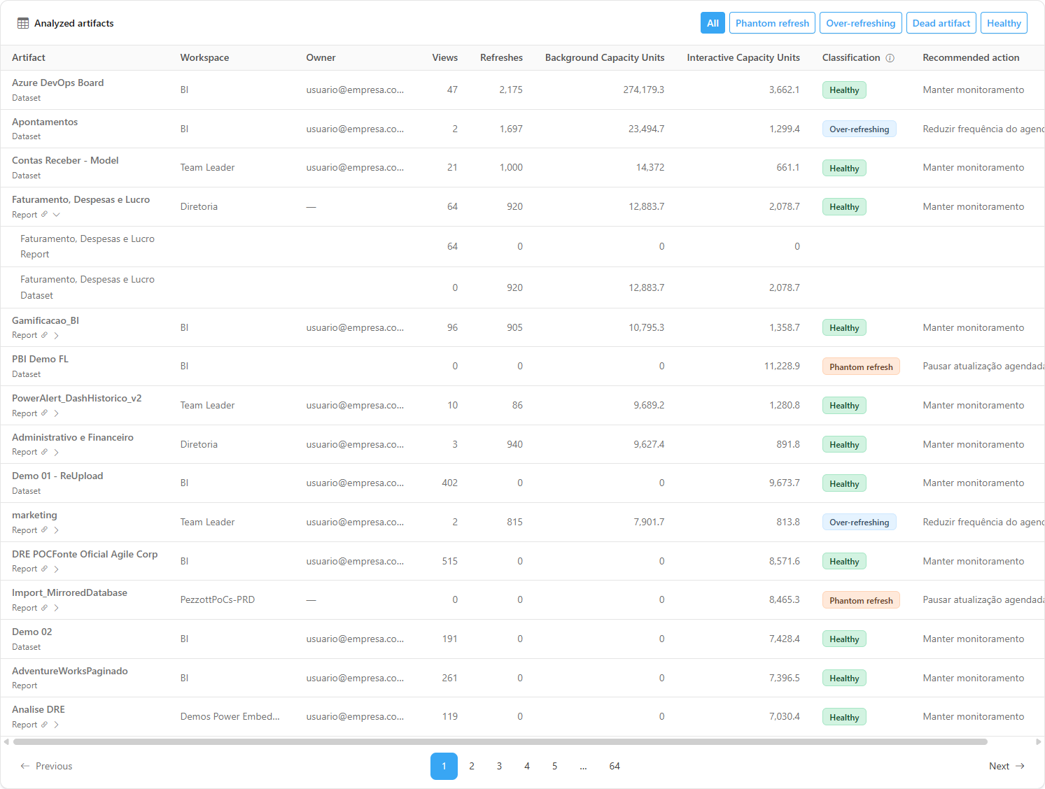
**What it is:** the paginated table (15 items per page by default; the **Items per page** selector allows 10, 25, 50 or 100) with the reports and semantic models in the scope, sorted from **highest to lowest Capacity Units consumption**, so that the items most worth acting on appear first.

**What it is for:** knowing, for each artifact, where it is, who is responsible for it, how much it is used, how much it consumes and what to do with it.

<figure><picture><source srcset="/files/ziuNpX81r8JPxSNt5j4T" media="(prefers-color-scheme: dark)"><img src="https://3938213054-files.gitbook.io/~/files/v0/b/gitbook-x-prod.appspot.com/o/spaces%2FH2bFRBmIfyK3kwVKbldl%2Fuploads%2Fgit-blob-66dd57ab3d32dc611a3d8c02540569edb03d9138%2Fpm-dashboards-eficiencia-abas-en.png?alt=media" alt="Analyzed artifacts table with the Artifact, Workspace, Owner, Views, Refreshes, Capacity Units, Classification and Recommended action columns"></picture><figcaption><p>Analyzed artifacts table</p></figcaption></figure>

| Column                         | Description                                                                                                                                                              |
| ------------------------------ | ------------------------------------------------------------------------------------------------------------------------------------------------------------------------ |
| **Artifact**                   | Name of the report or semantic model, with its type. Reports linked to an exclusive semantic model display a link icon and the breakdown button.                         |
| **Workspace**                  | Workspace where the artifact is published.                                                                                                                               |
| **Owner**                      | For reports, the last user who modified it; for semantic models, the user who configured the model. The e-mail is masked when **Hide data** is on.                       |
| **Views**                      | Number of report views and exports in the period. For semantic models, it is the sum of the accesses of all reports that use the model.                                  |
| **Refreshes**                  | Number of refresh executions in the period (scheduled or on-demand semantic model refresh, pipeline activity runs and scheduled notebook runs associated with the item). |
| **Background Capacity Units**  | Capacity Units consumed by background operations (refreshes, processing).                                                                                                |
| **Interactive Capacity Units** | Capacity Units consumed by interactive operations (queries triggered by users).                                                                                          |
| **Classification**             | Category of the artifact, in a colored badge.                                                                                                                            |
| **Recommended action**         | Suggestion for the category (see *Classification rules*).                                                                                                                |

**How to use:**

{% stepper %}
{% step %}

### See the total

Check the **Wasted Capacity Units** KPI and the **Phantom refreshes**, **Dead artifacts** and **Over-refreshing** counts.
{% endstep %}

{% step %}

### Filter by category

Click the **Phantom refresh** (or **Over-refreshing**) bar in one of the charts, or directly the category tab above the table.
{% endstep %}

{% step %}

### Prioritize by top consumers

The table is already sorted from highest to lowest Capacity Units consumption. Note down the **Workspace**, **Owner** and **Recommended action** of the first items. Hover over truncated names to read them in full and use the pagination in the footer to see the others.
{% endstep %}

{% step %}

### Act in Power BI/Fabric

With the artifact owner, pause or reduce the refresh schedule (or archive the artifact) in the Power BI/Fabric portal. Power Monitor does not change schedules.
{% endstep %}

{% step %}

### Confirm in the next period

Come back to the screen after a few days and check whether the artifact changed classification and whether the **Wasted Capacity Units** KPI dropped.
{% endstep %}
{% endstepper %}

With no results, the table shows "No artifacts found for the selected filters."

### Report with an exclusive semantic model (breakdown)

**What it is:** when a report is the **only** report in the whole organization that uses a given semantic model, the two are treated as a pair: the report's row considers the **combined** accesses, refreshes and Capacity Units of the report and the model, and the model does not appear in a separate row (to avoid duplicating consumption). The row shows the link icon and an arrow button to expand the breakdown.

**What it is for:** assessing the real cost of a report, adding what the model behind it consumes, while still being able to see each part separately.

<figure><picture><source srcset="/files/3jy8n3uo5ZcSg36YU5Ht" media="(prefers-color-scheme: dark)"><img src="https://3938213054-files.gitbook.io/~/files/v0/b/gitbook-x-prod.appspot.com/o/spaces%2FH2bFRBmIfyK3kwVKbldl%2Fuploads%2Fgit-blob-52d4964cc5e84b2147769bae242f935ec0daec37%2Fpm-dashboards-eficiencia-detalhamento-en.png?alt=media" alt="Expanded report row with the sub-rows of the report and the exclusive semantic model"></picture><figcaption><p>Breakdown of a report with an exclusive model</p></figcaption></figure>

**How to use:**

1. In the table, find a report with the link icon (**Linked to a semantic model**). Hover over the icon to see the model name and the combined totals.
2. Click the arrow button next to the icon (**View breakdown**). The sub-rows show the accesses, refreshes and Capacity Units of the report and the model separately.
3. Click the button again (**Hide breakdown**) to collapse it.

**How it works:** semantic models shared by two or more reports are never combined: they appear in their own row.

### Microsoft standard artifacts

When the analysis leaves out artifacts that Microsoft itself creates in the tenant (such as the Fabric Capacity Metrics app), the notice *N Microsoft standard artifacts ignored* appears in the header, with the **Configure** button for administrators. See [Microsoft standard artifacts](/en/power-monitor/qualidade-de-dados/exposicao-de-dados.md#microsoft-standard-artifacts).

## Rules and behavior

### Classification rules

The rules are evaluated **in this order** and the first one that applies defines the classification:

| Order | Classification      | Rule                                                                                                                                                                                                                                    | Recommended action        |
| ----- | ------------------- | --------------------------------------------------------------------------------------------------------------------------------------------------------------------------------------------------------------------------------------- | ------------------------- |
| 1     | **Dead artifact**   | 0 accesses **and** 0 Capacity Units consumed in the period.                                                                                                                                                                             | Archive or delete         |
| 2     | **Phantom refresh** | 0 accesses in the period, but with refreshes and/or Capacity Units consumption.                                                                                                                                                         | Pause scheduled refresh   |
| 3     | **Over-refreshing** | Number of refreshes **≥ 2 × the number of days in the period**, with at most **1 access per 15 days of the period** (minimum of 1). E.g.: in 30 days, 60 or more refreshes with up to 2 accesses; in 90 days, 180 or more with up to 6. | Reduce schedule frequency |
| 4     | **Healthy**         | None of the patterns above.                                                                                                                                                                                                             | Keep monitoring           |

{% hint style="info" %}
**Archiving a dead artifact does not save Capacity Units**: it already consumes nothing. The gain is in organization, storage and licensing. The capacity savings are in the **Phantom refresh** and **Over-refreshing** categories.
{% endhint %}

### Where the data comes from

* **Capacity Units consumption and refreshes:** daily per-item metrics collected from the **Microsoft Fabric Capacity Metrics App** configured for the organization. Only artifacts hosted on monitored capacities have consumption; artifacts on shared capacity (Pro) appear with 0 CU.
* **Accesses:** report **view** and **export** events recorded in the Power BI activity log (Activity Events).
* **Artifact catalog:** inventory of reports and semantic models obtained by the scans. Artifacts detected as **deleted** in the tenant are not included in the analysis.
* **Types analyzed:** reports and semantic models. Dataflows are left out of the analysis because there is no reliable "access" signal for them.
* **Window:** the days of the period are counted in the **organization's time zone**, ending today.

### Prerequisites

* Activity Events collection active (without it, all artifacts would have 0 accesses and would be classified as dead or phantom).
* Capacity monitoring configured, with a valid Capacity Metrics App source (see [Enable capacity monitoring](/en/power-monitor/monitoramento/capacidades/ativar-monitoramento-de-capacidade.md)).

### Loading

While the data for a new scope is loading, an indicator appears over the screen; the analysis cards load on their own, without blocking the KPIs and the table. If loading fails, the screen shows "Could not load the efficiency dashboard." with the **Retry** button.

## Frequently asked questions

<details>

<summary>Does Power Monitor pause the schedule automatically?</summary>

No. The screen diagnoses and recommends; changing the schedule or archiving the artifact must be done by the owner in Power BI/Fabric.

</details>

<details>

<summary>Why does a semantic model with heavily accessed reports appear as "Phantom refresh"?</summary>

A semantic model's accesses are the sum of the accesses of the reports that use it. Check whether the reports are in the inventory (not deleted) and whether Activity Events collection is active and up to date. Accesses through other tools (for example, Analyze in Excel or direct queries to the model) do not count as report accesses.

</details>

<details>

<summary>Why does a report not appear in the list, but its model does (or vice versa)?</summary>

When a report and a model are exclusive to each other, they become a single row (the report's) with the combined numbers. Use the breakdown button to see each one separately.

</details>

<details>

<summary>The total of the consumption chart does not match the KPI.</summary>

This is expected: the chart adds up the consumption of every category, Healthy included, and the KPI adds up only Phantom refresh and Over-refreshing (a dead artifact consumes nothing).

</details>

<details>

<summary>I searched for an artifact and the KPIs did not change.</summary>

This is expected: the search filters only the table. KPIs and charts follow only **Period** and **Workspace**.

</details>

## Related pages

* [Dashboards](/en/power-monitor/dashboards.md)
* [Capacity Dashboard](/en/power-monitor/dashboards/dashboard-de-capacidade.md)
* [Capacity Cost](/en/power-monitor/dashboards/custo-de-capacidade.md)
* [Report Access Dashboard](/en/power-monitor/dashboards/dashboard-de-visualizacoes.md)
* [Semantic models (Governance)](/en/power-monitor/governanca/modelos-semanticos.md)
* [Consumption metrics](/en/power-monitor/monitoramento/metricas-de-consumo.md)


---

# Agent Instructions
This documentation is published with GitBook. GitBook is the documentation platform designed so that both humans and AI agents can read, navigate, and reason over technical content effectively. Learn more at gitbook.com.

## Querying This Documentation
If you need additional information that is not directly available in this page, you can query the documentation by asking a question.

Perform an HTTP GET request on the following URL with the `ask` and `goal` query parameters:

```
GET https://docs.powermonitor.com.br/en/power-monitor/dashboards/dashboard-de-eficiencia.md?ask=<question>&goal=<user_goal>
```

`ask` is the immediate question: it should be specific, self-contained, and written in natural language.
`goal` is what the user is ultimately trying to achieve, the reason they need the answer. Sharing it helps GitBook give you a better, more relevant answer. A goal is most helpful when it describes the outcome the user wants rather than restating the question. For example, with `ask=how do I create an API token`, a goal like `automate deployments from our CI pipeline` lets GitBook tailor the answer to that use case.

The response will contain a direct answer to the question and relevant excerpts and sources from the documentation.

Use this mechanism when the answer is not explicitly present in the current page, you need clarification or additional context, or you want to retrieve related documentation sections.