> For the complete documentation index, see [llms.txt](https://docs.powermonitor.com.br/llms.txt). Markdown versions of documentation pages are available by appending `.md` to page URLs; this page is available as [Markdown](https://docs.powermonitor.com.br/en/power-monitor/dashboards/dashboard-de-visualizacoes.md).

# Report Access Dashboard

Report engagement: how many accesses, who accesses, which reports are (or are no longer) used, at what times, through which items and from where, based on the Microsoft Fabric audit log.

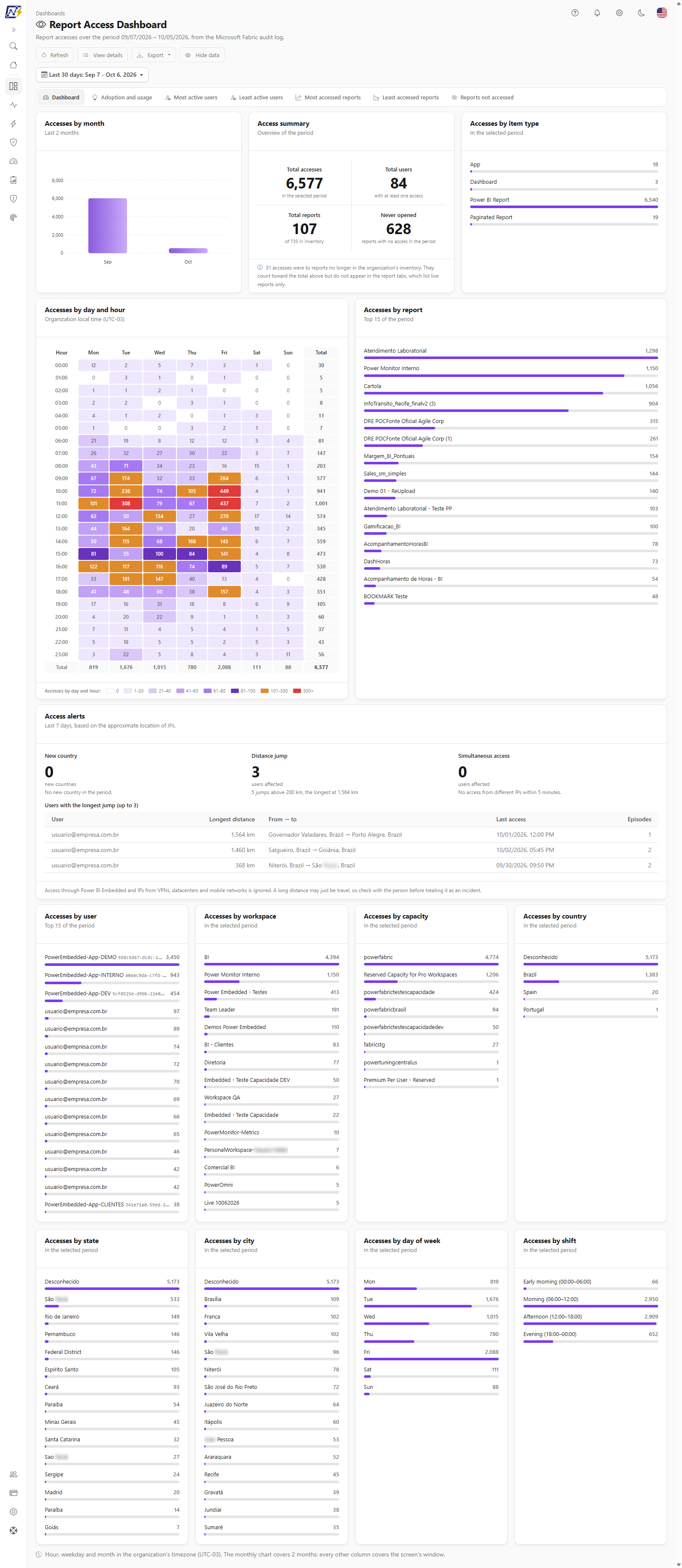
The **Report Access Dashboard** measures the actual use of the tenant's reports based on the Microsoft Fabric/Power BI activity log (audit): total accesses, active users, most and least accessed reports, reports that nobody opens, peak times and the geographic origin of accesses.

**How to access:** menu *Dashboards › Report Access Dashboard*. Who can open it is defined by each user's **page access profile** (administrators always have access; the Audit profile comes with the screen enabled and Member with it blocked), because it exposes the usage behavior of each person in the organization (who uses it, who stopped using it). The data respects the user's **workspace scope**.

**Prerequisite:** activity event collection enabled in *Settings › Audit*. Without it, the screen has no accesses to show.

<figure><picture><source srcset="/files/JFnR6n7Xp9ggk2hu75aR" media="(prefers-color-scheme: dark)"><img src="https://3938213054-files.gitbook.io/~/files/v0/b/gitbook-x-prod.appspot.com/o/spaces%2FH2bFRBmIfyK3kwVKbldl%2Fuploads%2Fgit-blob-57f591efa547ff17f06de9a63b1b94990d88172e%2Fpm-dashboards-visualizacoes-dashboard-en.png?alt=media" alt="Report Access Dashboard with the monthly chart, access summary and heatmap by day and hour"></picture><figcaption><p>Report Access Dashboard: Dashboard tab</p></figcaption></figure>

## What it is for

* **Measuring adoption:** how many users and reports had accesses in the period and how this evolved month by month.
* **Cleaning up the catalog:** finding reports that were never opened or that stopped being used.
* **Planning refresh windows:** seeing on which days and at what times there are more accesses and scheduling heavy refreshes outside the peak.
* **Understanding the audience:** most and least active users, most accessed workspaces and capacities, countries, states and cities of origin.

The screen is organized into seven tabs: **Dashboard** (charts and KPIs), **Adoption and usage**, **Most active users**, **Least active users**, **Most accessed reports**, **Least accessed reports** and **Reports not accessed**. The **Dashboard** tab and the five table tabs use the same dataset, loaded only once for the chosen period; that is why they never contradict each other. The **Adoption and usage** tab loads on its own (the first time you open it, and then it follows the period), and the **Access alerts** block also loads separately, always over the last 7 days.

## Features

### Header action bar

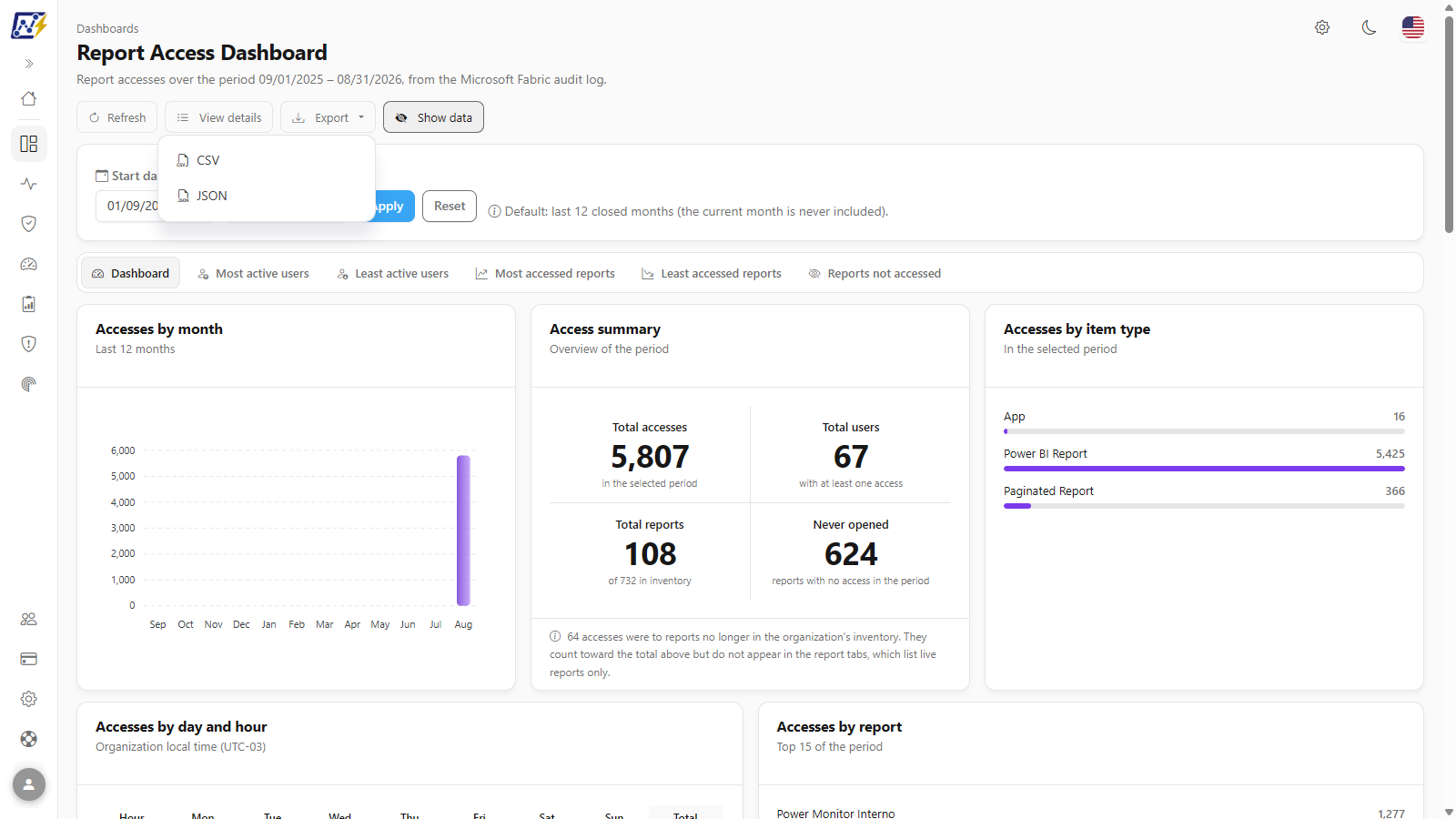
**What it is:** the row of buttons just below the title: **Refresh**, **View details**, **Export** and **Hide data**. The subtitle above it reports the analyzed period ("Report accesses over the period {period}, from the Microsoft Fabric audit log").

**What it is for:** reloading the numbers, jumping to event-by-event investigation, taking the tab's data to a spreadsheet and preparing the screen to be shared.

<figure><picture><source srcset="/files/hYIGuH9cqlV9fTzYaKsS" media="(prefers-color-scheme: dark)"><img src="https://3938213054-files.gitbook.io/~/files/v0/b/gitbook-x-prod.appspot.com/o/spaces%2FH2bFRBmIfyK3kwVKbldl%2Fuploads%2Fgit-blob-bcf9dca695709a4ac4b46ee5d6eb7a6f39a07b5b%2Fpm-dashboards-visualizacoes-cabecalho-en.png?alt=media" alt="Report Access Dashboard header with the Refresh, View details, Export and Hide data buttons"></picture><figcaption><p>Header with the analyzed period and the action bar</p></figcaption></figure>

**How to use:**

1. Click **Refresh** to fetch the already collected accesses again (the icon spins while loading). The button also reloads the **Access alerts** and, if you have already opened it, the **Adoption and usage** tab.
2. Click **View details** to open *Audit › Report Views*, with each individual access event. See [Report Views](/en/power-monitor/auditoria/visualizacoes-de-relatorios.md).
3. **Export** and **Hide data** are described in their own features, below.

**How it works:** **Refresh** does not trigger a new collection in Microsoft Fabric; new accesses only appear after the next activity log collection (three times a day).

### Period filter

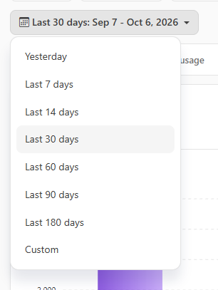
**What it is:** the button with a calendar icon just above the tabs, which shows the chosen range and the dates it stands for (for example, "Last 30 days: Aug 18 - Sep 16, 2026").

**What it is for:** analyzing the last month, a quarter, a closing month or the period of an adoption project.

<figure><picture><source srcset="/files/HJmJpBaogeo7fB82poWS" media="(prefers-color-scheme: dark)"><img src="https://3938213054-files.gitbook.io/~/files/v0/b/gitbook-x-prod.appspot.com/o/spaces%2FH2bFRBmIfyK3kwVKbldl%2Fuploads%2Fgit-blob-0733116e170ae549f194fc62f0181c95bd9a2002%2Fpm-dashboards-visualizacoes-filtro-periodo-en.png?alt=media" alt="Period menu open with Yesterday, Last 7, 14, 30, 60, 90 and 180 days and Custom"></picture><figcaption><p>Period filter</p></figcaption></figure>

**How to use:**

1. Click the period button (default: **Last 30 days**).
2. Choose **Yesterday**, **Last 7, 14, 30, 60, 90 or 180 days** or **Custom**. The shortcuts apply immediately.
3. In **Custom**, fill in the two dates (start and end). The period is applied as soon as they form a valid range: the end date cannot be in the future or earlier than the start date, and the range is at most 366 days.

**How it works / rules:**

* The default is the **last 30 days**, ending today (based on your browser's day).
* The period applies to the **Dashboard** tab, to **Adoption and usage** and to the five table tabs. While the data loads, the button is disabled.
* The filter affects the KPIs, the charts, the heatmap, the rankings and the **In the selected period** column of the tables. The **Last 7 days** and **Last 30 days** columns are always counted from today, and the **Access alerts** always use the last 7 days.
* With **Custom** still incomplete, the **Refresh** button repeats the period that is on screen.

### Navigating between tabs

**What it is:** the strip of seven tabs below the filter. On narrow screens (mobile), the strip becomes a drop-down selector with the same options.

**What it is for:** switching between the graphical view (**Dashboard**) and the user and report lists without reloading the data.

**How to use:** click the tab name. The active tab is highlighted; export and search then apply to it.

### Accesses by month

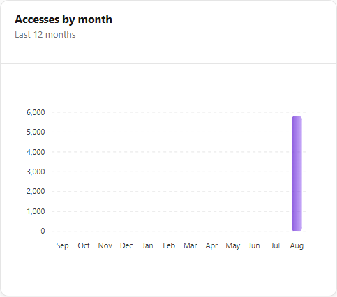
**What it is:** a column chart with the number of accesses in each month, in the first card of the **Dashboard** tab.

**What it is for:** seeing the adoption trend (growth, decline, seasonality such as vacations and closing periods).

<figure><picture><source srcset="/files/6vw4T8mafBigLV8Dld6D" media="(prefers-color-scheme: dark)"><img src="https://3938213054-files.gitbook.io/~/files/v0/b/gitbook-x-prod.appspot.com/o/spaces%2FH2bFRBmIfyK3kwVKbldl%2Fuploads%2Fgit-blob-9aa0e542a0223819773518844c7e7f640582df90%2Fpm-dashboards-visualizacoes-acessos-por-mes-en.png?alt=media" alt="Accesses by month column chart"></picture><figcaption><p>Accesses by month</p></figcaption></figure>

**How to use:** hover over a column to see the month and the exact number of accesses.

**How it works:** the series runs from the first month to the last month of the chosen period, and the subtitle indicates how many months it covers ("Last {n} months"); with the default of 30 days that is only one or two months, and a partial month adds up only the days inside the period. Months with no accesses appear as zero, so that the gap is visible. The year is only shown in the labels when the data crosses the turn of the year.

### Access summary

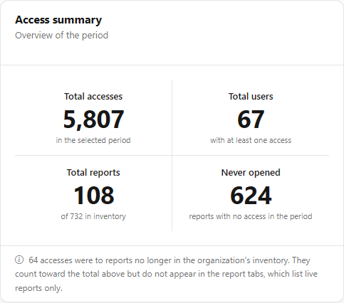
**What it is:** a card with the four KPIs for the period.

**What it is for:** answering, at a glance, "how many people use our reports and how much of the catalog is actually used".

<figure><picture><source srcset="/files/4sX9XSbner5FioeOUZdW" media="(prefers-color-scheme: dark)"><img src="https://3938213054-files.gitbook.io/~/files/v0/b/gitbook-x-prod.appspot.com/o/spaces%2FH2bFRBmIfyK3kwVKbldl%2Fuploads%2Fgit-blob-b7a2a11645ba97410c85a1aa790a0a126a8ff2a0%2Fpm-dashboards-visualizacoes-resumo-en.png?alt=media" alt="Access summary card with Total accesses, Total users, Total reports and Never opened"></picture><figcaption><p>Access summary</p></figcaption></figure>

| KPI                | Calculation                                                                                 |
| ------------------ | ------------------------------------------------------------------------------------------- |
| **Total accesses** | Number of report view and report export events in the period.                               |
| **Total users**    | Distinct users with at least one access in the period.                                      |
| **Total reports**  | Distinct reports accessed, over the total reports in the inventory ("of {n} in inventory"). |
| **Never opened**   | Inventory reports with no access at all in the period (inventory − accessed reports).       |

**How it works:** when some of the accesses were to reports that no longer exist in the inventory, a notice reports how many: they count toward the total, but do not appear in the report tabs, which list only existing reports.

### Accesses by item type

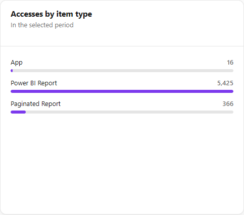
**What it is:** a ranking of accesses by **Power BI Report**, **Paginated Report**, **Dashboard** and **App** (reports opened through an App).

**What it is for:** understanding how people consume content (directly in the workspace, through an App, paginated reports).

<figure><picture><source srcset="/files/y79WkHGHIk4MZgpkdGoV" media="(prefers-color-scheme: dark)"><img src="https://3938213054-files.gitbook.io/~/files/v0/b/gitbook-x-prod.appspot.com/o/spaces%2FH2bFRBmIfyK3kwVKbldl%2Fuploads%2Fgit-blob-21db44a520d89b9890e03a13dbcdf65762b096e5%2Fpm-dashboards-visualizacoes-tipo-item-en.png?alt=media" alt="Accesses by item type ranking"></picture><figcaption><p>Accesses by item type</p></figcaption></figure>

**How it works:** it is the only block that also counts views of Power BI **dashboards**; the others consider only reports.

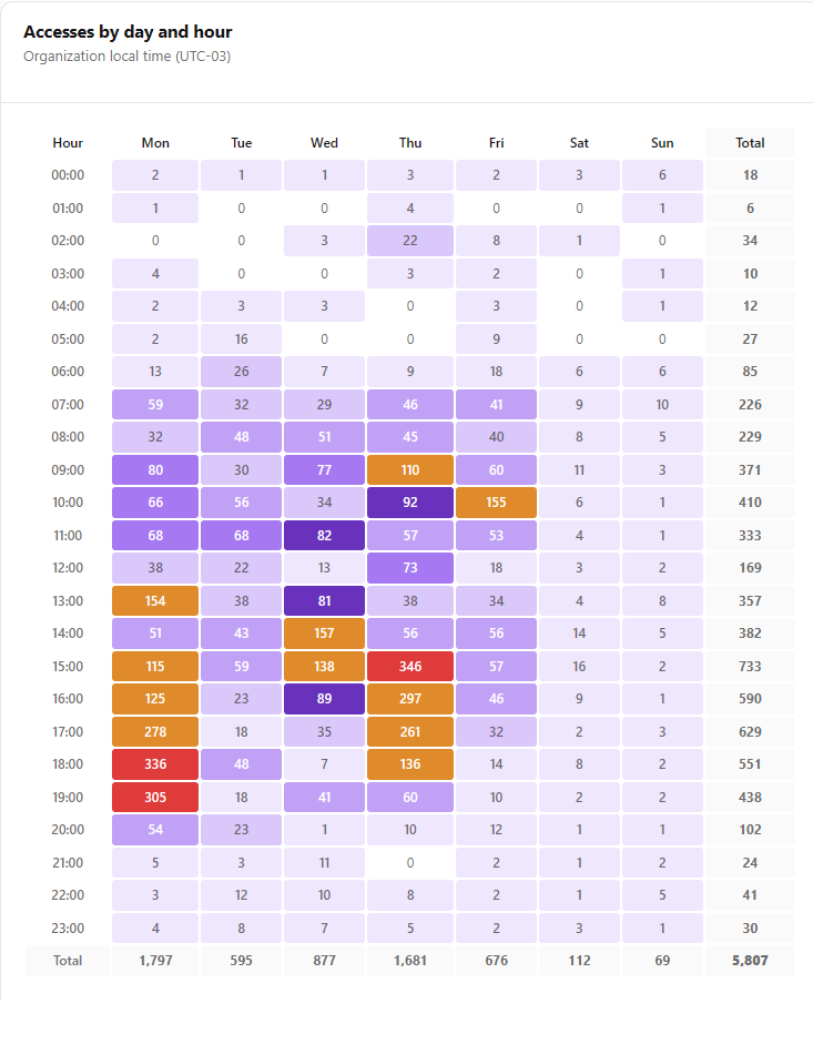
### Accesses by day and hour (heatmap)

**What it is:** a heat table with the hours of the day (00:00 to 23:00) in the rows and the days of the week in the columns, with row (**Total**) and column totals.

**What it is for:** discovering peak times and the quietest windows for scheduling heavy semantic model refreshes.

<figure><picture><source srcset="/files/KiM9ZTYVaFSU4bxa6ck9" media="(prefers-color-scheme: dark)"><img src="https://3938213054-files.gitbook.io/~/files/v0/b/gitbook-x-prod.appspot.com/o/spaces%2FH2bFRBmIfyK3kwVKbldl%2Fuploads%2Fgit-blob-96f67ae5bd96c4789c3242a85199981a5cd36969%2Fpm-dashboards-visualizacoes-heatmap-en.png?alt=media" alt="Accesses by day and hour heatmap with the color legend"></picture><figcaption><p>Accesses by day and hour</p></figcaption></figure>

**How to use:**

1. On the **Dashboard** tab, locate the **Accesses by day and hour** card.
2. Identify the lightest cells (ranges **0** or **1-20**) and check the **Accesses by shift** ranking to confirm the time of day.
3. Schedule heavy refreshes in those ranges, in the Power BI/Fabric portal.

**How it works:** the hours are in the **organization's time zone** (indicated in the card subtitle). The color legend uses the ranges 0, 1-20, 21-40, 41-60, 61-80, 81-100, 101-300 and 300+. On narrow screens, the table scrolls horizontally within the card itself.

### Access rankings

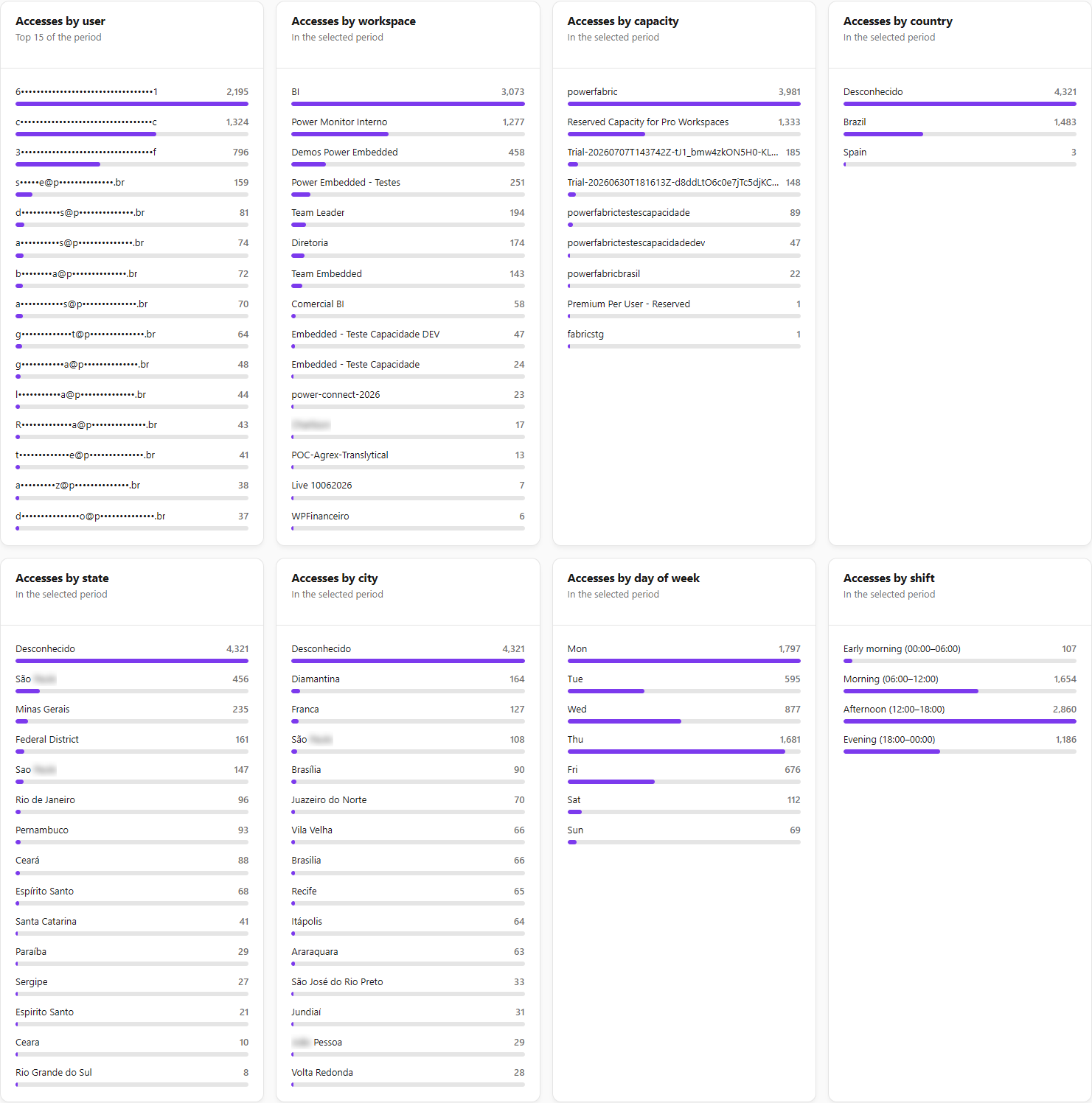
**What it is:** cards with the highest values for each dimension: **Accesses by report** and **Accesses by user** (the top 15 for the period), **Accesses by workspace**, **Accesses by capacity**, **Accesses by country**, **Accesses by state**, **Accesses by city**, **Accesses by day of week** (Monday to Sunday) and **Accesses by shift**.

**What it is for:** identifying business-critical reports, the heaviest users, the areas (workspaces) and capacities that concentrate consumption, and where people access from.

<figure><picture><source srcset="/files/txmSfKlM1mpHw9uxGzDm" media="(prefers-color-scheme: dark)"><img src="https://3938213054-files.gitbook.io/~/files/v0/b/gitbook-x-prod.appspot.com/o/spaces%2FH2bFRBmIfyK3kwVKbldl%2Fuploads%2Fgit-blob-9a27cf70299689288f7582c93ffe86d8b82a1940%2Fpm-dashboards-visualizacoes-rankings-en.png?alt=media" alt="Ranking cards by user, workspace, capacity, country, state, city, day of week and shift"></picture><figcaption><p>Access rankings by dimension</p></figcaption></figure>

**How it works / rules:**

* Each card shows the top 15 items of the dimension in the selected period.
* **Shifts:** **Early morning** (0h–6h), **Morning** (6h–12h), **Afternoon** (12h–18h) and **Evening** (18h–24h), in the organization's time zone.
* **Geolocation:** country, state and city are estimated from the IP recorded in the event. IPs with no location appear as **Unknown**; VPNs, proxies and corporate networks can concentrate accesses in a single location.
* With **Hide data** turned on, the emails in the ranking by user are masked.
* In the ranking by user, accesses made by an application (Service Principal) show the application name with its identifier next to it; an application identifier is not personal data and is not masked.

### Most active users and Least active users

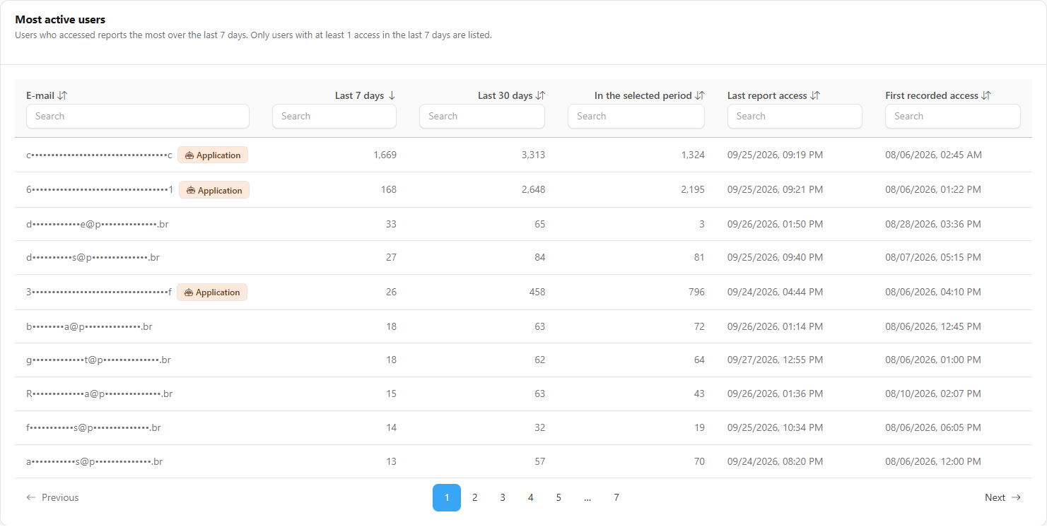
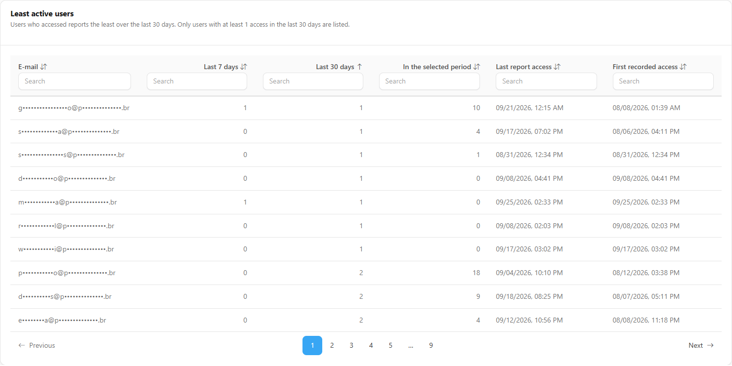
**What it is:** two tabs with the list of users and the access count for each one.

| Tab                    | Criterion and initial order                                                                                                                                                                  |
| ---------------------- | -------------------------------------------------------------------------------------------------------------------------------------------------------------------------------------------- |
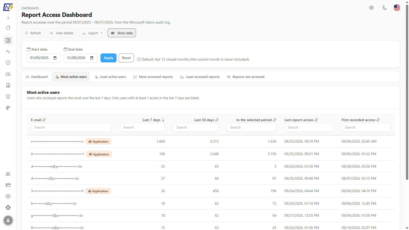
| **Most active users**  | Who accessed reports the most over the **last 7 days**. Only users with at least 1 access in that range appear. Sorted from most to least active.                                            |
| **Least active users** | Who accessed the least over the **last 30 days**. Only users with at least 1 access in that range appear (anyone who accessed nothing drops off the list). Sorted from least to most active. |

**What it is for:** recognizing key users (for pilots, train-the-trainer programs) and finding who is no longer using the reports (candidates for training or license review).

<figure><picture><source srcset="/files/SVCdPrLueTfp6PTnZh5s" media="(prefers-color-scheme: dark)"><img src="https://3938213054-files.gitbook.io/~/files/v0/b/gitbook-x-prod.appspot.com/o/spaces%2FH2bFRBmIfyK3kwVKbldl%2Fuploads%2Fgit-blob-9bea4264d2e4d68cced47910cb39e07ae36ba44c%2Fpm-dashboards-visualizacoes-usuarios-mais-ativos-en.png?alt=media" alt="Most active users tab with masked emails and 7-day, 30-day and period counts"></picture><figcaption><p>Most active users tab (with Hide data turned on)</p></figcaption></figure>

<figure><picture><source srcset="/files/0eL7i2udqNIDHM3knxwn" media="(prefers-color-scheme: dark)"><img src="https://3938213054-files.gitbook.io/~/files/v0/b/gitbook-x-prod.appspot.com/o/spaces%2FH2bFRBmIfyK3kwVKbldl%2Fuploads%2Fgit-blob-57c63b37d15d52225e0d02469cba16b17d290480%2Fpm-dashboards-visualizacoes-usuarios-menos-ativos-en.png?alt=media" alt="Least active users tab"></picture><figcaption><p>Least active users tab</p></figcaption></figure>

Columns: **E-mail**, **Last 7 days**, **Last 30 days**, **In the selected period**, **Last report access** and **First recorded access**.

**How to use:**

1. Click the **Most active users** or **Least active users** tab.
2. Sort by the count columns or search for an **E-mail** (see *Search, sorting and pagination*).
3. Rows with the **Application** badge are accesses made by a Service Principal that has not yet been mapped to a person; the application identifier appears next to the name and, when you hover over the badge, the screen guides you to configure the Power BI Embedded integration in *Settings › Audit*.

### Most accessed reports and Least accessed reports

**What it is:** two tabs with the inventory reports and the access count for each one.

| Tab                        | Criterion and initial order                                                                              |
| -------------------------- | -------------------------------------------------------------------------------------------------------- |
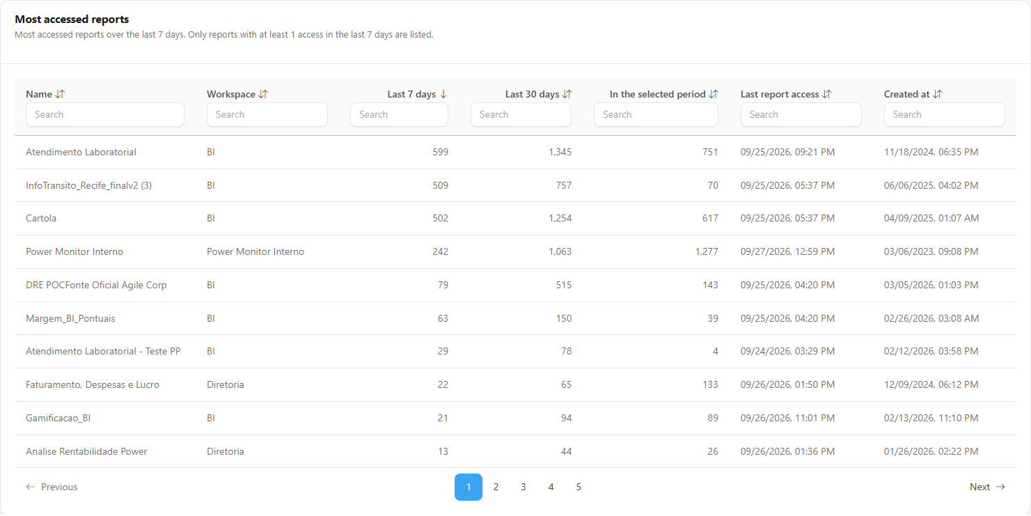
| **Most accessed reports**  | Most accessed over the **last 7 days** (at least 1 access in that range), from most to least accessed.   |
| **Least accessed reports** | Least accessed over the **last 30 days** (at least 1 access in that range), from least to most accessed. |

**What it is for:** prioritizing support (performance, data quality, refresh) for the most used reports and identifying those that are losing audience.

<figure><picture><source srcset="/files/qDFR8fYVIoXeZ43lYsWD" media="(prefers-color-scheme: dark)"><img src="https://3938213054-files.gitbook.io/~/files/v0/b/gitbook-x-prod.appspot.com/o/spaces%2FH2bFRBmIfyK3kwVKbldl%2Fuploads%2Fgit-blob-ce7f4efdae9514ab1edf079271fafd68a1876abb%2Fpm-dashboards-visualizacoes-relatorios-mais-acessados-en.png?alt=media" alt="Most accessed reports tab with name, workspace and counts"></picture><figcaption><p>Most accessed reports tab</p></figcaption></figure>

Columns: **Name**, **Workspace**, **Last 7 days**, **Last 30 days**, **In the selected period**, **Last report access** and **Created at**.

**How to use:** click the tab, sort by **Last 30 days** or **In the selected period** and search by **Workspace** to focus on one area.

### Reports not accessed

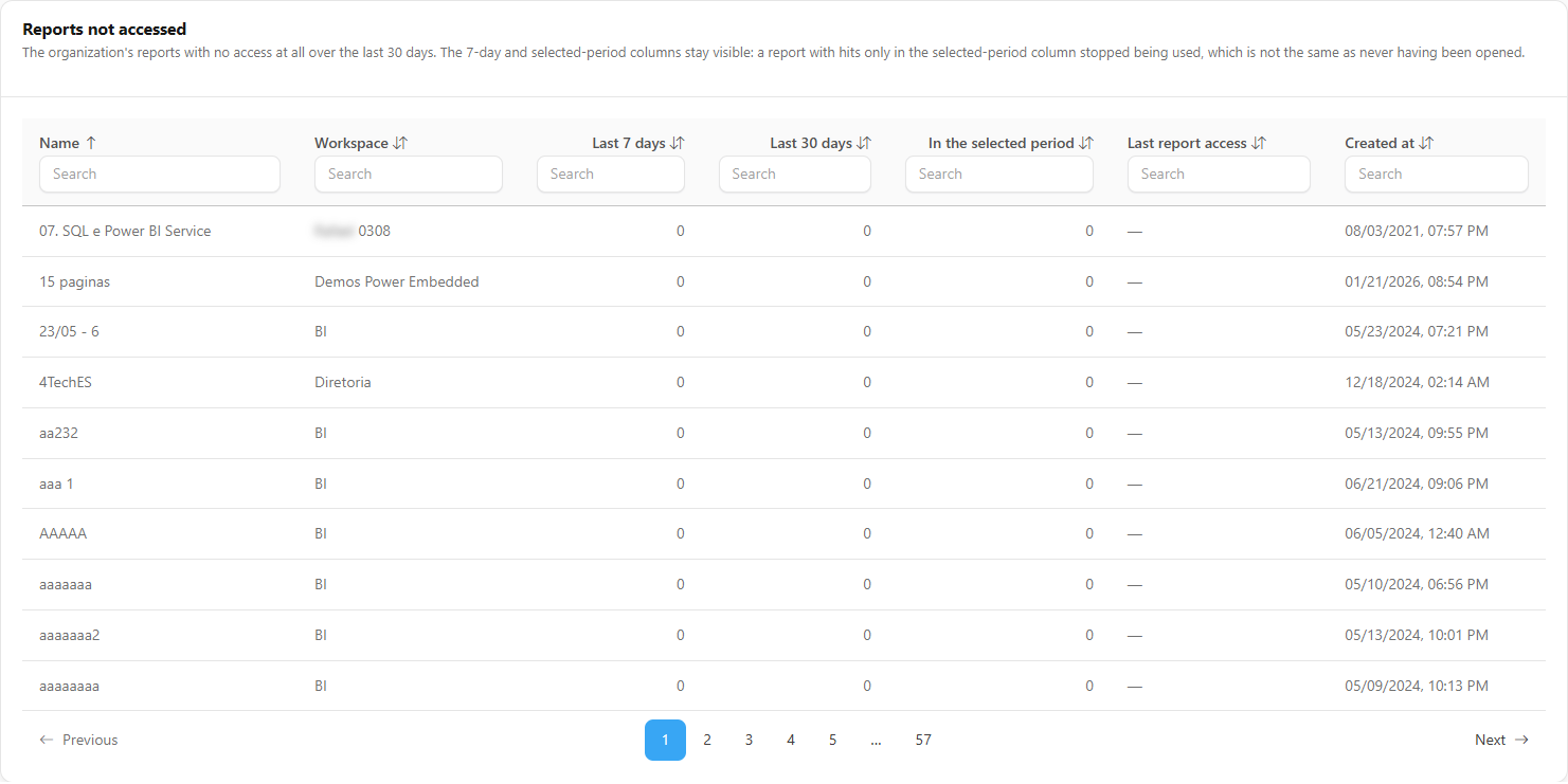
**What it is:** a tab with the inventory reports **with no access at all over the last 30 days**, in alphabetical order. The 7-day and period columns remain visible.

**What it is for:** building the list of candidates for archiving or deletion, reducing the catalog, the refresh cost and user confusion.

<figure><picture><source srcset="/files/5YQc386Nys8EcRWXkIgq" media="(prefers-color-scheme: dark)"><img src="https://3938213054-files.gitbook.io/~/files/v0/b/gitbook-x-prod.appspot.com/o/spaces%2FH2bFRBmIfyK3kwVKbldl%2Fuploads%2Fgit-blob-42a6f5da79c500ed39c2e66cb46ca224aa2d284d%2Fpm-dashboards-visualizacoes-relatorios-nao-acessados-en.png?alt=media" alt="Reports not accessed tab"></picture><figcaption><p>Reports not accessed tab</p></figcaption></figure>

**How to use:**

{% stepper %}
{% step %}

### Open the tab

Click **Reports not accessed**.
{% endstep %}

{% step %}

### Separate "never used" from "stopped being used"

Look at the **In the selected period** column: if it has accesses, the report was used before and stopped; if it is zero, it was not opened during the entire period. Widen the period in the filter to confirm.
{% endstep %}

{% step %}

### Sort and filter

Click the **Created at** or **Workspace** header to sort and use the column search to narrow the list (for example, to one workspace). Reports created only a few days ago naturally have no accesses yet.
{% endstep %}

{% step %}

### Take the list to the owners

Export the list and review it with the workspace owners before archiving or deleting reports in Power BI/Fabric.
{% endstep %}
{% endstepper %}

### Search, sorting and pagination of the tables

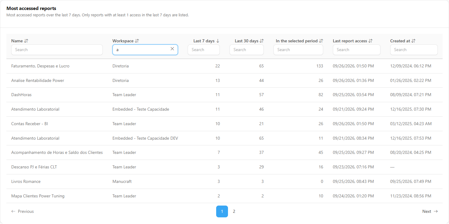
**What it is:** features common to the five table tabs: a **Search** field under each column header, sorting by clicking the header and pagination of 10 rows.

**What it is for:** quickly finding a person, a report or a workspace and reorganizing the list by the criterion that matters.

<figure><picture><source srcset="/files/9tbRJUt9i6uQZWAYJUCU" media="(prefers-color-scheme: dark)"><img src="https://3938213054-files.gitbook.io/~/files/v0/b/gitbook-x-prod.appspot.com/o/spaces%2FH2bFRBmIfyK3kwVKbldl%2Fuploads%2Fgit-blob-ebe48ce3e4fdb87bfa0591b44775b409c0252a06%2Fpm-dashboards-visualizacoes-pesquisa-coluna-en.png?alt=media" alt="Table with the Search field filled in on one column"></picture><figcaption><p>Search by column</p></figcaption></figure>

**How to use:**

1. Type in the **Search** field of the desired column; the list is filtered as you type. Searches in different columns are combined.
2. Click a column header to sort; click again to reverse the order (the arrow indicates the direction).
3. Use the pagination in the table footer to move between pages.

**How it works:** search and sorting also apply to the export: the file contains exactly the filtered rows of the tab.

### Hide data

**What it is:** the **Hide data** / **Show data** button in the header, which masks user emails on the screen and in the exported file.

**What it is for:** sharing the screen in meetings, recording demos or taking screenshots without exposing colleagues' names.

<figure><picture><source srcset="/files/uUkebfzzA7tFXpDlyYEH" media="(prefers-color-scheme: dark)"><img src="https://3938213054-files.gitbook.io/~/files/v0/b/gitbook-x-prod.appspot.com/o/spaces%2FH2bFRBmIfyK3kwVKbldl%2Fuploads%2Fgit-blob-21c9114696e553ded46a93e7cc4a82beb714732c%2Fpm-dashboards-visualizacoes-ocultar-dados-en.png?alt=media" alt="Show data button active and masked emails in the user list"></picture><figcaption><p>Hide data turned on: masked emails</p></figcaption></figure>

**How to use:**

1. Click **Hide data**. The button is highlighted and changes to **Show data**.
2. To see the emails again, click **Show data**.

{% hint style="warning" %}
**Hide data** is a presentation convenience, **not an access control**: what controls who sees the data is the page access in the user's profile. The choice is saved in the browser and also applies to the other screens that have the button (for example, the [Permissions Dashboard](/en/power-monitor/dashboards/dashboard-de-permissoes.md) and the [Permissions Audit](/en/power-monitor/auditoria/auditoria-de-permissoes.md)). Be careful when sharing screenshots and files with personal data, even when masked.
{% endhint %}

### Export

**What it is:** the **Export** menu, with the **CSV** and **JSON** options.

**What it is for:** taking the tab's data to Excel, to an adoption report or to another tool.

<figure><picture><source srcset="/files/Rz07JRNT6MkkVR1QuPug" media="(prefers-color-scheme: dark)"><img src="https://3938213054-files.gitbook.io/~/files/v0/b/gitbook-x-prod.appspot.com/o/spaces%2FH2bFRBmIfyK3kwVKbldl%2Fuploads%2Fgit-blob-0c3e80643fea9bd811a223ee2ec68fe15c2b933d%2Fpm-dashboards-visualizacoes-exportar-en.png?alt=media" alt="Export menu open with the CSV and JSON options"></picture><figcaption><p>Export menu</p></figcaption></figure>

**How to use:**

{% stepper %}
{% step %}

### Choose the tab and filters

Open the desired tab and apply search and sorting.
{% endstep %}

{% step %}

### Hide the emails, if you are going to share

Click **Hide data** to mask the emails in the file as well.
{% endstep %}

{% step %}

### Export

Click **Export** and choose **CSV** or **JSON**. The file is downloaded by the browser.
{% endstep %}
{% endstepper %}

**How it works:** the content depends on the tab: on the **Dashboard** tab, the monthly access series; on the others, the already filtered table rows, with the same columns as on the screen. The button is disabled while no data is loaded.

### Access alerts

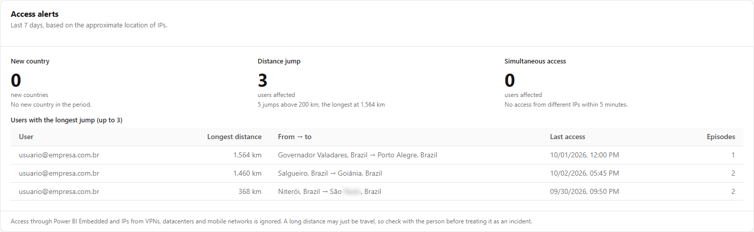
**What it is:** the **Access alerts** block on the **Dashboard** tab, which looks at the **last 7 days** and shows three types of unusual access behavior, based on the approximate location of IPs.

**What it is for:** pointing out access that deserves confirmation, such as credentials used in different places at the same time.

<figure><picture><source srcset="/files/CvA93nCZyG4vau0Hfa4J" media="(prefers-color-scheme: dark)"><img src="https://3938213054-files.gitbook.io/~/files/v0/b/gitbook-x-prod.appspot.com/o/spaces%2FH2bFRBmIfyK3kwVKbldl%2Fuploads%2Fgit-blob-ca56e0e6dec199d10593a7bf54118b663f7b62d4%2Fpm-dashboards-visualizacoes-alertas-acesso-en.png?alt=media" alt="Access alerts block with New country, Distance jump and Simultaneous access"></picture><figcaption><p>Access alerts</p></figcaption></figure>

| Alert                   | What it shows                                                                                                                                                                          |
| ----------------------- | -------------------------------------------------------------------------------------------------------------------------------------------------------------------------------------- |
| **New country**         | Countries with views in the last 7 days and no access in the previous 30 days (minimum of 3 views)                                                                                     |
| **Distance jump**       | Users who accessed from more than 200 km away from the previous access; the table has **User**, **Longest distance**, **From → to**, **Last access** and **Episodes** (up to 20 users) |
| **Simultaneous access** | Users with access from different IPs within a 5-minute window, on more than one occasion; the table has **Max. simultaneous IPs** (up to 20 users)                                     |

**How it works:**

* Access through **Power BI Embedded** and IPs from **VPNs, datacenters and mobile networks** is ignored. The screen never shows the IP, only city and country.
* A long distance may simply be travel: **check with the person** before treating it as an incident.
* Without enough data the screen shows *Unavailable*, which does **not** mean everything is fine; if the read reaches the row limit, distance jumps and simultaneous access appear as not assessed.
* The window is always 7 days and does **not** follow the period filter; only the **Refresh** button reloads it.
* The block loads on its own: if it fails, the rest of the dashboard stays available. The same signals feed findings of the [Environment X-Ray](/en/power-monitor/qualidade-de-dados/raio-x-do-ambiente.md).

### Adoption and usage tab

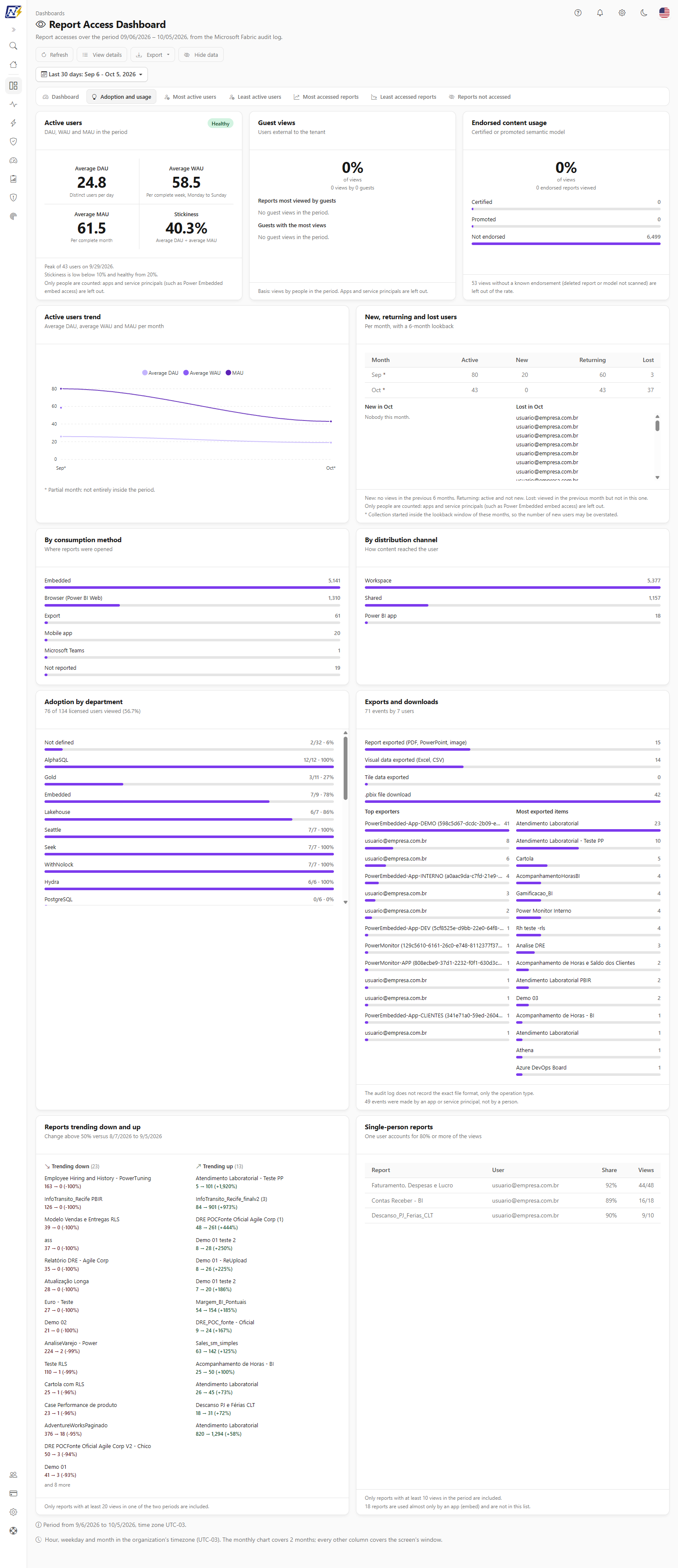
**What it is:** the **Adoption and usage** tab, with adoption indicators for the chosen period, in cards.

**What it is for:** measuring whether reports are being adopted, by whom and through which channel, and pointing out exports and declining reports.

<figure><picture><source srcset="/files/V7dmIHWEUDffnPQKNLWv" media="(prefers-color-scheme: dark)"><img src="https://3938213054-files.gitbook.io/~/files/v0/b/gitbook-x-prod.appspot.com/o/spaces%2FH2bFRBmIfyK3kwVKbldl%2Fuploads%2Fgit-blob-03df270170a20d4b7e38af8e23c610d0c2223352%2Fpm-dashboards-visualizacoes-adocao-uso-en.png?alt=media" alt="Adoption and usage tab with active users, new, returning and lost users and adoption by department"></picture><figcaption><p>Adoption and usage tab</p></figcaption></figure>

| Card                                                      | What it shows                                                                                                                                                                                                                                                                                                                                                                        |
| --------------------------------------------------------- | ------------------------------------------------------------------------------------------------------------------------------------------------------------------------------------------------------------------------------------------------------------------------------------------------------------------------------------------------------------------------------------ |
| **Active users**                                          | **Average DAU**, **Average WAU**, **Average MAU** and the **Stickiness** (average DAU ÷ average MAU) with a **Low** (below 10%), **Moderate** or **Healthy** (20% or more) level, plus the period peak; the **Active users trend** month by month (average DAU, average WAU and MAU). DAU counts distinct users per day, WAU per full week (Monday to Sunday) and MAU per full month |
| **New, returning and lost users**                         | By month: **Active**, **New** (no views at all in the previous 6 months), **Returning** (active and not new) and **Lost** (viewed in the previous month but not in this one), with the list of new and lost people of the month (up to 50 per list)                                                                                                                                  |
| **Adoption by department**                                | Licensed users who viewed any report, by department (**Not defined** for those with no registration; the smallest departments, from the 25th on, are added up in **Other departments**); requires the Power BI license collection                                                                                                                                                    |
| **By consumption method** and **By distribution channel** | Where reports were opened (browser, mobile app, Teams, SharePoint, embed and so on) and how the content reached the user                                                                                                                                                                                                                                                             |
| **Guest views**                                           | Share of views made by users external to the tenant, **Reports most viewed by guests** and **Guests with the most views** (up to 15 of each)                                                                                                                                                                                                                                         |
| **Exports and downloads**                                 | Export events (report, visual data, tile data, .pbix download), **Top exporters** and **Most exported items**                                                                                                                                                                                                                                                                        |
| **Reports trending down and up**                          | Reports whose views changed by more than 50% against the previous period of the same length, only those with at least 20 views in one of the two periods (up to 15 per column)                                                                                                                                                                                                       |
| **Single-person reports**                                 | Reports where a single user accounts for 80% or more of the views, with at least 10 views in the period; the table has **Report**, **User**, **Share** and **Views** (up to 25)                                                                                                                                                                                                      |
| **Endorsed content usage**                                | Share of views on reports whose semantic model is **Certified**, **Promoted**, has **Other endorsement** or is **Not endorsed**; views with no known endorsement (deleted report or model not yet scanned) are left out of the rate and counted in a note                                                                                                                            |

<figure><picture><source srcset="/files/Oe78ez14QbTLMC5Krnl2" media="(prefers-color-scheme: dark)"><img src="https://3938213054-files.gitbook.io/~/files/v0/b/gitbook-x-prod.appspot.com/o/spaces%2FH2bFRBmIfyK3kwVKbldl%2Fuploads%2Fgit-blob-4dc94688376f72f0875ecf8d3fe5304af81efce9%2Fpm-dashboards-visualizacoes-adocao-uso-engajamento-en.png?alt=media" alt="Adoption and usage tab with the Guest views, Exports and downloads, Reports trending down and up, Single-person reports and Endorsed content usage cards"></picture><figcaption><p>Adoption and usage tab: guests, exports, trends and endorsed content</p></figcaption></figure>

**How it works:** the cards count **people only** (applications and service principals are left out). Cards with people respect the **Hide data** button and the tab export carries all tables in one file. When the audit collection started inside the look-back, the screen warns that the number of new users may be overestimated. Without the license collection, the guest is identified by the #EXT# mark and the e-mail domain.

## Rules and behavior

* **What an access is:** each **report view** or **report export** event recorded in the Power BI/Fabric activity log. The block by item type also includes dashboard views.
* **Source and refresh:** events are collected from the tenant's activity log **three times a day** (approx. 01:23, 08:23 and 18:23 Brasília time, UTC-3), for organizations with audit collection enabled. Recent accesses may take a few hours to appear.
* **Time zone:** hour, day of week and month are in the organization's time zone, as the screen footer reminds you.
* **Inventory:** the report tabs list only reports that exist in the organization's inventory.
* **Permission:** it is no longer exclusive to administrators. Who has access is defined by the user's page access profile and the check also applies on the server.
* **Load failure:** if the data cannot be loaded, the screen shows "Could not load report accesses." instead of zeroed numbers.

## Frequently asked questions

<details>

<summary>Why don't I see the Report Access Dashboard in the menu?</summary>

Visibility follows the page access of your profile. Ask an administrator to enable the page in [Users](/en/power-monitor/usuarios.md).

</details>

<details>

<summary>Many accesses appear with the location "Unknown".</summary>

The location is inferred from the source IP. Private IPs, VPNs or IPs not yet resolved remain as Unknown.

</details>

<details>

<summary>What does "Application" mean in the email column?</summary>

It is an access made by a Service Principal (for example, in Power BI Embedded scenarios) that has not yet been mapped to a user. Configure the integration in *Settings › Audit*.

</details>

<details>

<summary>Total accesses is greater than the sum of the listed reports.</summary>

Accesses to reports that have already been deleted from the tenant count toward the total, but do not appear in the report tabs. The screen shows a notice with that number.

</details>

<details>

<summary>I changed the period, but the "Last 7 days" and "Last 30 days" columns did not change.</summary>

This is expected: those columns are always counted from today. Only the **In the selected period** column, the KPIs and the charts follow the filter.

</details>

## Related pages

* [Dashboards](/en/power-monitor/dashboards.md)
* [Efficiency Dashboard](/en/power-monitor/dashboards/dashboard-de-eficiencia.md)
* [Report Views](/en/power-monitor/auditoria/visualizacoes-de-relatorios.md)
* [Events Overview](/en/power-monitor/auditoria/geral-de-eventos.md)
* [Audit](/en/power-monitor/auditoria.md)
* [Reports (Governance)](/en/power-monitor/governanca/relatorios.md)


---

# Agent Instructions
This documentation is published with GitBook. GitBook is the documentation platform designed so that both humans and AI agents can read, navigate, and reason over technical content effectively. Learn more at gitbook.com.

## Querying This Documentation
If you need additional information that is not directly available in this page, you can query the documentation by asking a question.

Perform an HTTP GET request on the following URL with the `ask` and `goal` query parameters:

```
GET https://docs.powermonitor.com.br/en/power-monitor/dashboards/dashboard-de-visualizacoes.md?ask=<question>&goal=<user_goal>
```

`ask` is the immediate question: it should be specific, self-contained, and written in natural language.
`goal` is what the user is ultimately trying to achieve, the reason they need the answer. Sharing it helps GitBook give you a better, more relevant answer. A goal is most helpful when it describes the outcome the user wants rather than restating the question. For example, with `ask=how do I create an API token`, a goal like `automate deployments from our CI pipeline` lets GitBook tailor the answer to that use case.

The response will contain a direct answer to the question and relevant excerpts and sources from the documentation.

Use this mechanism when the answer is not explicitly present in the current page, you need clarification or additional context, or you want to retrieve related documentation sections.