
> For the complete documentation index, see [llms.txt](https://docs.powermonitor.com.br/llms.txt). Markdown versions of documentation pages are available by appending `.md` to page URLs; this page is available as [Markdown](https://docs.powermonitor.com.br/en/power-monitor/dashboards/dashboard-principal.md).

# Dashboard

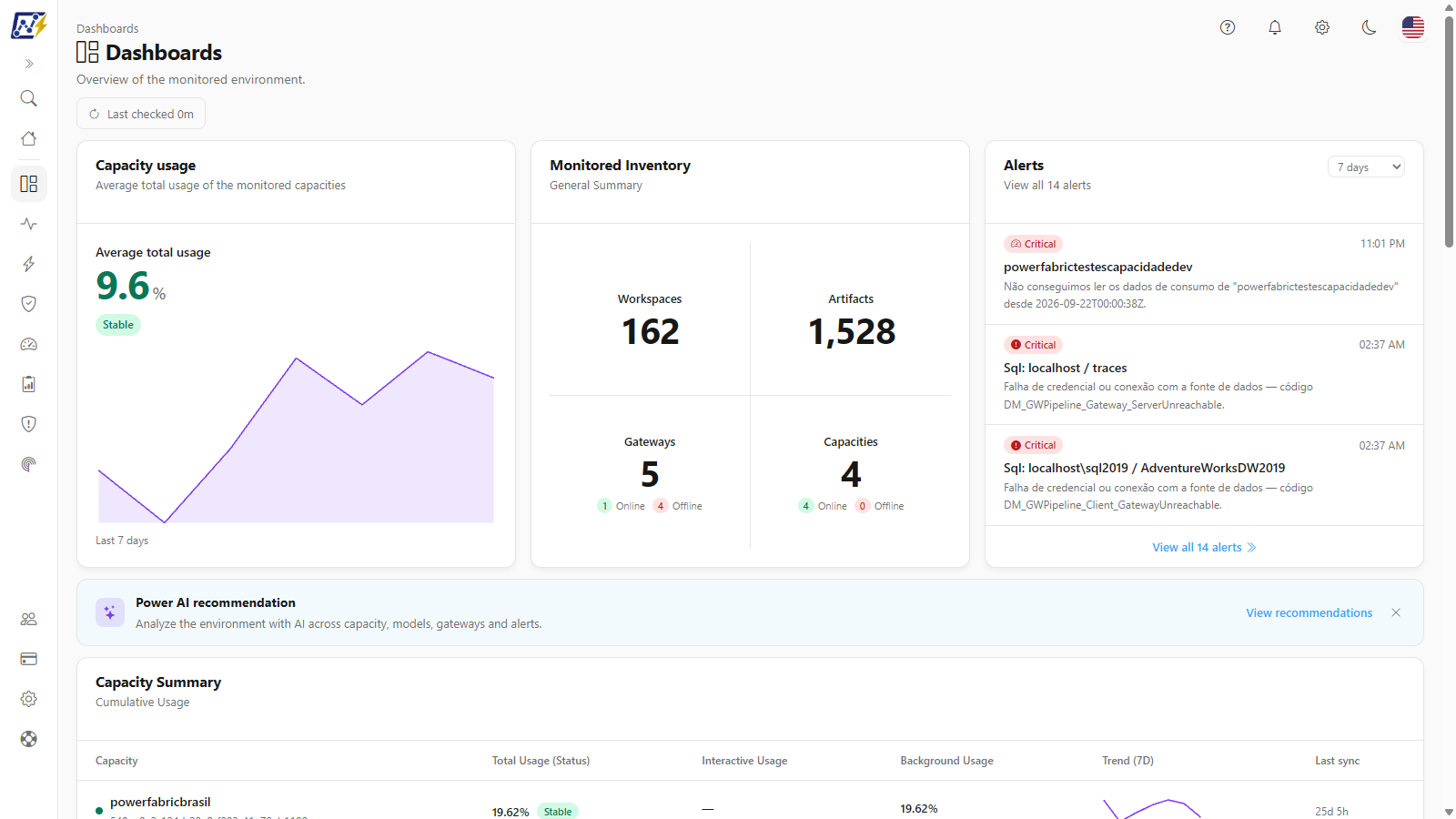
Entry panel of the dashboards, with the overall state of the capacities, the monitored inventory, the alerts for the period, the capacity summary and the latest scans.

The **Dashboard** (also called the Main Dashboard) brings together on a single screen an overview of the monitored environment: the average usage level of the capacities, the inventory totals, the most recent alerts, the situation of each capacity, the date of the latest scans and the distribution of artifacts by type.

**How to access:** menu **Dashboards › Dashboard**. At the top of the screen, the displayed title is **"Dashboards"**, with the subtitle *"Overview of the monitored environment."*. The screen is also available in the **Quick access** panel on the [Home](/en/power-monitor/pagina-inicial.md) page.

**Who can access:** all profiles. The page can be blocked for specific users through per-page access control, in [Users](/en/power-monitor/usuarios.md).

<figure><picture><source srcset="/files/ALFurN3ExrUYzFB3svvr" media="(prefers-color-scheme: dark)"><img src="https://3938213054-files.gitbook.io/~/files/v0/b/gitbook-x-prod.appspot.com/o/spaces%2FH2bFRBmIfyK3kwVKbldl%2Fuploads%2Fgit-blob-f62c2b2a11ebc8f98a3514366759b11b1dc5376c%2Fpm-dashboards-dashboard-en.png?alt=media" alt="Dashboard screen with the Capacity usage, Monitored Inventory and Alerts cards, the Power AI banner and the Capacity Summary"></picture><figcaption><p>Dashboard</p></figcaption></figure>

## What it is for

* **Daily environment check:** in a few seconds, see whether the average capacity usage is in a safe range, whether any gateways or capacities are offline and which alerts were opened recently.
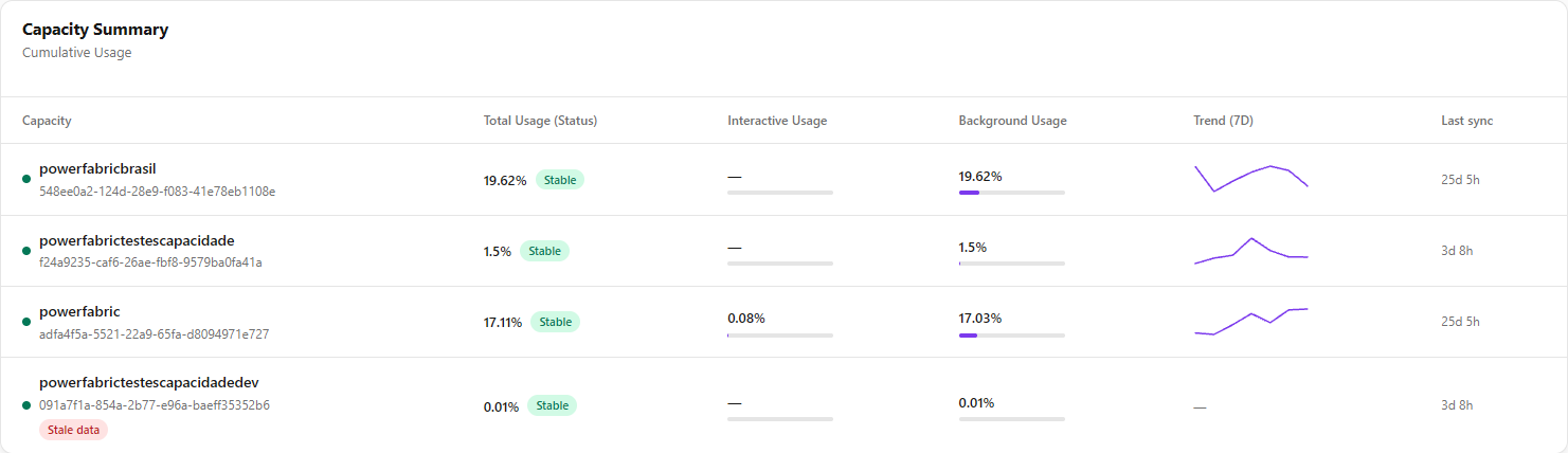
* **Identifying the capacity that needs attention:** the **Capacity Summary** shows, per capacity, the current usage, the split between interactive and background consumption and the trend for the last 7 days.
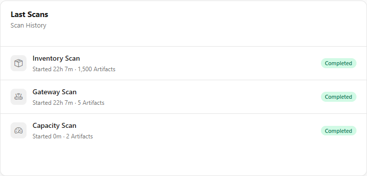
* **Confirming that collection is up to date:** the **Last Scans** card shows when the latest inventory, gateway and capacity scans ran and what the result of each one was.
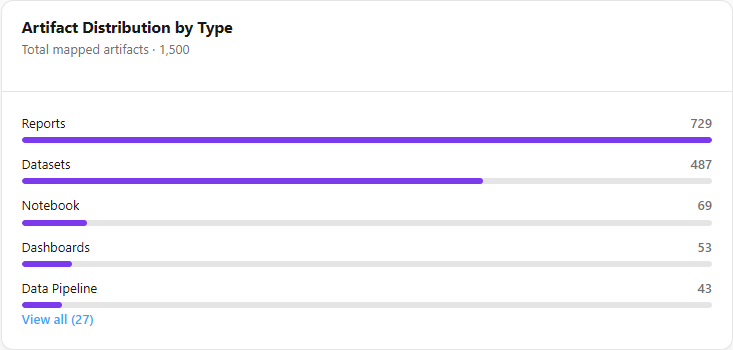
* **Understanding the inventory composition:** the **Artifact Distribution by Type** card shows which item types (reports, semantic models, notebooks etc.) predominate in the environment.
* **Requesting an AI reading:** the **Power AI recommendation** banner generates an analysis of the environment that cross-references capacity, semantic model, gateway and alert data.

The screen is organized into bands: indicators (three cards), the Power AI banner, the Capacity Summary, the [Operational indicators](#operational-indicators) (two rows of three cards and the Collection freshness card) and a final band with Last Scans and Artifact Distribution by Type.

## Features

### Last checked (data refresh)

**What it is:** a button in the header that shows how long ago the data was queried (for example, *"Last checked 3m"*) and reloads all cards when clicked.

**What it is for:** checking whether the numbers are recent and forcing a new reading right after an event (for example, after an administrator triggered a scan or enabled monitoring for a capacity).

<figure><picture><source srcset="/files/FTWdhDyJpF8rHXen5ApY" media="(prefers-color-scheme: dark)"><img src="https://3938213054-files.gitbook.io/~/files/v0/b/gitbook-x-prod.appspot.com/o/spaces%2FH2bFRBmIfyK3kwVKbldl%2Fuploads%2Fgit-blob-46c84b291f348e83606fbdd7b3683f9c994a78c0%2Fpm-dashboards-dashboard-ultima-consulta-en.png?alt=media" alt="Dashboard header with the Dashboards title, the subtitle and the Last checked button"></picture><figcaption><p>Header with the Last checked button</p></figcaption></figure>

**How to use:**

1. In the header, hover over the **Last checked** button to see the tooltip *"This page's data will be automatically updated every 5 minutes."*.
2. Click the button. The icon spins while the cards reload, and the button is disabled until the refresh finishes.

**How it works:**

* **Automatic refresh every 5 minutes**, synchronized with the clock (for example, at 10:00, 10:05, 10:10). If you leave the tab in the background and come back after 5 minutes or more, the screen reloads as soon as it becomes visible again.
* The cards load independently: each one shows its own loading indicator, and a slow card does not prevent the others from appearing. If loading fails, the message *"Failed to load data."* is displayed.
* To reduce the load on the database, the server keeps capacity, gateway and inventory count results for up to **1 minute**. A refresh made right after the previous one may therefore return the same numbers. For users with a restricted workspace scope, workspace and artifact counts are always calculated on the fly.

### Capacity usage (Average total usage)

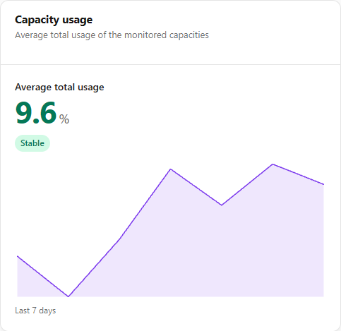
**What it is:** the **Capacity usage** card (subtitle *Average total usage of the monitored capacities*) that shows the **Average total usage**, that is, the **average usage of the monitored capacities**, displayed in **%**, with a status badge and the trend for the last 7 days.

**What it is for:** knowing, with a single number, whether the environment's capacities have headroom, are close to the limit or are overloaded.

<figure><picture><source srcset="/files/dRnHXzruhpnfqOO4C2CG" media="(prefers-color-scheme: dark)"><img src="https://3938213054-files.gitbook.io/~/files/v0/b/gitbook-x-prod.appspot.com/o/spaces%2FH2bFRBmIfyK3kwVKbldl%2Fuploads%2Fgit-blob-1ac68e36a01e66aaa591a18d01f8afd954616701%2Fpm-dashboards-dashboard-saude-inventarios-en.png?alt=media" alt="Capacity usage card with the Average total usage, the status badge and the trend for the last 7 days"></picture><figcaption><p>Capacity usage card</p></figcaption></figure>

{% hint style="warning" %}
**The higher the number, the worse.** The Average total usage is not a quality score. It measures how much of the purchased capacity is being used, with 100% as the reference. A value such as *12.1%* means that, on average, the capacities are using about 12% of their limit. The value can exceed 100% when there is overload (throttling). Until October 9, 2026, the value was shown as *value/100*, which made it look like a score.
{% endhint %}

**How to use:**

1. Read the **Average total usage** and the badge next to it: **Stable**, **Attention** or **Critical**.
2. If the note *"X of Y capacities with samples"* appears, some monitored capacity does not have consumption data yet and was left out of the average.
3. Look at the **Last 7 days** chart to know whether usage is rising, stable or falling.
4. To find out which capacity is driving the average, scroll down to the [Capacity Summary](#capacity-summary).

**How the Average total usage is calculated:**

1. For each monitored capacity, Power Monitor uses the **cumulative Capacity Units (CU) usage** from the last collected point, which is the same value as the *Total Usage (Status)* column in the Capacity Summary.
2. The Average total usage is the **simple average** of these values across the capacities that have samples, displayed with up to one decimal place.
3. Capacities **without samples** are left out of the average: they are included in neither the numerator nor the denominator. This prevents a capacity with no data from pulling the average down and making the environment look like it has more headroom than it does.
4. If no capacity has samples, or if there are no monitored capacities, the value appears as **"—"**.

**Status badge** (applied to the average, with the same ranges used per capacity). The color of the number follows that of the badge.

| Average usage              | Badge                      | Color  |
| -------------------------- | -------------------------- | ------ |
| Less than 85%              | **Stable**                 | Green  |
| From 85% to less than 100% | **Attention**              | Yellow |
| 100% or more               | **Critical**               | Red    |
| No samples                 | *No monitored capacities.* | Gray   |

**Trend (Last 7 days):** the area chart below the value shows the evolution of the Average total usage over the last 7 days, from the oldest (on the left) to the current day (on the right). Each point is calculated in two steps:

1. For each capacity, the daily average of cumulative Capacity Units usage is calculated, with days counted in the time zone configured for the organization's metrics.
2. The point for the day is the average of these daily averages across the capacities that have data on that day.

A day with no samples appears as a **break in the line**, not as zero. With no data on any of the 7 days, the card displays *"Not enough data"*.

### Monitored Inventory

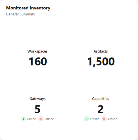
**What it is:** the **Monitored Inventory** card (subtitle *General Summary*) with four quadrants of totals: Workspaces, Artifacts, Gateways and Capacities.

**What it is for:** keeping the size of the environment in view and noticing right away if any gateways or capacities are down.

<figure><picture><source srcset="/files/DquH7yKaOWGrW4732hdw" media="(prefers-color-scheme: dark)"><img src="https://3938213054-files.gitbook.io/~/files/v0/b/gitbook-x-prod.appspot.com/o/spaces%2FH2bFRBmIfyK3kwVKbldl%2Fuploads%2Fgit-blob-bf5c8a3f6f2d08aa6f45bc16940431b80e369a60%2Fpm-dashboards-dashboard-inventario-monitorado-en.png?alt=media" alt="Monitored Inventory card with the Workspaces, Artifacts, Gateways and Capacities totals"></picture><figcaption><p>Monitored Inventory card</p></figcaption></figure>

**How to use:**

1. Read the total in each quadrant.
2. In the **Gateways** and **Capacities** quadrants, check the **Online** (green) and **Offline** (red) counters. An Offline value greater than zero deserves investigation in [Gateways](/en/power-monitor/monitoramento/gateways.md) or in [Capacities (Monitoring)](/en/power-monitor/monitoramento/capacidades.md).

| Quadrant       | What it shows                                        | Detail                                                                                          |
| -------------- | ---------------------------------------------------- | ----------------------------------------------------------------------------------------------- |
| **Workspaces** | Number of inventoried workspaces you can view        | Respects your workspace scope                                                                   |
| **Artifacts**  | Sum of all inventoried artifacts, of all types       | Respects your workspace scope. It is the same total as the *Artifact Distribution by Type* card |
| **Gateways**   | Total monitored gateways                             | **Online:** gateways with online status in the last test. **Offline:** all others               |
| **Capacities** | Total capacities with consumption monitoring enabled | **Online:** active capacities. **Offline:** inactive (paused) capacities or with unknown state  |

### Alerts

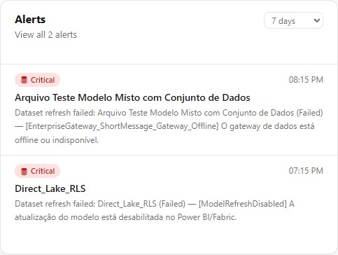
**What it is:** a card that lists the **3 most recent alerts not yet resolved** for the selected period, with the total alerts for the period in the subtitle.

**What it is for:** seeing open incidents at a glance without leaving the Dashboard and deciding whether you need to open the full Alerts screen.

<figure><picture><source srcset="/files/5aUxR6xTqDFnPUfUyVV2" media="(prefers-color-scheme: dark)"><img src="https://3938213054-files.gitbook.io/~/files/v0/b/gitbook-x-prod.appspot.com/o/spaces%2FH2bFRBmIfyK3kwVKbldl%2Fuploads%2Fgit-blob-938d356b76ac55a19dc61b682a063970ef0a9db7%2Fpm-dashboards-dashboard-alertas-en.png?alt=media" alt="Alerts card with the period selector and the three most recent alerts"></picture><figcaption><p>Alerts card</p></figcaption></figure>

**How to use:**

1. Read the listed alerts: each one shows the severity badge, the time, the affected resource and the message.
2. To see all alerts for the period, with filters and details, click **View all N alerts** in the card footer. The [Alerts](/en/power-monitor/monitoramento/alertas.md) screen opens.

| Element                             | Description                                                                                                                                                                                            |
| ----------------------------------- | ------------------------------------------------------------------------------------------------------------------------------------------------------------------------------------------------------ |
| Subtitle                            | *"View all N alerts"*, where N is the total unresolved alerts in the period                                                                                                                            |
| Severity badge                      | **Critical** (red) for error alerts and **Attention** (yellow) for informational alerts. The badge icon indicates the alert source (gateway, capacity, connection, semantic model etc.)                |
| Time                                | Time at which the alert was recorded                                                                                                                                                                   |
| Title and message                   | Name of the affected resource and the alert message                                                                                                                                                    |
| **View all N alerts** (footer link) | Appears when there are more than 3 alerts in the period. Opens the [Alerts](/en/power-monitor/monitoramento/alertas.md) screen. The period chosen in the card is not carried over to the Alerts screen |

**Rules:**

* Alerts for incidents that have already been resolved (for example, a gateway that came back online) do not appear in the card.
* With no alerts in the period, the card displays *"No alerts at the moment."*.
* The card respects your workspace scope: it shows only alerts from the visible workspaces, plus alerts with no workspace (such as gateway and capacity alerts), which are visible to everyone.

### Alerts period

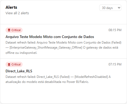
**What it is:** a selector in the upper right corner of the **Alerts** card that defines the date range considered: **Today**, **Yesterday**, **7 days** (default) or **30 days**.

**What it is for:** focusing on what happened today (morning check), reviewing the previous day or looking at a whole month of incidents.

<figure><picture><source srcset="/files/vQ7AQJOeqMr9Slc9oumD" media="(prefers-color-scheme: dark)"><img src="https://3938213054-files.gitbook.io/~/files/v0/b/gitbook-x-prod.appspot.com/o/spaces%2FH2bFRBmIfyK3kwVKbldl%2Fuploads%2Fgit-blob-08ce5d91e2ed9d198e2797c15857cb28ce28e925%2Fpm-dashboards-dashboard-alertas-periodo-en.png?alt=media" alt="Alerts card with the 30-day period selected"></picture><figcaption><p>Alerts card with another period selected</p></figcaption></figure>

**How to use:**

1. In the **Alerts** card, click the **Alerts period** selector.
2. Choose **Today**, **Yesterday**, **7 days** or **30 days**. The card reloads with the 3 most recent unresolved alerts for the new period, and the total in the subtitle is updated.

**Rules:** days are counted in your browser's time zone. *7 days* and *30 days* include today. The choice applies only to the card and is not carried over to the Alerts screen.

### Power AI recommendation

**What it is:** the **Power AI recommendation** banner (*"Analyze the environment with AI across capacity, models, gateways and alerts."*), with the **View recommendations** button and an **X** to hide it.

**What it is for:** asking Power AI for a consolidated reading of the environment, with recommendations, without having to manually cross-reference numbers from several screens.

<figure><picture><source srcset="/files/l5XNu1O0EBSqFdOYoRtd" media="(prefers-color-scheme: dark)"><img src="https://3938213054-files.gitbook.io/~/files/v0/b/gitbook-x-prod.appspot.com/o/spaces%2FH2bFRBmIfyK3kwVKbldl%2Fuploads%2Fgit-blob-65706f60466c07758a1dad0773e32bbde1e9acc5%2Fpm-dashboards-dashboard-banner-power-ai-en.png?alt=media" alt="Power AI recommendation banner with the View recommendations button"></picture><figcaption><p>Power AI recommendation banner</p></figcaption></figure>

**How to use:**

1. Make sure the **View recommendations** button is enabled. If it is disabled, hover over it to see the reason.
2. Click **View recommendations**. The [Environment insights](#environment-insights) modal opens.
3. To hide the banner, click the **X**. It stays hidden only until you leave the screen and appears again on your next visit.

**Rules:**

* **Available to all profiles.** Each call consumes the organization's and the user's AI budget.
* The button is **disabled** when AI cannot be used, for example: no AI provider configured, the organization's or user's monthly limit set to zero or reached. The provider and limits are defined by an administrator in [Settings](/en/power-monitor/configuracoes.md) › AI, and the per-user limit in [Users](/en/power-monitor/usuarios.md).
* While the analysis is in progress, the button shows *"Analyzing…"* and does not accept another click.
* There is a limit of **20 analyses per minute per user**.

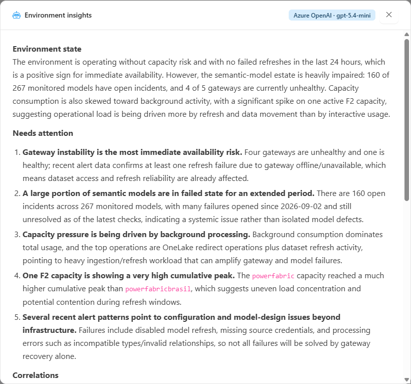
### Environment insights

**What it is:** a modal opened by the **View recommendations** button, with the text generated by Power AI from data on **capacity usage and health**, **semantic model health**, **gateway health** and **recent alerts**.

**What it is for:** getting a natural-language diagnosis and a list of recommendations to prioritize the day's work.

<figure><picture><source srcset="/files/T90DO4PZlyLeqRpjgvai" media="(prefers-color-scheme: dark)"><img src="https://3938213054-files.gitbook.io/~/files/v0/b/gitbook-x-prod.appspot.com/o/spaces%2FH2bFRBmIfyK3kwVKbldl%2Fuploads%2Fgit-blob-92cbd058f09f03f06a216571f24f5569380fec13%2Fpm-dashboards-dashboard-modal-insights-ia-en.png?alt=media" alt="Environment insights modal with the AI-generated analysis"></picture><figcaption><p>Environment insights modal</p></figcaption></figure>

**How to use:**

{% stepper %}
{% step %}

### Wait for the analysis

The **Environment insights** modal opens immediately, with the indication *"Analyzing…"*. The analysis can take from a few seconds to tens of seconds.
{% endstep %}

{% step %}

### Read and verify

Read the analysis and the recommendations. The modal shows the AI provider and model that responded, the generation time (**Generated at**) and the notice *"Generated by AI from the collected telemetry. Review before acting."*. Check the numbers on the source screens before acting.
{% endstep %}

{% step %}

### Close the modal

Close the modal to return to the Dashboard. For a new reading, click **View recommendations** again: each click generates a new analysis.
{% endstep %}
{% endstepper %}

**Rules:**

* If there is not enough collected data yet, the analysis returns a message saying that there is not yet enough collected data to analyze the environment and asking you to run a scan and try again.
* If generation fails, the modal itself shows the error (for example, *"Could not generate the insights. Please try again."*).

### Capacity Summary

**What it is:** the **Capacity Summary** table (subtitle *Cumulative Usage*) with one row per capacity with consumption monitoring enabled. The percentages refer to the **last collected point**.

**What it is for:** identifying which capacity is most loaded and whether consumption comes from users querying reports (interactive) or from scheduled processes (background).

<figure><picture><source srcset="/files/nbt8jCizMGUjUMajzUIh" media="(prefers-color-scheme: dark)"><img src="https://3938213054-files.gitbook.io/~/files/v0/b/gitbook-x-prod.appspot.com/o/spaces%2FH2bFRBmIfyK3kwVKbldl%2Fuploads%2Fgit-blob-6e077d5ac371d16f5839e6157614950c8f340611%2Fpm-dashboards-dashboard-resumo-capacidade-en.png?alt=media" alt="Capacity Summary table with state, interactive usage, background usage, trend and last sync"></picture><figcaption><p>Capacity Summary table</p></figcaption></figure>

**How to use:**

1. Locate the capacity with the highest **Total Usage (Status)** and look at the badge (**Stable**, **Attention** or **Critical**).
2. Compare **Interactive Usage** and **Background Usage** to know the source of the usage.
3. Check the **Trend (7D)** to see whether the usage is a one-off or has been growing.
4. Check the **Last sync**: a very long time indicates that collection for that capacity is behind.
5. To see what consumed it, open the [Capacity Dashboard](/en/power-monitor/dashboards/dashboard-de-capacidade.md) for the identified capacity.

| Column                   | Description                                                                                                                                                                                                    |
| ------------------------ | -------------------------------------------------------------------------------------------------------------------------------------------------------------------------------------------------------------- |
| **Capacity**             | Name and identifier of the capacity. The dot on the left is **green** when the capacity is active and **red** when it is inactive (paused) or its state is unknown                                             |
| **Total Usage (Status)** | Cumulative Capacity Units usage relative to the capacity limit, with up to two decimal places, and the badge **Stable** (below 85%), **Attention** (from 85% to less than 100%) or **Critical** (100% or more) |
| **Interactive Usage**    | Percentage of billable Capacity Units consumed by interactive operations (for example, report queries), with a proportional bar                                                                                |
| **Background Usage**     | Percentage of billable Capacity Units consumed by background operations (for example, semantic model refreshes, pipelines and notebooks), with a proportional bar                                              |
| **Trend (7D)**           | Mini chart with the daily average of cumulative usage over the last 7 days. Days with no data appear as a break in the line                                                                                    |
| **Last sync**            | Time elapsed since the last update of the capacity's consumption record (for example, *"12m"*, *"19h 18m"*)                                                                                                    |

**Rules:**

* Values without samples appear as **"—"**, not as 0%.
* The consumption bars stop at 100% even when the actual value is higher (overload). The displayed number is still the actual one.
* On narrow screens, the table scrolls horizontally within the card itself.
* With no monitored capacities, the table displays *"No monitored capacities."*.

### Last Scans

**What it is:** the **Last Scans** card (subtitle *Scan History*) with the most recent run of three scan types, with no date limit (even if the scan did not run this week).

**What it is for:** confirming that data collection is up to date. If a scan failed or has been stalled for a long time, the numbers on the other screens may be outdated.

<figure><picture><source srcset="/files/zsH6uLLO24v7YLMjoFmU" media="(prefers-color-scheme: dark)"><img src="https://3938213054-files.gitbook.io/~/files/v0/b/gitbook-x-prod.appspot.com/o/spaces%2FH2bFRBmIfyK3kwVKbldl%2Fuploads%2Fgit-blob-5d5ca41995932a5bbdbc5d9f94ff252952592c13%2Fpm-dashboards-dashboard-ultimos-mapeamentos-en.png?alt=media" alt="Last Scans card with the inventory, gateway and capacity scans and their statuses"></picture><figcaption><p>Last Scans card</p></figcaption></figure>

**How to use:**

1. Check whether **Inventory Scan**, **Gateway Scan** and **Capacity Scan** are **Completed** and with a recent time.
2. If any row shows **Failed**, an **Administrator** clicks the row to open the scan screen in **Mapping** and see the run details. For other profiles, the click leads to the unauthorized access screen; in that case, notify an administrator.

| Row                | Run considered                                                   | Quantity displayed         |
| ------------------ | ---------------------------------------------------------------- | -------------------------- |
| **Inventory Scan** | The most recent inventory scan, full or incremental              | Total artifacts            |
| **Gateway Scan**   | The most recent gateway scan                                     | Total monitored gateways   |
| **Capacity Scan**  | The most recent capacity scan or capacity consumption collection | Total monitored capacities |

Each row shows when the run occurred (for example, *"Started 2h 5m"*). For runs that have already finished, the time is counted from the end. The quantity appears next to the time always with the word *"Artifacts"*, also in the gateway and capacity rows. The row also shows a status badge:

| Status        | Meaning                                  |
| ------------- | ---------------------------------------- |
| **Completed** | The last run finished successfully       |
| **Failed**    | The last run finished with an error      |
| **Running**   | The run has not finished yet             |
| **Pending**   | No run recorded (*"No scans performed"*) |

Clicking a row opens the corresponding scan screen: [Mapping › Inventory › Inventory](/en/power-monitor/mapeamento/inventarios.md), [Gateway Scan](/en/power-monitor/mapeamento/gateways.md) or [Capacity Scan](/en/power-monitor/mapeamento/capacidades.md). These screens are exclusive to **Administrator**.

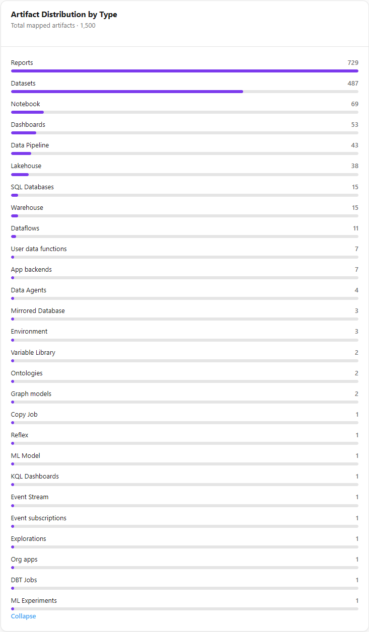
### Artifact Distribution by Type

**What it is:** a card that shows, in the subtitle, the **Total mapped artifacts** and, below it, one bar per artifact type with the respective quantity.

**What it is for:** understanding the composition of the environment (for example, whether there are many more semantic models than reports, or how many Fabric items such as notebooks and lakehouses already exist).

<figure><picture><source srcset="/files/WZIOAueapSjAqZ7rCQgE" media="(prefers-color-scheme: dark)"><img src="https://3938213054-files.gitbook.io/~/files/v0/b/gitbook-x-prod.appspot.com/o/spaces%2FH2bFRBmIfyK3kwVKbldl%2Fuploads%2Fgit-blob-81b890096c602c59a1e532e42cf47e92de1e25a8%2Fpm-dashboards-dashboard-distribuicao-artefatos-en.png?alt=media" alt="Artifact Distribution by Type card with bars per artifact type"></picture><figcaption><p>Artifact Distribution by Type card</p></figcaption></figure>

**How to use:**

1. Read the 5 most numerous types, displayed by default.
2. Click **View all (N)** to list all types with at least one artifact.
3. Click **Collapse** to return to the first 5.

<figure><picture><source srcset="/files/8zJ35dOmlvpuGrVKM0ox" media="(prefers-color-scheme: dark)"><img src="https://3938213054-files.gitbook.io/~/files/v0/b/gitbook-x-prod.appspot.com/o/spaces%2FH2bFRBmIfyK3kwVKbldl%2Fuploads%2Fgit-blob-132fb944d67bc91b052903b2067929796479b948%2Fpm-dashboards-dashboard-distribuicao-artefatos-ver-todos-en.png?alt=media" alt="Artifact Distribution by Type card expanded with all types and the Collapse button"></picture><figcaption><p>Artifact Distribution by Type expanded</p></figcaption></figure>

**Rules:**

* Only types with at least one artifact appear, sorted from most to least numerous.
* The bar length is proportional to the **most numerous type**, not to the total. This way, types with few units remain visible.
* The **View all (N)** button only appears when there are more than 5 types.
* The totals respect your workspace scope.
* With no inventoried artifacts, the card displays *"No scans performed"*.

### Operational indicators

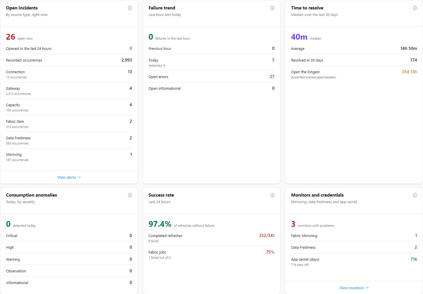
**What it is:** a row of **Dashboard** cards with the operational state of the environment **right now**. Each card loads on its own: if one fails, *This indicator could not be loaded right now* appears and the rest keeps working.

**What it is for:** answering, at a glance, "what is broken and for how long?".

<figure><picture><source srcset="/files/DYHwuvLRPNwO10DtFUoR" media="(prefers-color-scheme: dark)"><img src="https://3938213054-files.gitbook.io/~/files/v0/b/gitbook-x-prod.appspot.com/o/spaces%2FH2bFRBmIfyK3kwVKbldl%2Fuploads%2Fgit-blob-94be17e581120d7db035caa8728ffa50e0da2640%2Fpm-dashboards-principal-indicadores-en.png?alt=media" alt="Open incidents, Failure trend, Time to resolve, Consumption anomalies, Success rate, Monitors and credentials and Collection freshness cards"></picture><figcaption><p>Operational indicators</p></figcaption></figure>

| Card                         | What it shows                                                                                                                                                                                                                                                                                                                                          |
| ---------------------------- | ------------------------------------------------------------------------------------------------------------------------------------------------------------------------------------------------------------------------------------------------------------------------------------------------------------------------------------------------------ |
| **Open incidents**           | How many incidents are open right now (each resource with an unresolved problem counts once), with the **Opened in the last 24 hours** and **Recorded occurrences** rows (how many times those resources failed while the problem was open) and, by source type, the incidents with their occurrences (*N occurrences*), plus the **View alerts** link |
| **Failure trend**            | Failures in the last hour against the **Previous hour**, the total for **Today** and **Yesterday**, and how many are **Open errors** and **Open informational**                                                                                                                                                                                        |
| **Time to resolve**          | **Median** (and **Average**) resolution time over the last days, how many were **Resolved** and the incident **Open the longest**                                                                                                                                                                                                                      |
| **Consumption anomalies**    | Anomalies detected today, by severity (**Critical**, **High**, **Warning**, **Observation**)                                                                                                                                                                                                                                                           |
| **Success rate**             | Share of refreshes without failure in the last hours, with **Completed refreshes** and **Fabric jobs** (and how many failed)                                                                                                                                                                                                                           |
| **Monitors and credentials** | Monitors with problems in **Fabric Mirroring** and **Data Freshness**, and the days left on the **App secret** (*Expired* when it has passed), with the **View monitors** link                                                                                                                                                                         |
| **Collection freshness**     | The **Last run** of each periodic collection, with its **Status** (**Completed**, **Running**, **Failed** or **Never ran**) and whether the consumption data of running capacities is up to date                                                                                                                                                       |

**Details:** the indicators appear below the Capacity Summary. Each card has an information icon that explains what it measures. Incidents only count the workspaces you can see. An **incident** is the resource with an open problem; an **occurrence** is each failure recorded for it while the problem is open. That is why a single gateway that has been down for hours counts as 1 incident with several occurrences. The **Opened in the last 24 hours** row separates what is recent from what has been open for longer. In **Success rate**, the number is green from 95%, yellow from 80% to less than 95% and red below 80%; for Fabric jobs, a cancellation counts as a failure. The **Collection freshness** card is a table (**Collection**, **Last run**, **Status**) with the **Consumption metric (CU)** row (**Up to date** or the number of stale capacities, with their names) and one row for each periodic collection: Semantic Model, Item Operation, Audit, Fabric Job, Hourly Aggregation and Anomaly Detection. Hover over **Failed** to see the run error.

**Capacity badges:** in the capacity list, **Off schedule** indicates a capacity running outside the expected window configured for it, and **Stale data** indicates that no new consumption data has arrived for more than 45 minutes.

## Rules and behavior

### Data source

| Card                                                    | Source                                                                                                                                                                                                                                                                  |
| ------------------------------------------------------- | ----------------------------------------------------------------------------------------------------------------------------------------------------------------------------------------------------------------------------------------------------------------------- |
| Capacity usage, Capacity Summary, Capacities quadrant   | Capacity consumption collection (Capacity Metrics), performed automatically **every 5 minutes** for capacities with consumption monitoring enabled. See [Enable Capacity Monitoring](/en/power-monitor/monitoramento/capacidades/ativar-monitoramento-de-capacidade.md) |
| Gateways quadrant                                       | Gateway status monitoring. See [Gateways](/en/power-monitor/monitoramento/gateways.md)                                                                                                                                                                                  |
| Workspaces, Artifacts and Artifact Distribution by Type | Inventory collected by the inventory scans. See [Mapping › Inventory › Inventory](/en/power-monitor/mapeamento/inventarios.md)                                                                                                                                          |
| Alerts                                                  | Alerts generated by monitoring. See [Alerts](/en/power-monitor/monitoramento/alertas.md)                                                                                                                                                                                |
| Last Scans                                              | Scan run history. See [Scan Logs](/en/power-monitor/mapeamento/logs-de-scans-e-re-execucoes.md)                                                                                                                                                                         |

{% hint style="info" %}
Only capacities with **consumption monitoring enabled** appear in the Average total usage, the Capacity Summary and the Capacities quadrant. A capacity that is inventoried but does not have monitoring enabled is not included in these numbers.
{% endhint %}

### Permissions and workspace scope

* The screen is open to **all profiles**. It has no write actions. The only actions are reloading the data, changing the alerts period, expanding the artifact distribution and requesting the AI analysis.
* The user's **workspace scope** applies to:
  * **Workspaces**, **Artifacts** and **Artifact Distribution by Type**, which count only the workspaces you can view;
  * **Alerts**, which show only alerts from visible workspaces, plus alerts with no workspace (such as gateway and capacity alerts), which are visible to everyone.
* **Capacities** and **gateways** are organization-wide resources and are **not** filtered by workspace scope. All users see the same values for Average total usage, Capacity Summary and the Gateways and Capacities quadrants.
* **Last Scans** reflects the scans of the entire organization. The shortcuts to the scan screens work only for administrators.

### Export

This screen **does not have PNG or PDF export**. To export a dashboard as an image or PDF, use the [Governance Dashboard](/en/power-monitor/dashboards/dashboard-de-governanca.md), the [Capacity Dashboard](/en/power-monitor/dashboards/dashboard-de-capacidade.md) or the [Permissions Dashboard](/en/power-monitor/dashboards/dashboard-de-permissoes.md), which have export buttons.

### Suggested daily check routine

{% stepper %}
{% step %}

### Open the Dashboard

Go to *Dashboards › Dashboard* (or click **Dashboard** in **Quick access** on the Home page).
{% endstep %}

{% step %}

### Read the Average total usage and the inventory

In the **Capacity usage** card, look at the **Average total usage** and the badge. In **Monitored Inventory**, check whether any gateways or capacities are **Offline**.
{% endstep %}

{% step %}

### Review the alerts

In the **Alerts** card, choose the period in **Alerts period** and, if there are many, click **View all N alerts**.
{% endstep %}

{% step %}

### Identify the capacity and confirm collection

In the **Capacity Summary**, locate the most loaded capacity. In **Last Scans**, confirm that the scans are **Completed** and recent.
{% endstep %}
{% endstepper %}

## Frequently asked questions

<details>

<summary>The Average total usage is 12%. Is that bad?</summary>

No. The Average total usage is the **average usage** of the capacities relative to their limit, and **the higher, the worse**. A value below 85% appears as **Stable**. From 85% to less than 100%, as **Attention**. From 100% on, which indicates overload, as **Critical**.

</details>

<details>

<summary>Why does the Average total usage appear as "—"?</summary>

No monitored capacity has a consumption sample. Check whether consumption monitoring is enabled for at least one capacity (see [Enable Capacity Monitoring](/en/power-monitor/monitoramento/capacidades/ativar-monitoramento-de-capacidade.md)) and wait for the next collection, which runs every 5 minutes.

</details>

<details>

<summary>The card shows "2 of 3 capacities with samples". What does that mean?</summary>

One of the monitored capacities does not have consumption data yet. This happens, for example, when monitoring has just been enabled or when the collection did not return data for it. That capacity is left out of the average, so as not to distort the Average total usage.

</details>

<details>

<summary>A recently created artifact does not appear in the total artifacts. Why?</summary>

The totals come from the inventory collected by the scans. The artifact starts counting after the next inventory scan. An administrator can trigger a manual scan in [Mapping › Inventory › Inventory](/en/power-monitor/mapeamento/inventarios.md). If your user has a restricted workspace scope, artifacts from workspaces outside your scope are not counted either.

</details>

<details>

<summary>Why does my colleague see a different total of workspaces and artifacts than I do?</summary>

These totals respect each user's **workspace scope**. Users with visibility restricted to some workspaces see only the totals for those workspaces. Capacity and gateway numbers are the same for everyone.

</details>

<details>

<summary>The "View recommendations" button is disabled. What should I do?</summary>

Hover over the button to see the reason. The most common cases are: no AI provider configured, the organization's monthly AI spending limit set to zero or reached, and your user's limit set to zero or reached. An administrator adjusts the provider and the organization limit in **Settings › AI** and the per-user limit in **Users**.

</details>

<details>

<summary>I closed the Power AI banner. How do I get it back?</summary>

Just leave the screen and come back to it (or reload the page). The **X** hides the banner only during the current visit.

</details>

<details>

<summary>Can I export the Dashboard to PNG or PDF?</summary>

No. This screen does not have export. PNG and PDF export is available on the Governance Dashboard, the Capacity Dashboard and the Permissions Dashboard.

</details>

<details>

<summary>I clicked a row in Last Scans and got "unauthorized access".</summary>

The scan screens, under **Mapping**, are exclusive to administrators. Users with other profiles can check scan status on the card itself, but cannot open the scan screens.

</details>

## Related pages

* [Home](/en/power-monitor/pagina-inicial.md)
* [Dashboards](/en/power-monitor/dashboards.md)
* [Capacity Dashboard](/en/power-monitor/dashboards/dashboard-de-capacidade.md)
* [Capacity Overview](/en/power-monitor/dashboards/visao-geral-de-capacidades.md)
* [Monitoring Dashboard](/en/power-monitor/dashboards/dashboard-de-monitoramento.md)
* [Alerts](/en/power-monitor/monitoramento/alertas.md)
* [Capacities (Monitoring)](/en/power-monitor/monitoramento/capacidades.md)
* [Mapping › Inventory › Inventory](/en/power-monitor/mapeamento/inventarios.md)
* [AI Assistant](/en/power-monitor/assistente-de-ia.md)


---

# Agent Instructions
This documentation is published with GitBook. GitBook is the documentation platform designed so that both humans and AI agents can read, navigate, and reason over technical content effectively. Learn more at gitbook.com.

## Querying This Documentation
If you need additional information that is not directly available in this page, you can query the documentation by asking a question.

Perform an HTTP GET request on the following URL with the `ask` and `goal` query parameters:

```
GET https://docs.powermonitor.com.br/en/power-monitor/dashboards/dashboard-principal.md?ask=<question>&goal=<user_goal>
```

`ask` is the immediate question: it should be specific, self-contained, and written in natural language.
`goal` is what the user is ultimately trying to achieve, the reason they need the answer. Sharing it helps GitBook give you a better, more relevant answer. A goal is most helpful when it describes the outcome the user wants rather than restating the question. For example, with `ask=how do I create an API token`, a goal like `automate deployments from our CI pipeline` lets GitBook tailor the answer to that use case.

The response will contain a direct answer to the question and relevant excerpts and sources from the documentation.

Use this mechanism when the answer is not explicitly present in the current page, you need clarification or additional context, or you want to retrieve related documentation sections.