> For the complete documentation index, see [llms.txt](https://docs.powermonitor.com.br/llms.txt). Markdown versions of documentation pages are available by appending `.md` to page URLs; this page is available as [Markdown](https://docs.powermonitor.com.br/en/power-monitor/dashboards/visao-geral-de-capacidades.md).

# Capacity Overview

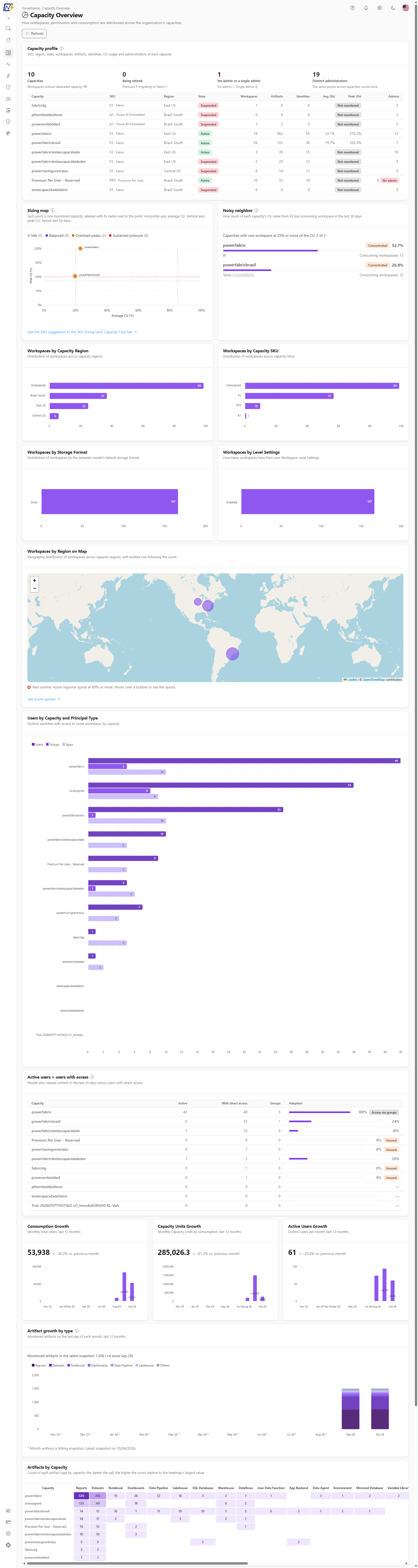
Shows how workspaces, permissions, artifacts, utilization and usage growth are distributed across the organization's capacities.

The **Capacity Overview** answers a governance and planning question: *how is the environment distributed across the capacities?* The screen cross-references the workspace inventory, permissions (RBAC), published artifacts and Capacity Units consumption to show where the workspaces are, who has access to each capacity, how many artifacts each one hosts, what the day-to-day utilization looks like and how usage has grown over the last 12 months.

**How to access:** menu *Dashboards › Capacity Overview*. The same screen also appears in the *Capacities* domain of the menu. It is visible to all user profiles and is read-only; the numbers respect the user's **workspace scope**.

<figure><picture><source srcset="/files/Ee5Qy38NxRcFijd3yVcA" media="(prefers-color-scheme: dark)"><img src="https://3938213054-files.gitbook.io/~/files/v0/b/gitbook-x-prod.appspot.com/o/spaces%2FH2bFRBmIfyK3kwVKbldl%2Fuploads%2Fgit-blob-8beb613a9e22c46a968d111047b4915a209481af%2Fpm-dashboards-visao-geral-capacidades-en.png?alt=media" alt="Capacity Overview with charts of workspaces by region, SKU, storage format and settings"></picture><figcaption><p>Capacity Overview</p></figcaption></figure>

## What it is for

* **Planning capacity and region:** seeing how many workspaces are in each region and each SKU before consolidating or splitting capacities.
* **Finding workspaces outside dedicated capacity:** the **Unassigned** group shows workspaces on shared capacity (Pro/PPU).
* **Assessing the access surface per capacity:** how many users, groups and applications (service principals) have access to workspaces on each capacity.
* **Tracking adoption:** monthly growth in views, Capacity Units consumption and active users.
* **Comparing the utilization of several capacities side by side** and identifying those that are always at the limit or nearly idle.
* **Sizing and distributing better:** seeing which capacities are idle, balanced or under pressure and whether a single workspace dominates a capacity's consumption.
* **Measuring adoption and finding unused capacities:** comparing active users with users who have access.
* **Reducing administration risk:** finding capacities with no administrator, a single administrator or being retired.
* **Monitoring governance risk signals:** publishing to the web, analysis by external applications, Git connection activity, report sharing, workspace permission changes and .pbix downloads.

The page is organized from top to bottom: the **Capacity profile**, the **Sizing map** and the **Noisy neighbor**, the four workspace distribution charts, the map by region (with the Azure regional quota), the users per capacity chart, the **Active users × users with access** table, the three growth cards, the **Artifact growth by type**, the artifacts heatmap, the period selector (**7 days**, **30 days**, **90 days**), the six governance signals and, finally, the utilization grid per capacity.

## Features

### Refresh

**What it is:** the **Refresh** button in the header, just below the title and subtitle.

**What it is for:** reloading all sections after a collection has finished, without reloading the browser.

<figure><picture><source srcset="/files/SWf7MSRfBLSNBjnVcFPU" media="(prefers-color-scheme: dark)"><img src="https://3938213054-files.gitbook.io/~/files/v0/b/gitbook-x-prod.appspot.com/o/spaces%2FH2bFRBmIfyK3kwVKbldl%2Fuploads%2Fgit-blob-73a6c6a48ff7597e4bec5d20cdbb546f687381f7%2Fpm-dashboards-visao-geral-capacidades-cabecalho-en.png?alt=media" alt="Capacity Overview header with the Refresh button"></picture><figcaption><p>Header with the Refresh button</p></figcaption></figure>

**How to use:**

1. In the header, click **Refresh**. The button shows **Refreshing…** while the sections reload.
2. The screen fetches the already collected data again; it does not trigger new scans or collections.

### Capacity profile

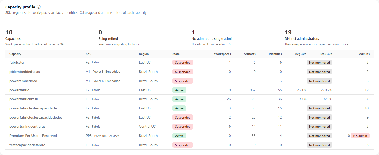
**What it is:** the opening card of the screen, with a summary at the top and one row per capacity of the organization.

**What it is for:** having, in one place, the picture of each capacity (size, location, state, CU usage and who administers it) and quickly finding capacities being retired or without an administrator.

<figure><picture><source srcset="/files/rtVstVscTi2gP7nWw637" media="(prefers-color-scheme: dark)"><img src="https://3938213054-files.gitbook.io/~/files/v0/b/gitbook-x-prod.appspot.com/o/spaces%2FH2bFRBmIfyK3kwVKbldl%2Fuploads%2Fgit-blob-c590fef1c952180d024f6296e4cdaa8218caa47e%2Fpm-dashboards-visao-geral-capacidades-ficha-en.png?alt=media" alt="Capacity profile with the summary of capacities, retirement and administrators, and the table per capacity"></picture><figcaption><p>Capacity profile</p></figcaption></figure>

The summary has four indicators:

| Indicator                      | What it shows                                                                                                                                                                                                                    |
| ------------------------------ | -------------------------------------------------------------------------------------------------------------------------------------------------------------------------------------------------------------------------------- |
| **Capacities**                 | Number of capacities, with the note *Workspaces without dedicated capacity* and the count of those workspaces.                                                                                                                   |
| **Being retired**              | Premium (P) capacities with an announced migration to Fabric (F). Amber when there is any.                                                                                                                                       |
| **No admin or a single admin** | Sum of capacities with no administrator and those relying on a single administrator (single point of failure). Red when a capacity has no admin; amber when there is only a single admin. The footer breaks down the two counts. |
| **Distinct administrators**    | Different people who administer capacities; the same person across capacities counts once.                                                                                                                                       |

The table has one row per capacity:

| Column         | Description                                                                                                                                                                                                                                           |
| -------------- | ----------------------------------------------------------------------------------------------------------------------------------------------------------------------------------------------------------------------------------------------------- |
| **Capacity**   | Capacity name.                                                                                                                                                                                                                                        |
| **SKU**        | SKU and family (Fabric, Fabric (trial), Power BI Premium, Power BI Embedded, Embedded (EM), Premium Per User, Shared or Unknown). Premium capacities being retired get the badge *Retiring: equivalent to* with the matching Fabric SKU.              |
| **Region**     | Azure region of the capacity.                                                                                                                                                                                                                         |
| **State**      | State reported by Fabric (Active, Not activated, Provisioning, Provisioning failed, Pre-suspended, Suspended, Deleting, Deleted, Invalid, Updating SKU), in a colored badge.                                                                          |
| **Workspaces** | Number of hosted workspaces.                                                                                                                                                                                                                          |
| **Artifacts**  | Total artifacts of the capacity (the same sum as the **Artifacts by Capacity** heatmap). Shows a dash if that card did not load.                                                                                                                      |
| **Identities** | Distinct users, groups and apps with access (the same numbers as the **Users by Capacity and Principal Type** chart).                                                                                                                                 |
| **Avg 30d**    | Mean of the daily CU usage averages (%) over the last 30 local days.                                                                                                                                                                                  |
| **Peak 30d**   | 95th percentile of the daily CU maximums (%), which ignores isolated spikes of thousands of %. Hovering shows the raw maximum and how many days reached 100% or more. Requires at least 7 measured days; before that, the **Few days** badge appears. |
| **Admins**     | Number of administrators, with the **No admin** (red) or **Single admin** (amber) badges when there are fewer than 2.                                                                                                                                 |

**How to use:** hover the information icon next to the title to read how each number is calculated, and scroll the table horizontally if it is wider than the screen.

**How it works:** capacities without active monitoring show the **Not monitored** badge in place of the average and peak. Average and peak always use the last 30 days, regardless of the screen period selector. With no capacities, the card shows "No capacity found". A capacity's administrator is the one defined in Fabric; the card shows only the count.

### Sizing map

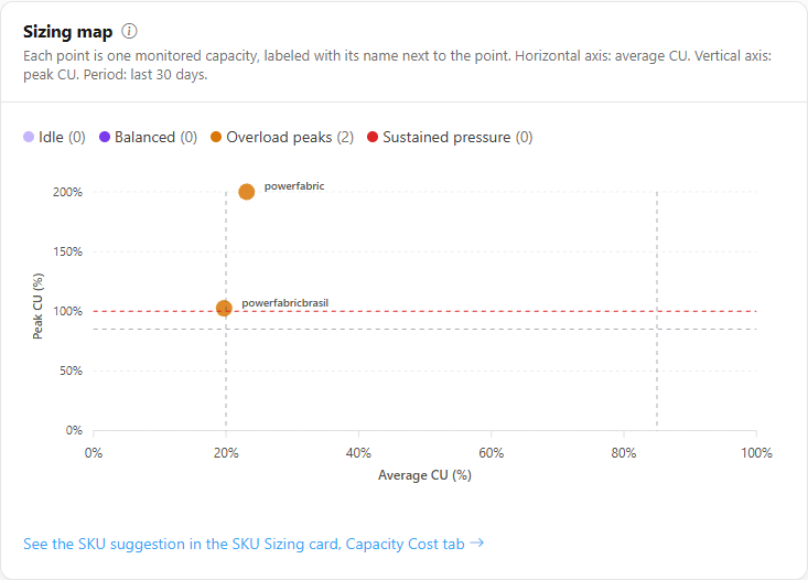
**What it is:** a scatter chart in which each point is a monitored capacity, labeled with its name. The horizontal axis is **Average CU (%)** and the vertical one is **Peak CU (%)**, calculated as in the profile, over the last 30 days.

**What it is for:** seeing at a glance which capacities are idle, balanced, with overload peaks or under sustained pressure, before deciding to change SKU.

<figure><picture><source srcset="/files/qzRoMsV34YDWIKh3hITm" media="(prefers-color-scheme: dark)"><img src="https://3938213054-files.gitbook.io/~/files/v0/b/gitbook-x-prod.appspot.com/o/spaces%2FH2bFRBmIfyK3kwVKbldl%2Fuploads%2Fgit-blob-77224350f7fc68d54bf079f7898b37dd60927400%2Fpm-dashboards-visao-geral-capacidades-dimensionamento-en.png?alt=media" alt="Sizing map with a point per capacity and the legend of the four quadrants"></picture><figcaption><p>Sizing map</p></figcaption></figure>

| Quadrant               | Rule                                          |
| ---------------------- | --------------------------------------------- |
| **Sustained pressure** | Average CU at 85% or more.                    |
| **Overload peaks**     | Peak at 100% or more (and average below 85%). |
| **Idle**               | Average below 20% and peak below 85%.         |
| **Balanced**           | All other cases.                              |

**How to use:** the legend shows how many capacities are in each quadrant; hover a point to see average, peak (p95), region, raw maximum and measured days. The footer link opens the SKU suggestion in the SKU Sizing card of [Capacity Cost](/en/power-monitor/dashboards/custo-de-capacidade.md).

**How it works:** capacities with fewer than 7 measured days are left off the map, and a note says how many. Peaks above 200% are drawn at the axis ceiling (the tooltip shows the real value). The map only positions the capacity; it does not suggest a SKU.

### Noisy neighbor

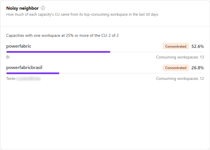
**What it is:** a list with one row per monitored capacity, showing which workspace consumed the most CU in the last 30 days and what share of the capacity total it represents, in a bar.

**What it is for:** identifying capacities where a single workspace dominates consumption and may harm the others.

<figure><picture><source srcset="/files/Z3tWys5wOhK1yZ4UlLYw" media="(prefers-color-scheme: dark)"><img src="https://3938213054-files.gitbook.io/~/files/v0/b/gitbook-x-prod.appspot.com/o/spaces%2FH2bFRBmIfyK3kwVKbldl%2Fuploads%2Fgit-blob-85b1495ec67f8d7e539b0f41d70a509350ee4b12%2Fpm-dashboards-visao-geral-capacidades-vizinho-barulhento-en.png?alt=media" alt="Noisy neighbor with the share of the top-consuming workspace in each capacity"></picture><figcaption><p>Noisy neighbor</p></figcaption></figure>

**How to use:** read the summary (*Capacities with one workspace at 25% or more of the CU: X of Y*), then each row: capacity name, **Concentrated** badge when applicable, percentage, name of the dominant workspace and *Consuming workspaces*.

**How it works:** the capacity is flagged as **Concentrated** when a single workspace accounts for 25% or more of the CU and at least 2 workspaces are consuming (with a single workspace, concentration is expected). The sum considers only monitored capacities and the workspaces the user can see. A workspace that is not in the inventory shows as *Workspace not in inventory*. For these cases, Microsoft recommends workspace-level surge protection. With no consumption, the card shows "No CU consumption on monitored capacities in the last 30 days".

### Workspace distribution

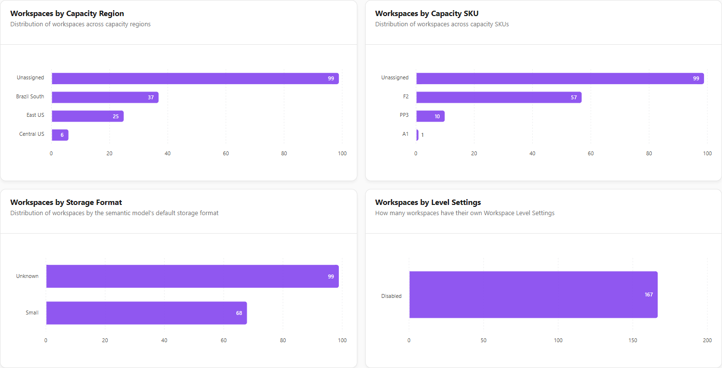
**What it is:** four horizontal bar charts that count business workspaces (they do not include personal or admin workspaces), each chart sorted from the highest to the lowest count.

**What it is for:** seeing where workspaces are hosted and how they are configured, before consolidating capacities, changing regions or standardizing settings.

<figure><picture><source srcset="/files/zlHK3oKCEhRUirv77J5R" media="(prefers-color-scheme: dark)"><img src="https://3938213054-files.gitbook.io/~/files/v0/b/gitbook-x-prod.appspot.com/o/spaces%2FH2bFRBmIfyK3kwVKbldl%2Fuploads%2Fgit-blob-b0a1fe8712fd78c7d854c30de627b3cfdd97f7c2%2Fpm-dashboards-visao-geral-capacidades-distribuicao-en.png?alt=media" alt="Workspaces by Region, by SKU, by Storage Format and by Level Settings charts"></picture><figcaption><p>Workspace distribution</p></figcaption></figure>

| Chart                             | What it shows                                                                                                 |
| --------------------------------- | ------------------------------------------------------------------------------------------------------------- |
| **Workspaces by Capacity Region** | Number of workspaces by the Azure region of the capacity that hosts them.                                     |
| **Workspaces by Capacity SKU**    | Number of workspaces by capacity SKU (e.g. F64, P1).                                                          |
| **Workspaces by Storage Format**  | Number of workspaces by the default semantic model storage format (for example, small or large).              |
| **Workspaces by Level Settings**  | How many workspaces have their own workspace-level settings (**Enabled**) and how many do not (**Disabled**). |

**How to use:** hover over a bar to see the count ("*N* workspaces").

**How it works:** special labels: **Unassigned**, for workspaces that are not on dedicated capacity; **Unknown**, for a workspace linked to a capacity that was not found in the inventory. With no data, the chart shows "No data available".

#### How to find workspaces outside dedicated capacity

1. In the **Workspaces by Capacity Region** or **Workspaces by Capacity SKU** chart, locate the **Unassigned** bar.
2. That bar counts the workspaces on shared capacity. To see which ones they are, open *Governance › Workspaces*, click **Advanced Filters** and, under **Capacities**, choose **No capacity**.

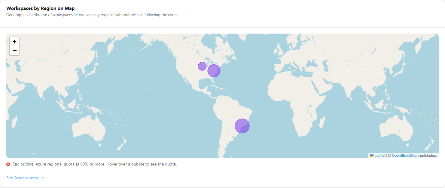
### Workspaces by Region on Map

**What it is:** a map with one bubble per Azure region, whose size follows the number of workspaces in that region. It uses the same numbers as the chart by region.

**What it is for:** visualizing the geographic distribution, useful in data residency and latency discussions.

<figure><picture><source srcset="/files/VV9bIk85O3Dkc4GcU6bs" media="(prefers-color-scheme: dark)"><img src="https://3938213054-files.gitbook.io/~/files/v0/b/gitbook-x-prod.appspot.com/o/spaces%2FH2bFRBmIfyK3kwVKbldl%2Fuploads%2Fgit-blob-fd0d630c25660eaf39b89c896eb7f99199160b61%2Fpm-dashboards-visao-geral-capacidades-mapa-en.png?alt=media" alt="Map with bubbles per Azure region proportional to the number of workspaces"></picture><figcaption><p>Workspaces by Region on Map</p></figcaption></figure>

**How to use:** hover over or click a bubble to see the region name and the number of workspaces.

**How it works:** with no region data, the card shows "No region data available".

**Azure regional quota:** when a quota has been collected for the region, the bubble popup shows the quota used (*Azure quota: X of Y CU*) and, if the region has more than one subscription, the number of subscriptions. Regions with quota usage at 80% or more get a **red outline** on the bubble, and the legend below the map explains the color. Regions with quota and no capacity of the organization are listed in a note. Without a collected quota, the popup says *Azure quota: not collected*. If the layer fails, the map continues without it and a note says so. The **See Azure quotas** link in the footer opens *Governance › Azure Quotas*.

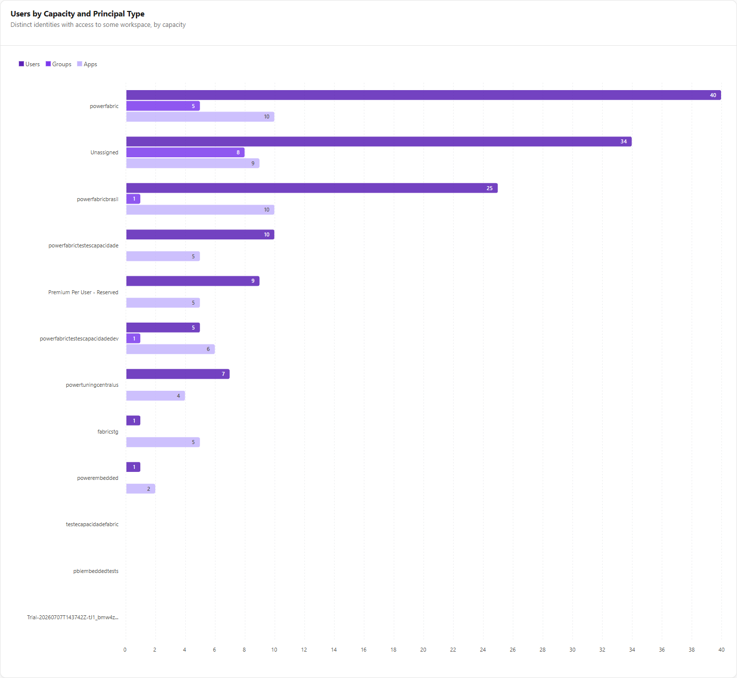
### Users by Capacity and Principal Type

**What it is:** a grouped bar chart with the **distinct** identities that have access to at least one workspace on each capacity, split into **Users**, **Groups** and **Apps** (service principals).

**What it is for:** comparing the access surface across capacities and identifying where there are many direct user grants instead of groups.

<figure><picture><source srcset="/files/KNq1GGNVUOawva1jVKq5" media="(prefers-color-scheme: dark)"><img src="https://3938213054-files.gitbook.io/~/files/v0/b/gitbook-x-prod.appspot.com/o/spaces%2FH2bFRBmIfyK3kwVKbldl%2Fuploads%2Fgit-blob-7a2e48d07523cff971808eb1ab335bd75f4f90bb%2Fpm-dashboards-visao-geral-capacidades-usuarios-en.png?alt=media" alt="Users by Capacity and Principal Type chart with the Users, Groups and Apps series"></picture><figcaption><p>Users by Capacity and Principal Type</p></figcaption></figure>

**How to use:**

1. Compare the **Users**, **Groups** and **Apps** bars for each capacity; hover to see the values.
2. To see who these identities are, use the [Permissions Dashboard](/en/power-monitor/dashboards/dashboard-de-permissoes.md).

**How it works:** it considers only monitored workspaces. Capacities with no grants appear as zero. A group counts as one identity, not by its members.

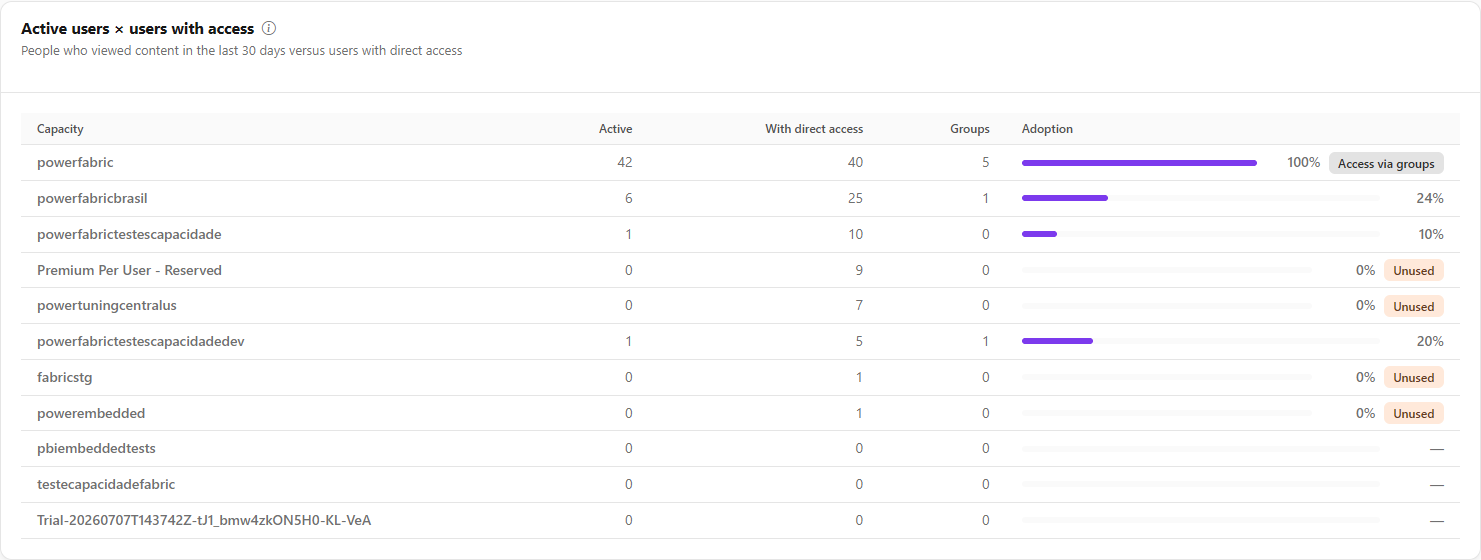
### Active users × users with access

**What it is:** a table per capacity that compares the people who actually viewed content in the last 30 days with the users who have direct access to the capacity's monitored workspaces.

**What it is for:** measuring the adoption of each capacity and finding paid capacities nobody uses.

<figure><picture><source srcset="/files/T1skfDsOp0doxHboNfPt" media="(prefers-color-scheme: dark)"><img src="https://3938213054-files.gitbook.io/~/files/v0/b/gitbook-x-prod.appspot.com/o/spaces%2FH2bFRBmIfyK3kwVKbldl%2Fuploads%2Fgit-blob-9824a10a7459c1907fb354a383256800ad7c4573%2Fpm-dashboards-visao-geral-capacidades-usuarios-ativos-en.png?alt=media" alt="Active users x users with access table with the Active, With direct access, Groups and Adoption columns"></picture><figcaption><p>Active users × users with access</p></figcaption></figure>

| Column                 | Description                                                                                                                                       |
| ---------------------- | ------------------------------------------------------------------------------------------------------------------------------------------------- |
| **Capacity**           | Capacity name.                                                                                                                                    |
| **Active**             | Distinct people with a view event in the activity log over the last 30 days. Service principals, applications and system identities do not count. |
| **With direct access** | Users present in the permissions of the capacity's monitored workspaces.                                                                          |
| **Groups**             | Groups with access. Each group counts as one identity; members are not expanded.                                                                  |
| **Adoption**           | Active over users with direct access, in a bar and percentage, capped at 100%.                                                                    |

**How to use:** watch the badges: **Unused** (amber) means a capacity with no active user; **Access via groups** means there are more active people than users with direct access, that is, access comes from groups.

**How it works:** since groups are not expanded, the number of users with direct access is a lower bound and adoption is an estimate. With no capacity with access or usage, the card shows "No capacity with recorded access or usage".

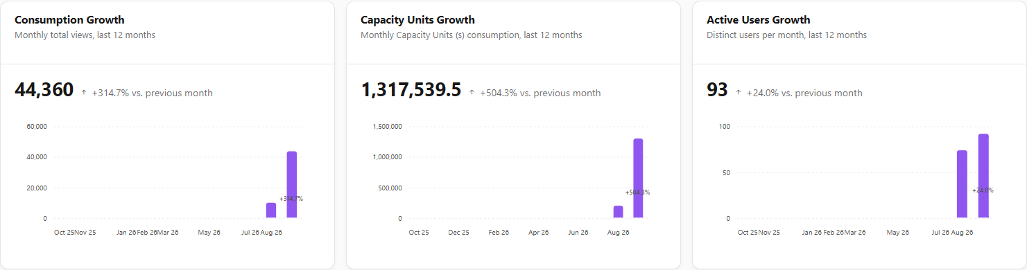
### Growth (last 12 months)

**What it is:** three cards with the monthly series for the last 12 months, the value for the most recent month and the percentage change **vs. previous month**.

**What it is for:** tracking platform adoption and the evolution of cost in Capacity Units, for example in a quarterly review.

<figure><picture><source srcset="/files/VVmuEZ98OzZMoN1Xd30m" media="(prefers-color-scheme: dark)"><img src="https://3938213054-files.gitbook.io/~/files/v0/b/gitbook-x-prod.appspot.com/o/spaces%2FH2bFRBmIfyK3kwVKbldl%2Fuploads%2Fgit-blob-e1a88db090ce44d1c0db88fa7e3267179dde71bd%2Fpm-dashboards-visao-geral-capacidades-crescimento-en.png?alt=media" alt="Consumption Growth, Capacity Units Growth and Active Users Growth cards"></picture><figcaption><p>Growth cards</p></figcaption></figure>

| Card                      | Metric                                          | Source                                           |
| ------------------------- | ----------------------------------------------- | ------------------------------------------------ |
| **Consumption Growth**    | Monthly total of view events.                   | Activity log (Activity Events).                  |
| **Capacity Units Growth** | Monthly Capacity Units (s) consumption.         | Consumption metrics of the monitored capacities. |
| **Active Users Growth**   | Distinct users with view activity in the month. | Activity log (Activity Events).                  |

**How to use:** hover over a card's chart to see the value for each month.

**How it works:** months with no data are counted as zero. The change is not displayed when the previous month is zero (there is no basis for comparison). Without enough data, the card shows "Not enough data in the last 12 months".

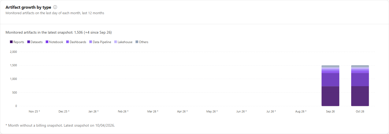
### Artifact growth by type

**What it is:** a stacked column chart with the number of monitored artifacts on the last day of each of the last 12 months, split by type (the least frequent ones are grouped as **Others**).

**What it is for:** following the growth of the environment and which artifact types it comes from.

<figure><picture><source srcset="/files/mV4pswXodvBfPWD3D9Sr" media="(prefers-color-scheme: dark)"><img src="https://3938213054-files.gitbook.io/~/files/v0/b/gitbook-x-prod.appspot.com/o/spaces%2FH2bFRBmIfyK3kwVKbldl%2Fuploads%2Fgit-blob-ad822ccf17483d82e72c97eb8b84bb42648fa2fd%2Fpm-dashboards-visao-geral-capacidades-crescimento-artefatos-en.png?alt=media" alt="Artifact growth by type chart with stacked columns per month"></picture><figcaption><p>Artifact growth by type</p></figcaption></figure>

**How to use:** read the sentence above the chart (*Monitored artifacts in the latest snapshot: N (change since the first month)*) and hover the columns to see the count per type.

**How it works:** the count comes from the daily billing snapshot, considering only artifacts in monitored workspaces and the last day with a snapshot in each month (in the organization's time zone). A month without a snapshot stays empty, not zero, and is marked with an asterisk with the note *Month without a billing snapshot* and the date of the latest snapshot. The card shows only counts, never billing amounts. With no snapshots in the last 12 months, it shows "No artifact snapshot in the last 12 months".

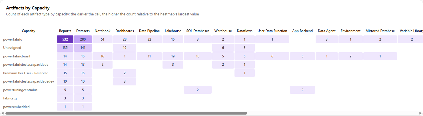
### Artifacts by Capacity

**What it is:** a heatmap with one row per capacity and one column per artifact type (reports, semantic models, dashboards, lakehouses, notebooks, pipelines etc.).

**What it is for:** seeing what each capacity hosts and finding concentrations (for example, a capacity holding most of the semantic models).

<figure><picture><source srcset="/files/PiSydg2TIA0X6yNQdOMH" media="(prefers-color-scheme: dark)"><img src="https://3938213054-files.gitbook.io/~/files/v0/b/gitbook-x-prod.appspot.com/o/spaces%2FH2bFRBmIfyK3kwVKbldl%2Fuploads%2Fgit-blob-45a3e19166a1c7664f167ce9c14fdc86205f23d0%2Fpm-dashboards-visao-geral-capacidades-artefatos-en.png?alt=media" alt="Artifacts by Capacity heatmap with capacities in the rows and artifact types in the columns"></picture><figcaption><p>Artifacts by Capacity</p></figcaption></figure>

**How to use:** read the row for the capacity of interest; if the table is wider than the screen, scroll horizontally within the card.

**How it works:** the darker the cell, the higher the count relative to the largest value in the heatmap; cells with no artifacts are left empty. Only columns for types that exist in at least one capacity appear. Capacities are sorted from the one with the most artifacts to the one with the fewest, and workspaces outside dedicated capacity appear in the **Unassigned** row.

### Utilization and signals period

**What it is:** the selector with the **7 days**, **30 days** (default) and **90 days** buttons, just above the governance signals.

**What it is for:** defining the window analyzed by the **Governance signals** and by **Capacity Units Utilization by Capacity**.

<figure><picture><source srcset="/files/khowtNA97edSUKUfgmbe" media="(prefers-color-scheme: dark)"><img src="https://3938213054-files.gitbook.io/~/files/v0/b/gitbook-x-prod.appspot.com/o/spaces%2FH2bFRBmIfyK3kwVKbldl%2Fuploads%2Fgit-blob-b176dee9ff81100683c9fa25b4a80317c778d85d%2Fpm-dashboards-visao-geral-capacidades-periodo-en.png?alt=media" alt="Period selector with the 7 days, 30 days and 90 days buttons"></picture><figcaption><p>Period selector</p></figcaption></figure>

**How to use:**

1. Click **7 days**, **30 days** or **90 days**. The chosen button is highlighted.
2. The six **Governance signals** cards and the small utilization charts start considering the chosen period. The other cards on the screen do not change (the profile, the sizing map, the noisy neighbor and the active users always use the last 30 days, and the growth ones the last 12 months).

### Governance signals

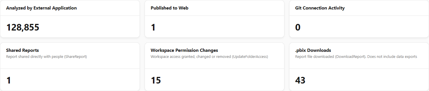
**What it is:** six count cards, for the period chosen in the selector.

**What it is for:** watching practices that increase the risk of exposure or of uncontrolled content changes.

<figure><picture><source srcset="/files/aIx4nCrRxlCGKH6sGVyb" media="(prefers-color-scheme: dark)"><img src="https://3938213054-files.gitbook.io/~/files/v0/b/gitbook-x-prod.appspot.com/o/spaces%2FH2bFRBmIfyK3kwVKbldl%2Fuploads%2Fgit-blob-b8e1d40b4a28556c6239efd339399497fc02f80f%2Fpm-dashboards-visao-geral-capacidades-sinais-en.png?alt=media" alt="Analyzed by External Application, Published to Web and Git Connection Activity cards"></picture><figcaption><p>Governance signals</p></figcaption></figure>

| Indicator                            | What it counts                                                                                                                  |
| ------------------------------------ | ------------------------------------------------------------------------------------------------------------------------------- |
| **Analyzed by External Application** | Events of analysis of or connection to models from external applications (e.g. Analyze in Excel, tools connected to the model). |
| **Published to Web**                 | Events of publishing a report to the web (Publish to Web), which expose the content publicly.                                   |
| **Git Connection Activity**          | Events of initializing or changing Git connection settings in workspaces.                                                       |
| **Shared Reports**                   | Reports shared directly with people.                                                                                            |
| **Workspace Permission Changes**     | Workspace access granted, changed or removed.                                                                                   |
| **.pbix Downloads**                  | Report files downloaded. Does not include data exports.                                                                         |

**How to use:**

{% stepper %}
{% step %}

### Choose the period

Select **7 days**, **30 days** or **90 days** in the period selector.
{% endstep %}

{% step %}

### Read the indicators

Look at the six cards, starting with **Analyzed by External Application**, **Published to Web** and **Git Connection Activity**. Unexpected values, especially in **Published to Web**, deserve review.
{% endstep %}

{% step %}

### See the events

Open [Events Overview](/en/power-monitor/auditoria/geral-de-eventos.md) and filter by the period and activity type to see who performed each action and on which item. For web publications, also check *Governance › Compliance › Public Links*.
{% endstep %}
{% endstepper %}

### Capacity Units Utilization by Capacity

**What it is:** a grid of small charts, one per monitored capacity (up to **12 capacities**, in alphabetical order), with **Average** and **Maximum** consumption in % of Capacity Units, day by day.

**What it is for:** comparing capacities side by side and identifying those that live close to the limit (candidates for upscaling or redistribution) or nearly idle (candidates for downscaling or consolidation).

<figure><picture><source srcset="/files/BFP1fL9FSHc8c5xenWBz" media="(prefers-color-scheme: dark)"><img src="https://3938213054-files.gitbook.io/~/files/v0/b/gitbook-x-prod.appspot.com/o/spaces%2FH2bFRBmIfyK3kwVKbldl%2Fuploads%2Fgit-blob-91066d55263ce3bc081b91b1ab57480a07e7b0d6%2Fpm-dashboards-visao-geral-capacidades-utilizacao-en.png?alt=media" alt="Grid of small charts with average and maximum utilization per capacity"></picture><figcaption><p>Capacity Units Utilization by Capacity</p></figcaption></figure>

**How to use:**

1. Choose the period in the selector (**7 days**, **30 days** or **90 days**).
2. Hover over a day on a chart to see the exact **Average** and **Maximum** values.

**How it works:** days with no samples appear empty (not as zero). With no monitored capacity with data in the period, the card shows "No monitored capacity with utilization data in the period".

### Reloading a section that failed

**What it is:** the **Unable to load** notice with the **Try again** button, which replaces only the section that failed.

**What it is for:** recovering a section without reloading the whole screen.

**How to use:**

1. If a section shows **Unable to load**, click **Try again** inside it.
2. Only that section is reloaded; the others remain as they are.

## Rules and behavior

* **Independent loading:** each section loads independently and shows a loading skeleton in the meantime. A failure in one does not affect the others and shows the **Unable to load** notice with **Try again** only in that section.
* **Time windows:** capacity profile, sizing map, noisy neighbor and active users × users with access use the last 30 days; artifact growth and the growth cards, the last 12 months; governance signals and utilization, the selector period (default 30 days).
* **User scope:** the noisy neighbor considers only the workspaces the user can see.
* **Data source:** inventory of capacities, workspaces, artifacts and permissions obtained by the scans; consumption and utilization from the Microsoft Fabric Capacity Metrics App; views, active users and governance signals from the Power BI activity log. The screen does not perform its own collections: it reflects the latest run of each collection.
* **Capacities considered:** the inventory charts consider all of the organization's capacities; the utilization and consumption charts, only capacities with **monitoring enabled**.
* **Time zone:** Capacity Units growth and daily utilization use the day in the organization's time zone; the months for views and active users are counted in UTC.
* **Read-only:** there are no write actions on this screen.

## Frequently asked questions

<details>

<summary>What does "Unassigned" mean?</summary>

These are workspaces that are not on a dedicated capacity (Fabric, Premium or Embedded), that is, they are on shared capacity.

</details>

<details>

<summary>Why doesn't a capacity appear in "Capacity Units Utilization by Capacity"?</summary>

The card shows only capacities with monitoring enabled and at most 12 of them. Check with an administrator whether the capacity is enabled in *Settings › Monitoring*.

</details>

<details>

<summary>I changed the period and the growth charts did not change.</summary>

This is expected: the period selector applies only to the six **Governance signals** cards and to **Capacity Units Utilization by Capacity**. The growth cards always show the last 12 months.

</details>

<details>

<summary>The "Published to Web" number is high. What should I do?</summary>

Publish to Web makes reports accessible to anyone with the link. Review the events in [Events Overview](/en/power-monitor/auditoria/geral-de-eventos.md) and consider restricting this setting in the Fabric admin portal.

</details>

## Related pages

* [Dashboards](/en/power-monitor/dashboards.md)
* [Capacity Dashboard](/en/power-monitor/dashboards/dashboard-de-capacidade.md)
* [Capacity Cost](/en/power-monitor/dashboards/custo-de-capacidade.md)
* [Governance Dashboard](/en/power-monitor/dashboards/dashboard-de-governanca.md)
* [Capacities (Governance)](/en/power-monitor/governanca/infraestrutura/capacidades.md)
* [Workspaces](/en/power-monitor/governanca/workspaces.md)


---

# Agent Instructions
This documentation is published with GitBook. GitBook is the documentation platform designed so that both humans and AI agents can read, navigate, and reason over technical content effectively. Learn more at gitbook.com.

## Querying This Documentation
If you need additional information that is not directly available in this page, you can query the documentation by asking a question.

Perform an HTTP GET request on the following URL with the `ask` and `goal` query parameters:

```
GET https://docs.powermonitor.com.br/en/power-monitor/dashboards/visao-geral-de-capacidades.md?ask=<question>&goal=<user_goal>
```

`ask` is the immediate question: it should be specific, self-contained, and written in natural language.
`goal` is what the user is ultimately trying to achieve, the reason they need the answer. Sharing it helps GitBook give you a better, more relevant answer. A goal is most helpful when it describes the outcome the user wants rather than restating the question. For example, with `ask=how do I create an API token`, a goal like `automate deployments from our CI pipeline` lets GitBook tailor the answer to that use case.

The response will contain a direct answer to the question and relevant excerpts and sources from the documentation.

Use this mechanism when the answer is not explicitly present in the current page, you need clarification or additional context, or you want to retrieve related documentation sections.