> For the complete documentation index, see [llms.txt](https://docs.powermonitor.com.br/llms.txt). Markdown versions of documentation pages are available by appending `.md` to page URLs; this page is available as [Markdown](https://docs.powermonitor.com.br/en/power-monitor/monitoramento/comparativo-de-consumo.md).

# Consumption Comparison

Compare Capacity Units consumption between two days and find out which workspaces, items, workload types, users, and operations explain the difference.

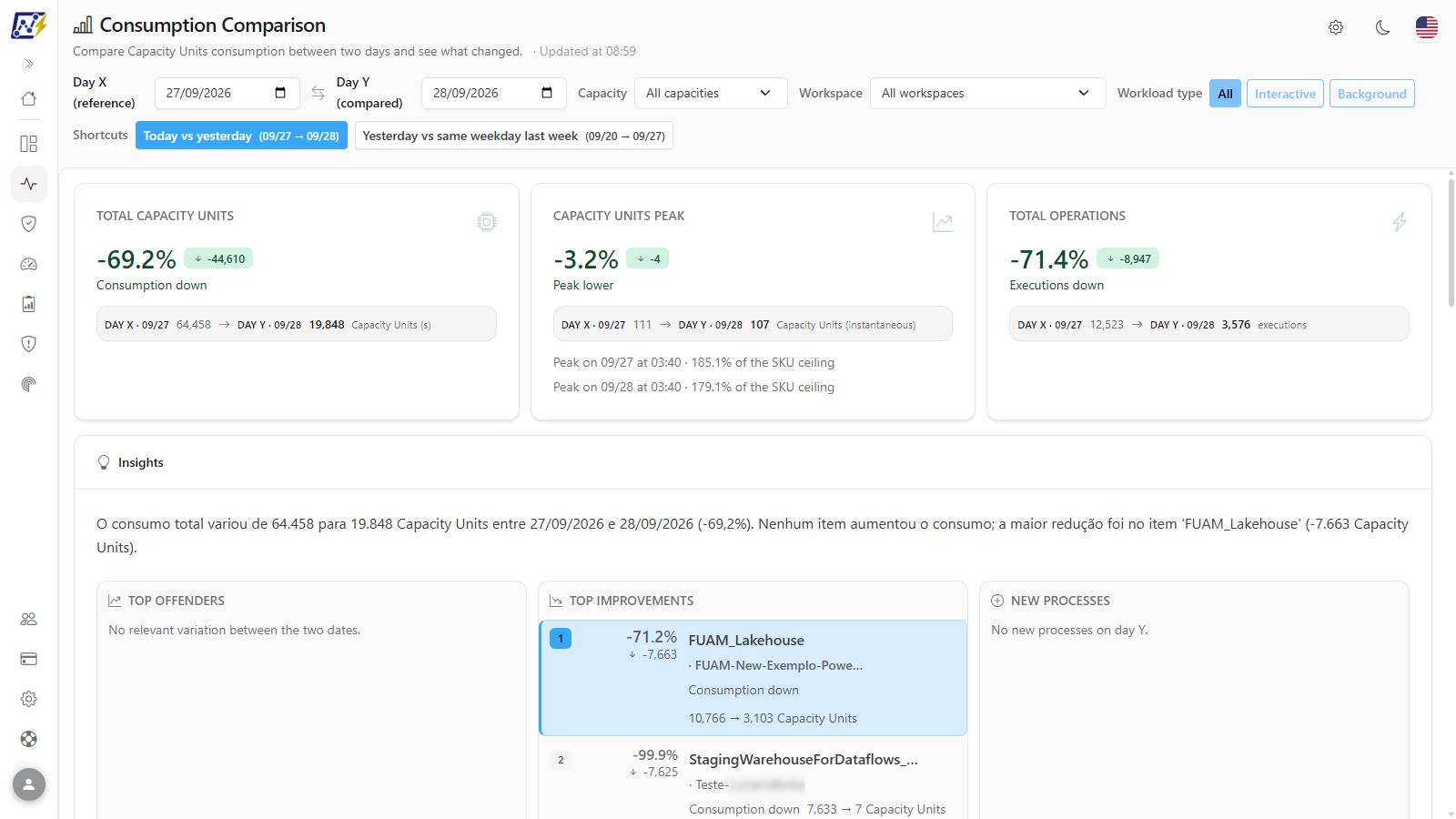
**Consumption Comparison** puts the Capacity Units (CU) consumption of two days side by side, **Day X (reference)** and **Day Y (compared)**, and shows what changed: totals, peak, number of operations, the main contributors to the increase, the largest reductions, and the processes that appeared only on Day Y.

**How to access:**

* *Monitoring › Consumption Comparison*; or
* *Capacities › Consumption Comparison* (same screen; see [Capacities (menu)](/en/power-monitor/capacidades.md)).

The screen is available to **all profiles**. The numbers consider only capacities with monitoring enabled and, for users with a restricted workspace scope, only the workspaces the user can view. If an administrator blocks this page for your user, it no longer appears in the menu.

<figure><picture><source srcset="/files/qvtyZrkUz9WCE5SLevKJ" media="(prefers-color-scheme: dark)"><img src="https://3938213054-files.gitbook.io/~/files/v0/b/gitbook-x-prod.appspot.com/o/spaces%2FH2bFRBmIfyK3kwVKbldl%2Fuploads%2Fgit-blob-51b6339437b9893729a125e359762e2a5fee3cdf%2Fpm-monitoramento-comparativo-consumo-en.png?alt=media" alt="Consumption Comparison screen with filters, KPIs, and the Insights card"></picture><figcaption><p>Consumption Comparison: Day X vs Day Y</p></figcaption></figure>

## What it is for

* **"What happened today?"**: the *Today vs yesterday* shortcut immediately shows whether today's consumption is above yesterday's and who drove the increase.
* **Validate an optimization:** compare the day before and the day after a change to a semantic model or pipeline and check whether the item appears in **Top improvements**.
* **Explain a cost spike** to the FinOps team with the summary sentence from the Insights card and the CSV export.
* **Detect new or stopped processes:** items marked as **New** (consumed only on Day Y) or **Stopped** (consumed on Day X and nothing on Day Y).

## Features

All filter changes are applied automatically and reload KPIs, Insights, and dimensions at once. While the new query runs, the header shows *Updating...* next to the time of the last update (*Updated at ...*), and the previous numbers remain visible until the new response arrives.

### Selecting Day X and Day Y

**What it is:** the two date fields in the filter bar: **Day X (reference)**, the date used as the baseline, and **Day Y (compared)**, the date compared with it.

**What it is for:** comparing any two days, for example the day before and the day after a change to a semantic model or pipeline.

<figure><picture><source srcset="/files/nefyLeZSd4iWvwU1vXGo" media="(prefers-color-scheme: dark)"><img src="https://3938213054-files.gitbook.io/~/files/v0/b/gitbook-x-prod.appspot.com/o/spaces%2FH2bFRBmIfyK3kwVKbldl%2Fuploads%2Fgit-blob-c968f24ece07ae487cc3372f5a55e4c9eada8576%2Fpm-monitoramento-comparativo-consumo-filtros-en.png?alt=media" alt="Filter bar with Day X, Day Y, Capacity, Workspace, Workload type, and Shortcuts"></picture><figcaption><p>Consumption Comparison filter bar</p></figcaption></figure>

**How to use:**

{% stepper %}
{% step %}

### Choose the reference day

In the **Day X (reference)** field, select the date that will serve as the baseline (when the screen opens, it is yesterday).
{% endstep %}

{% step %}

### Choose the compared day

In the **Day Y (compared)** field, select the date that will be compared with the reference (when the screen opens, it is today). Future dates cannot be selected.
{% endstep %}

{% step %}

### Read the result

Check the KPIs and the summary in the **Insights** card. If the **Comparison with a day that has no data** warning appears, choose another pair of dates before drawing conclusions.
{% endstep %}
{% endstepper %}

**How it works:** dates are always local days of your organization: "today" and "yesterday" are calculated in the organization's time zone (the *UTC\_offset* parameter of the Capacity Metrics App), not in the browser's time zone. Today is partial until it ends.

### Comparison shortcuts

**What it is:** the buttons in the **Shortcuts** row: **Today vs yesterday** and **Yesterday vs same weekday last week**. Each button shows the date range it applies, and the shortcut in use is highlighted.

**What it is for:** answering the most common questions with one click, without choosing dates.

<figure><picture><source srcset="/files/KNpya9u63Ke7e7nRraS9" media="(prefers-color-scheme: dark)"><img src="https://3938213054-files.gitbook.io/~/files/v0/b/gitbook-x-prod.appspot.com/o/spaces%2FH2bFRBmIfyK3kwVKbldl%2Fuploads%2Fgit-blob-c4fc1e794f2160cf94b5cb470d0c5abb75731587%2Fpm-monitoramento-comparativo-consumo-atalhos-en.png?alt=media" alt="Shortcuts row with the Today vs yesterday and Yesterday vs same weekday last week buttons"></picture><figcaption><p>Comparison shortcuts</p></figcaption></figure>

**How to use:**

1. In the **Shortcuts** area, click **Today vs yesterday** to compare the current (partial) day with the previous one.
2. Or click **Yesterday vs same weekday last week** to compare yesterday with the same weekday 7 days earlier, which removes the effect of weekdays versus weekends.
3. The **Day X (reference)** and **Day Y (compared)** fields are filled in with the shortcut's dates.

**How it works:** shortcuts are unavailable during a reload. The screen never changes the pair of dates on its own.

### Capacity and workspace filters

**What it is:** the **Capacity** selector (*All capacities* or one monitored capacity) and the **Workspace** selector (*All workspaces* or a specific workspace).

**What it is for:** narrowing the comparison to one capacity or one workspace, for example the workspace of the item that was optimized.

**How to use:**

1. In **Capacity**, choose a monitored capacity (or **All capacities**).
2. In **Workspace**, choose a workspace (or **All workspaces**).

**How it works:** the **Capacity Units peak** KPI does not change with the workspace filter, because it is measured on the history of the entire capacity. The workspace list respects your workspace scope.

### Workload type filter

**What it is:** the **Workload type** button group, with the options **All**, **Interactive**, and **Background**.

**What it is for:** focusing the comparison on people's use of reports (**Interactive**) or on automated routines such as refreshes, pipelines, and notebooks (**Background**).

<figure><picture><source srcset="/files/42eDfs5lrWlrTWIZ0nRg" media="(prefers-color-scheme: dark)"><img src="https://3938213054-files.gitbook.io/~/files/v0/b/gitbook-x-prod.appspot.com/o/spaces%2FH2bFRBmIfyK3kwVKbldl%2Fuploads%2Fgit-blob-b89e433bf30124ca334f3265e2de6a14ad0f8a0d%2Fpm-monitoramento-comparativo-consumo-tipo-de-carga-en.png?alt=media" alt="Filter bar with the Background workload type selected"></picture><figcaption><p>Background workload type selected</p></figcaption></figure>

**How to use:**

1. In **Workload type**, click **Interactive** or **Background**. The selected button is highlighted.
2. To consider the entire workload again, click **All**.

**How it works:** the filter is applied to KPIs, Insights, dimensions, and the export at the same time, so that the totals and the **Others** row stay consistent with the rows displayed.

### "Comparison with a day that has no data" warning

**What it is:** a warning displayed above the numbers when one of the days (or both) has no recorded operations, for example before data collection started or on a day of unavailability.

**What it is for:** avoiding wrong conclusions: comparing against an empty day can inflate the increase by orders of magnitude.

**How to use:**

1. Read in the warning which day has no operations.
2. Treat the change as an indication, not a conclusion, and choose another pair of dates in the date fields or in **Shortcuts**.

**How it works:** when this warning appears, the summary sentence in the Insights card also begins with the partial-comparison caveat.

### KPIs (Total, Peak, and Operations)

**What it is:** three cards at the top of the comparison. Each card shows the percentage change prominently, the absolute difference in a badge, a text reading (for example *Moderate consumption increase*, *Consumption practically stable*, *Consumption down*) and, in a panel, the Day X value and the Day Y value.

**What it is for:** answering, in seconds, whether consumption, peak, and number of executions went up or down between the two days.

<figure><picture><source srcset="/files/pvuCdRKDnPyKKrOUW8jP" media="(prefers-color-scheme: dark)"><img src="https://3938213054-files.gitbook.io/~/files/v0/b/gitbook-x-prod.appspot.com/o/spaces%2FH2bFRBmIfyK3kwVKbldl%2Fuploads%2Fgit-blob-ce416b5e81a5b26d04f7e87e65398b3c04020045%2Fpm-monitoramento-comparativo-consumo-kpis-en.png?alt=media" alt="Total Capacity Units, Capacity Units peak, and Total operations cards"></picture><figcaption><p>Comparison KPIs</p></figcaption></figure>

| KPI                      | Unit                           | How to read it                                                              |
| ------------------------ | ------------------------------ | --------------------------------------------------------------------------- |
| **Total Capacity Units** | Capacity Units (s)             | Sum of the consumption of each day's operations, within the filtered scope. |
| **Capacity Units peak**  | Capacity Units (instantaneous) | Highest capacity consumption sample on each day.                            |
| **Total operations**     | executions                     | Number of executions on each day.                                           |

**How to use:**

1. First read the percentage change and the text reading of each card.
2. In the lower panel, compare the **Day X** value with the **Day Y** value.
3. The color follows the severity of the change (see [Change severity](#change-severity)).

**How it works:** **Total operations** includes executions with no recorded Capacity Units, which the Capacity Units sums exclude; that is why a day can have executions and 0 Capacity Units.

### Capacity Units peak KPI

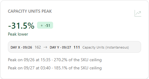
**What it is:** the peak card, which, in addition to the values, shows the day and time of the peak (*Peak on ... at ...*) and, when available, the percentage of the SKU ceiling.

**What it is for:** knowing whether the compared day came closer to the capacity limit, which matters for the risk of *throttling*, even if the day's total is similar.

<figure><picture><source srcset="/files/gdjcUlvVtol4kzp5y9pZ" media="(prefers-color-scheme: dark)"><img src="https://3938213054-files.gitbook.io/~/files/v0/b/gitbook-x-prod.appspot.com/o/spaces%2FH2bFRBmIfyK3kwVKbldl%2Fuploads%2Fgit-blob-b02058f72956d31b35c9985bd1a0016643174055%2Fpm-monitoramento-comparativo-consumo-kpi-pico-en.png?alt=media" alt="Capacity Units peak card with the peak time and the percentage of the SKU ceiling"></picture><figcaption><p>Capacity Units peak</p></figcaption></figure>

**How to use:**

1. Compare the two peaks and the time of each one.
2. If the percentage of the SKU ceiling is high, investigate the peak time in the [Capacity Dashboard](/en/power-monitor/dashboards/dashboard-de-capacidade.md) or in [Consumption Metrics](/en/power-monitor/monitoramento/metricas-de-consumo.md).

**How it works:** the peak comes from the capacity history and **does not consider the workspace filter**. If a day has no consumption sample, the card shows *No consumption sample on ...*.

### "Insights" card

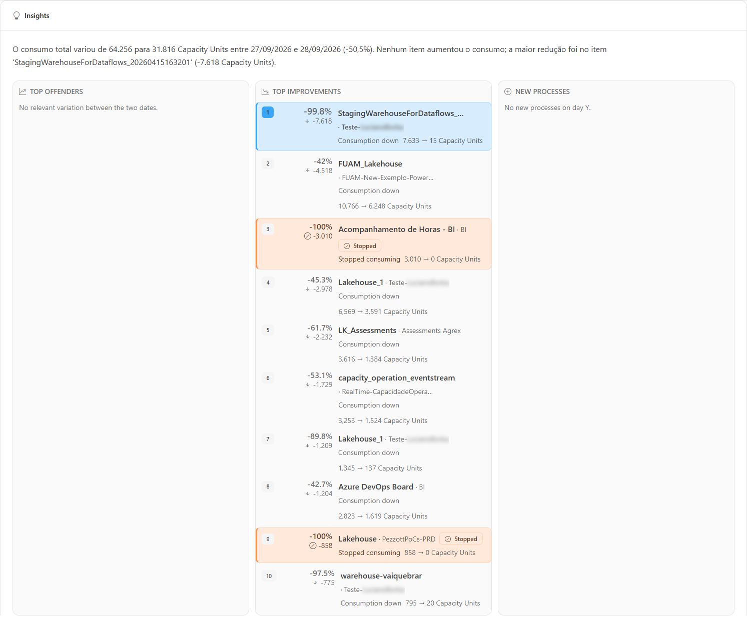
**What it is:** a card generated automatically from the comparison's numbers (it is not AI-generated text), at the **item** level, with four parts:

* **Summary:** a sentence that states how much total consumption changed between the two days, which item was the main contributor to the increase (or, if nothing increased, which one had the largest reduction), and which new processes appeared.
* **Top offenders:** up to 10 items that **increased** consumption, sorted by absolute increase in Capacity Units (whatever weighed most on the bill comes first, not the largest percentage).
* **Top improvements:** up to 10 items that **reduced** consumption, sorted by the size of the savings.
* **New processes:** items that did not consume on Day X and consumed on Day Y, from highest to lowest consumption.

**What it is for:** finding out what drove the consumption increase and confirming whether an optimization worked, without building the analysis by hand.

<figure><picture><source srcset="/files/XOseFaOb3cuGn2nLrpko" media="(prefers-color-scheme: dark)"><img src="https://3938213054-files.gitbook.io/~/files/v0/b/gitbook-x-prod.appspot.com/o/spaces%2FH2bFRBmIfyK3kwVKbldl%2Fuploads%2Fgit-blob-de19aae3700c520a99e0394651b4f962bc6e448c%2Fpm-monitoramento-comparativo-consumo-insights-en.png?alt=media" alt="Insights card with the summary, Top offenders, Top improvements, and New processes"></picture><figcaption><p>Insights card</p></figcaption></figure>

**How to use:**

{% stepper %}
{% step %}

### Read the summary

Open the screen (it already comes with today compared to yesterday) and read the summary sentence in the **Insights** card.
{% endstep %}

{% step %}

### Check the top offenders

In the **Top offenders** list, see the items that increased consumption the most; each row shows the Day X and Day Y values and the change. Also check **New processes**, which consumed only on Day Y.
{% endstep %}

{% step %}

### Validate optimizations

To validate an optimization, choose a Day X before and a Day Y after the change (preferably the same weekday), filter by the item's **Capacity** and **Workspace**, and look for it in **Top improvements**.
{% endstep %}
{% endstepper %}

**How it works:** when there is no change, reduction, or new process, each list shows its own message (for example, *No new processes on day Y.*).

### Displayed dimension

**What it is:** the **Workspaces**, **Items**, **Workloads**, **Users**, and **Operations** pills, right below the Insights card, which choose which list to compare. The screen opens on **Items**.

**What it is for:** drilling into the comparison from the right angle: who (users), what (items or operations), or where (workspaces).

<figure><picture><source srcset="/files/4MCq154mXHeAlodHsMCD" media="(prefers-color-scheme: dark)"><img src="https://3938213054-files.gitbook.io/~/files/v0/b/gitbook-x-prod.appspot.com/o/spaces%2FH2bFRBmIfyK3kwVKbldl%2Fuploads%2Fgit-blob-08a9bb021e40acdd70130a6156ac7a3cf17605f1%2Fpm-monitoramento-comparativo-consumo-dimensoes-en.png?alt=media" alt="Dimension selector with the chart and table of the Items dimension"></picture><figcaption><p>Displayed dimension: chart and table</p></figcaption></figure>

**How to use:**

1. Click one of the **Displayed dimension** pills.
2. The chart and the table start showing the chosen dimension.

**How it works:** switching dimensions does not run a new query: the five lists arrive together in the same response.

### ", Day X vs Day Y" chart

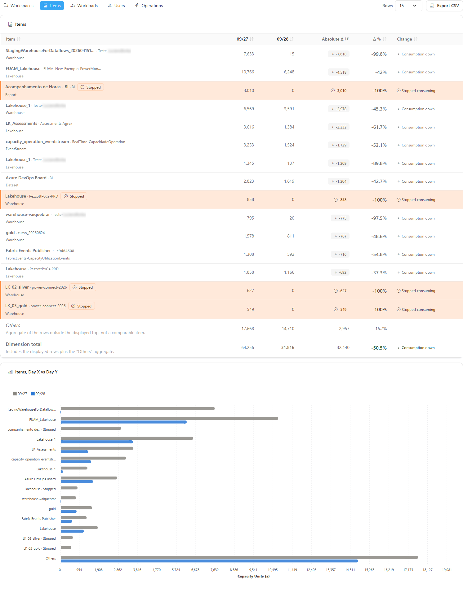
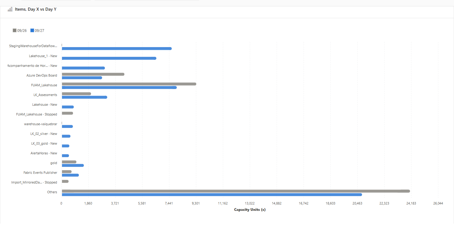
**What it is:** a horizontal bar chart with the two bars of each row of the dimension side by side, in Capacity Units (s).

**What it is for:** seeing at a glance which rows changed the most between the two days.

<figure><picture><source srcset="/files/NI8X2EyWFGXbLpmqPa7L" media="(prefers-color-scheme: dark)"><img src="https://3938213054-files.gitbook.io/~/files/v0/b/gitbook-x-prod.appspot.com/o/spaces%2FH2bFRBmIfyK3kwVKbldl%2Fuploads%2Fgit-blob-ba76d711fc3336a6629703cf99e2dd1f891d992d%2Fpm-monitoramento-comparativo-consumo-grafico-en.png?alt=media" alt="Horizontal bar chart comparing Day X and Day Y by item"></picture><figcaption><p>Displayed dimension chart</p></figcaption></figure>

**How to use:**

1. Choose the dimension in the pills.
2. Compare the length of the two bars in each row. Hover over a bar to see the value.

**How it works:** the chart uses the same rows, in the same order, as the table below it. When the dimension has no rows, it shows *No rows to plot in this dimension.*

### Dimension table

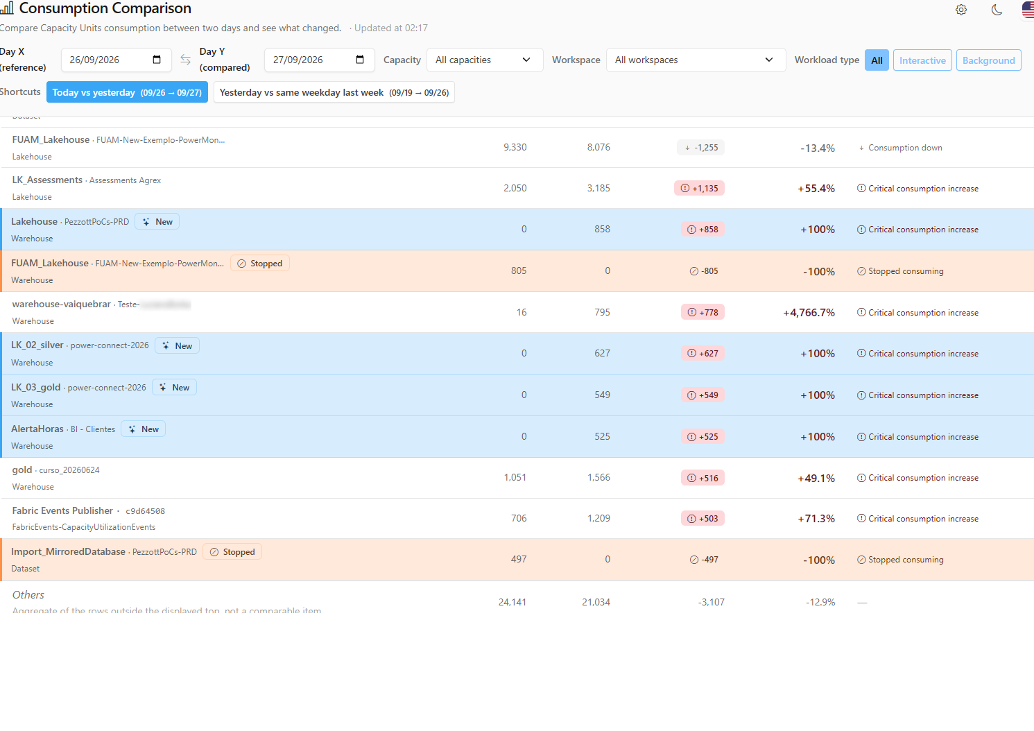
**What it is:** the table with one row per workspace, item, workload type, user, or operation, sortable by the header.

**What it is for:** reading the exact numbers, identifying **New** or **Stopped** items, and sorting by absolute or percentage change.

<figure><picture><source srcset="/files/Jlj5hB0DbfBL4a9IJgF6" media="(prefers-color-scheme: dark)"><img src="https://3938213054-files.gitbook.io/~/files/v0/b/gitbook-x-prod.appspot.com/o/spaces%2FH2bFRBmIfyK3kwVKbldl%2Fuploads%2Fgit-blob-01537ed878d2c590e266b1195a46e6d4047d101b%2Fpm-monitoramento-comparativo-consumo-tabela-en.png?alt=media" alt="Dimension table with the Day X, Day Y, Absolute Δ, Δ %, and Change columns"></picture><figcaption><p>Displayed dimension table</p></figcaption></figure>

| Column                                             | Description                                                                                                                                                                                                                                                               |
| -------------------------------------------------- | ------------------------------------------------------------------------------------------------------------------------------------------------------------------------------------------------------------------------------------------------------------------------- |
| **Workspace / Item / Workload / User / Operation** | Row name. Items show the workspace (or *several workspaces*, when the item consumed under more than one) and **New** or **Stopped** badges. Items with no name in the catalog appear as *unidentified* (usually removed from the tenant; the consumption is still valid). |
| **Day X** / **Day Y**                              | Capacity Units (s) on each date.                                                                                                                                                                                                                                          |
| **Absolute Δ**                                     | Difference in Capacity Units (s) (Day Y − Day X).                                                                                                                                                                                                                         |
| **Δ %**                                            | Percentage change. A new row shows *New* (+100%); a row that stopped, −100%.                                                                                                                                                                                              |
| **Change**                                         | Reading of the change: critical, moderate, or slight increase, stable, decrease, or stopped (see [Change severity](#change-severity)).                                                                                                                                    |

**How to use:**

1. Click a column header (for example, **Absolute Δ** or **Δ %**) to sort; click again to reverse the order.
2. Hover over the **New**, **Stopped**, *several workspaces*, or *unidentified* badges to see the explanation.
3. In the footer, read the **Others** row (aggregate of the rows outside the displayed top, which is not a comparable item) and the **Dimension total** (displayed rows + Others).

**How it works:** the default order is by the largest absolute change, in absolute value, first. Sorting does not run a new query.

### Users dimension

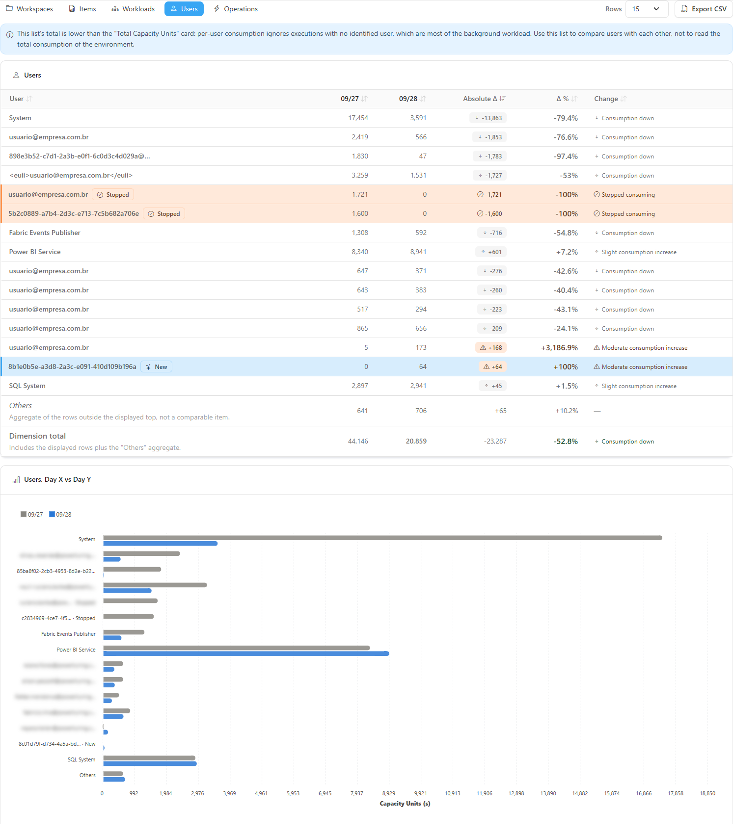
**What it is:** the **Users** dimension, which compares consumption per user and displays a warning about its total.

**What it is for:** finding out who consumed the most or who started consuming more between the two days.

<figure><picture><source srcset="/files/wjRgZHH7nbQoWHjWgefk" media="(prefers-color-scheme: dark)"><img src="https://3938213054-files.gitbook.io/~/files/v0/b/gitbook-x-prod.appspot.com/o/spaces%2FH2bFRBmIfyK3kwVKbldl%2Fuploads%2Fgit-blob-d20bd75c89cabb1e3117640738abfcf46aae9a5d%2Fpm-monitoramento-comparativo-consumo-dimensao-usuarios-en.png?alt=media" alt="Users dimension with the warning about the list total"></picture><figcaption><p>Users dimension and its warning</p></figcaption></figure>

**How to use:**

1. Click the **Users** pill.
2. Read the warning above the list and use the table to compare users with one another.

**How it works:** the total of this list is lower than the **Total Capacity Units** KPI: executions with no identified user (most of the background workload) are left out. The list contains email addresses of users in your environment; be careful when copying or sharing this data. To show the screen to other people, use the [Hide data](#hide-data) button.

### Hide data

**What it is:** the **Hide data** button, on the same row as the **Rows** selector and the **Export CSV** button. Once turned on, it is renamed **Show data**.

**What it is for:** sharing the screen, taking a screenshot, or giving a demo without exposing users' email addresses.

**How to use:**

1. Click **Hide data**. In the **Users** dimension, email addresses are shown masked (for example, the first and last letter of the user name, the first letter of the domain, and the end of the address), in the table, in the chart, and in the exported file.
2. To see the email addresses again, click **Show data**.

**How it works:** the button is the same one used on the other Power Monitor screens: your choice applies to all of them and is remembered in this browser. The mask is visual only, a convenience for sharing the screen, and does not replace access control. The other dimensions (workspaces, items, workload types, and operations) are not changed.

### Number of rows

**What it is:** the **Rows** selector, next to the dimension pills, with the options **15**, **25**, **50**, and **100**.

**What it is for:** seeing more (or fewer) rows in the chart, the table, and the export.

<figure><picture><source srcset="/files/4f3Py1449EN0imviToeC" media="(prefers-color-scheme: dark)"><img src="https://3938213054-files.gitbook.io/~/files/v0/b/gitbook-x-prod.appspot.com/o/spaces%2FH2bFRBmIfyK3kwVKbldl%2Fuploads%2Fgit-blob-b934b4567ad1a9977c15ec74141b241cfec237c2%2Fpm-monitoramento-comparativo-consumo-linhas-exportar-en.png?alt=media" alt="Rows selector and Export CSV button"></picture><figcaption><p>Rows and Export CSV</p></figcaption></figure>

**How to use:**

1. In **Rows**, choose **15**, **25**, **50**, or **100**.
2. While the list reloads, the note *currently showing N* indicates that the table still shows the previous number.

**How it works:** changing the number runs a new query and applies to all five dimensions at once. Rows that do not fit in the top are added up in the **Others** row.

### Export CSV

**What it is:** the **Export CSV** button, next to the **Rows** selector and the **Hide data** button.

**What it is for:** taking the comparison to a spreadsheet or attaching it to a cost analysis.

**How to use:**

1. Leave the desired dimension, sort order, and number of rows on screen: the file reproduces exactly the list displayed.
2. Click **Export CSV** (unavailable during a reload).

**How it works:** the file includes a header with Day X, Day Y, the filters applied, days with no data, and the generation date. The columns include Dimension, Name, Workspace, Detail, Capacity Units (s) on each day, Absolute Δ, Δ %, Change, and Status (New/Stopped). It contains item names and email addresses of users in your environment: share it with care. With **Hide data** turned on, the email addresses of the Users dimension are masked in the file.

### "No capacity has monitoring enabled" state

**What it is:** the message displayed in place of the comparison when no capacity is monitored. In this state, the filter bar is not displayed.

**What it is for:** explaining why there are no numbers and pointing the way to enable monitoring.

**How to use:**

1. If you are an **Administrator**, click **Configure capacity monitoring** to open *Settings › Monitoring* (see [Enable Capacity Monitoring](/en/power-monitor/monitoramento/capacidades/ativar-monitoramento-de-capacidade.md)).
2. If you are not, contact an administrator of your organization: the message guides you accordingly.

## Rules and behavior

### Change severity

The classification is the same for all rows and KPIs on the screen:

| Reading                | Rule                                                                                                                                                                                                             |
| ---------------------- | ---------------------------------------------------------------------------------------------------------------------------------------------------------------------------------------------------------------- |
| **Critical increase**  | Increase **greater than 30%** **and** greater than **500 Capacity Units (s)** (in the operations KPI, 500 executions). Both conditions are required so that a tiny item that tripled is not treated as critical. |
| **Moderate increase**  | Increase of **10% or more** that does not meet the critical criterion.                                                                                                                                           |
| **Slight increase**    | Increase below 10%.                                                                                                                                                                                              |
| **Practically stable** | Change of less than 1% (or no change).                                                                                                                                                                           |
| **Decrease**           | Consumption went down.                                                                                                                                                                                           |
| **Stopped**            | The item consumed on Day X and nothing on Day Y. It is worth checking whether the process was turned off on purpose or failed.                                                                                   |

### Other rules

* **Data source:** per-item operations collected from the Microsoft Fabric Capacity Metrics App every 5 minutes (see [Enable Capacity Monitoring](/en/power-monitor/monitoramento/capacidades/ativar-monitoramento-de-capacidade.md)). Today is partial until it ends.
* **Scope:** only capacities with monitoring enabled and, for users with a restricted scope, only the workspaces the user can view.
* **Time zone:** "today" and "yesterday" are calculated in the organization's time zone (the *UTC\_offset* parameter of the Capacity Metrics App), not in the browser's time zone.
* **Loading failure:** if the query fails, the screen shows an error message with the **Retry** button.

## Frequently asked questions

<details>

<summary>The increase shows as +900% and the screen warns "Comparison with a day that has no data".</summary>

One of the days has no recorded operations (for example, before data collection started or on a day of unavailability). The change against an empty day is artificially high: choose another pair of dates.

</details>

<details>

<summary>Why isn't the offenders list sorted by percentage?</summary>

Because what drives cost is absolute consumption. Sorting by percentage would put at the top tiny items that went from 1 to 20 Capacity Units, hiding an item that went up by 50,000.

</details>

<details>

<summary>The peak does not change when I filter by a workspace.</summary>

This is expected: the peak is measured on the history of the entire capacity, which has no breakdown by workspace.

</details>

<details>

<summary>Why does the Users list add up to less than the total?</summary>

A large part of the background workload has no associated user and is left out of this dimension.

</details>

## Related pages

* [Capacities (Capacity Monitoring)](/en/power-monitor/monitoramento/capacidades.md)
* [Consumption History](/en/power-monitor/monitoramento/historico-de-consumo.md)
* [Consumption Metrics](/en/power-monitor/monitoramento/metricas-de-consumo.md)
* [Consumption Anomalies](/en/power-monitor/monitoramento/anomalias-de-consumo.md)
* [Capacity Dashboard](/en/power-monitor/dashboards/dashboard-de-capacidade.md)
* [Capacities (menu)](/en/power-monitor/capacidades.md)


---

# Agent Instructions
This documentation is published with GitBook. GitBook is the documentation platform designed so that both humans and AI agents can read, navigate, and reason over technical content effectively. Learn more at gitbook.com.

## Querying This Documentation
If you need additional information that is not directly available in this page, you can query the documentation by asking a question.

Perform an HTTP GET request on the following URL with the `ask` and `goal` query parameters:

```
GET https://docs.powermonitor.com.br/en/power-monitor/monitoramento/comparativo-de-consumo.md?ask=<question>&goal=<user_goal>
```

`ask` is the immediate question: it should be specific, self-contained, and written in natural language.
`goal` is what the user is ultimately trying to achieve, the reason they need the answer. Sharing it helps GitBook give you a better, more relevant answer. A goal is most helpful when it describes the outcome the user wants rather than restating the question. For example, with `ask=how do I create an API token`, a goal like `automate deployments from our CI pipeline` lets GitBook tailor the answer to that use case.

The response will contain a direct answer to the question and relevant excerpts and sources from the documentation.

Use this mechanism when the answer is not explicitly present in the current page, you need clarification or additional context, or you want to retrieve related documentation sections.