> For the complete documentation index, see [llms.txt](https://docs.powermonitor.com.br/llms.txt). Markdown versions of documentation pages are available by appending `.md` to page URLs; this page is available as [Markdown](https://docs.powermonitor.com.br/en/power-monitor/monitoramento/historico-de-consumo.md).

# Consumption History

Daily timeline of Capacity Units consumption by workspace, workload, or item, with change against the previous window, consumption concentration, per-lane drill-down, and AI analysis.

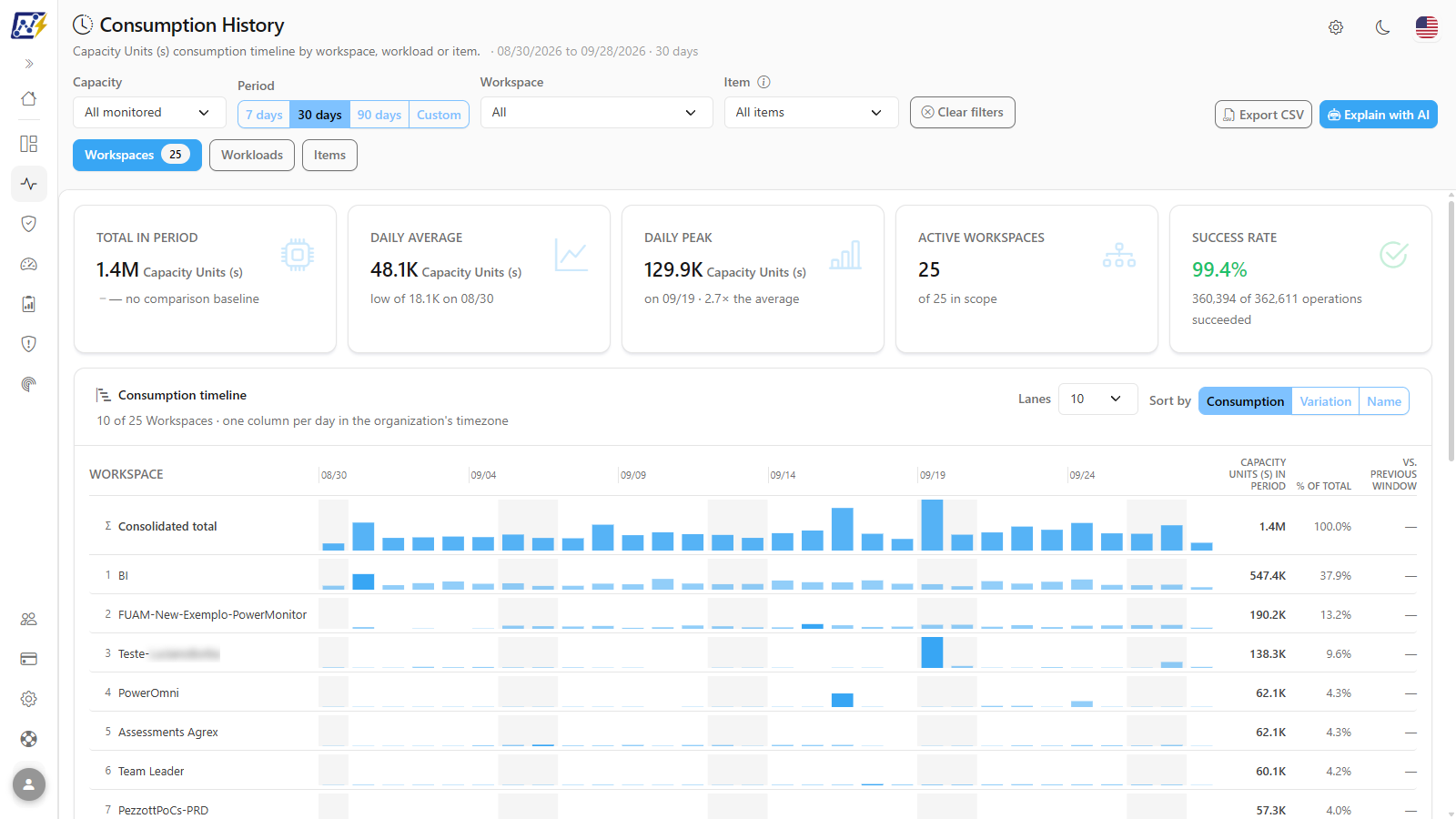
**Consumption History** shows the daily evolution of Capacity Units (s) consumption over a period (from yesterday up to the last 180 days, or a custom range), in **lanes** (*swimlanes*): one lane for the consolidated total and one for each workspace, workload, or item that consumed the most. It is the screen for seeing trends, seasonality (for example, month-end closings), and who is growing.

**How to access:**

* *Monitoring › Consumption History*; or
* *Capacities › Consumption History* (same screen; see [Capacities (menu)](/en/power-monitor/capacidades.md)).

The screen is available to **all profiles**. The data considers only capacities with monitoring enabled and respects the user's workspace scope. If an administrator blocks this page for your user, it no longer appears in the menu.

<figure><picture><source srcset="/files/pdeopDcx1UCv369T6XRC" media="(prefers-color-scheme: dark)"><img src="https://3938213054-files.gitbook.io/~/files/v0/b/gitbook-x-prod.appspot.com/o/spaces%2FH2bFRBmIfyK3kwVKbldl%2Fuploads%2Fgit-blob-2fe5100652bb315f077a002695e4fc21fc34916a%2Fpm-monitoramento-historico-consumo-en.png?alt=media" alt="Consumption History screen with KPIs and the lane timeline"></picture><figcaption><p>Consumption History: lane timeline</p></figcaption></figure>

## What it is for

* **Capacity planning and FinOps:** evaluate the daily average and peak over the last 90 days (or up to 180 days) before deciding on a larger SKU or on reservations.
* **Identify who is growing:** the **Biggest movers** card points out the entities that went up (or down) the most compared with the previous window of the same size.
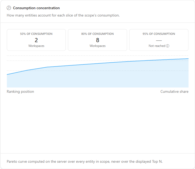
* **Understand concentration:** the **Consumption concentration** card shows how many workspaces/items account for 50%, 80%, and 95% of consumption, useful for prioritizing optimizations.
* **Investigate an entity:** clicking a lane opens the detail with the Interactive/Background split, the breakdown, and the most expensive operations.

## Features

Filters are applied automatically: when you change any of them, the KPIs, the timeline, and the cards reload. The page subtitle shows the range covered (for example, *09/01/2026 to 09/30/2026 · 30 days*).

### Capacity and period filters

**What it is:** the **Period** menu, which is the first filter in the bar, and the **Capacity** selector (*All monitored* or one capacity). The **Period** menu offers **Yesterday**, **Last 7 days**, **Last 14 days**, **Last 30 days** (default), **Last 60 days**, **Last 90 days**, **Last 180 days**, and **Custom**. The menu button shows the chosen option and the date range it represents (for example, *Last 30 days: Sep 1 - Sep 30, 2026*).

**What it is for:** defining the analysis window, from one week (to follow day-to-day activity) to 90 days or more (for capacity planning).

<figure><picture><source srcset="/files/CrB7ZeGAReVd0dtoDDmk" media="(prefers-color-scheme: dark)"><img src="https://3938213054-files.gitbook.io/~/files/v0/b/gitbook-x-prod.appspot.com/o/spaces%2FH2bFRBmIfyK3kwVKbldl%2Fuploads%2Fgit-blob-38553c4f562fd47101566920ac8ffabbbf01dcab%2Fpm-monitoramento-historico-consumo-filtros-en.png?alt=media" alt="Filter bar with Period, Capacity, Workspace, Item, Clear filters, and the Export CSV and Explain with AI buttons"></picture><figcaption><p>Consumption History filter bar</p></figcaption></figure>

**How to use:**

1. In **Period**, open the menu and choose an option, for example **Last 90 days**.
2. In **Capacity**, keep **All monitored** or choose a specific capacity.

**How it works:** each column of the timeline is a local day of the organization (time zone defined by the *UTC\_offset* parameter of the Capacity Metrics App). The current day is partial. The *Last N days* options end on the organization's current day and count it among the N days; **Yesterday** shows a single day. While the screen is loading the filter is disabled; if the first load fails, it stays available so you can change the period and try again.

### Custom period

**What it is:** the **Custom** option of the **Period** menu, which displays the **From** and **To** fields.

**What it is for:** analyzing a specific range, such as a month-end closing or the week of a migration.

<figure><picture><source srcset="/files/vnR90l2qBYMiwoJBNi9R" media="(prefers-color-scheme: dark)"><img src="https://3938213054-files.gitbook.io/~/files/v0/b/gitbook-x-prod.appspot.com/o/spaces%2FH2bFRBmIfyK3kwVKbldl%2Fuploads%2Fgit-blob-08427e3ea4227a6055c5d33f4739246939028cfa%2Fpm-monitoramento-historico-consumo-periodo-personalizado-en.png?alt=media" alt="Custom period with the From and To fields"></picture><figcaption><p>Custom period</p></figcaption></figure>

**How to use:**

1. In **Period**, choose **Custom**. The **From** and **To** fields appear already filled in with the displayed period.
2. Adjust the dates. The screen reloads as soon as the two dates form a valid range.

**How it works:** the range can be up to 366 days, the start date cannot be after the end date, and future dates cannot be selected. Incomplete or invalid ranges do not trigger a new query.

### Workspace and item filters

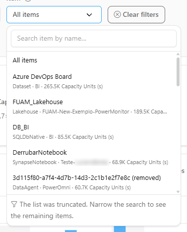
**What it is:** the **Workspace** selector (*All* or one workspace), the **Item** selector (*All items* or one item, with search by name), and the **Clear filters** button.

**What it is for:** following the evolution of a specific workspace or item, for example a semantic model that went through optimization.

<figure><picture><source srcset="/files/6fiC0Q9TiiUNZ6Gb49jI" media="(prefers-color-scheme: dark)"><img src="https://3938213054-files.gitbook.io/~/files/v0/b/gitbook-x-prod.appspot.com/o/spaces%2FH2bFRBmIfyK3kwVKbldl%2Fuploads%2Fgit-blob-1ea40d4a70b5a68e73c433a6d99865dff525d293%2Fpm-monitoramento-historico-consumo-filtro-item-en.png?alt=media" alt="Item selector open with the Search item by name field"></picture><figcaption><p>Item selector with search</p></figcaption></figure>

**How to use:**

1. In **Workspace**, choose a workspace (or **All**).
2. In **Item**, click the selector (**All items**), type part of the name in **Search item by name…**, and click the item. If the list warns that it was truncated, narrow the search.
3. To return all filters to their default values, click **Clear filters**.

**How it works:** filtering by item **recalculates all lanes, including the consolidated total**, to show only that item (it does not just shorten the list). The information icon next to the **Item** label is a reminder of this behavior.

### Timeline dimension

**What it is:** the **Workspaces** (default), **Workloads**, and **Items** buttons, right below the filters. The number on each button is the number of entities of that dimension in the slice.

**What it is for:** choosing what each lane represents: a workspace, a workload type, or an item.

<figure><picture><source srcset="/files/7ZtUlyliHZvvgpyvTBYK" media="(prefers-color-scheme: dark)"><img src="https://3938213054-files.gitbook.io/~/files/v0/b/gitbook-x-prod.appspot.com/o/spaces%2FH2bFRBmIfyK3kwVKbldl%2Fuploads%2Fgit-blob-0e9618072a447244329661559f92a65a6dbe60ad%2Fpm-monitoramento-historico-consumo-dimensoes-en.png?alt=media" alt="Workspaces, Workloads, and Items dimension buttons with the entity count"></picture><figcaption><p>Timeline dimension</p></figcaption></figure>

**How to use:**

1. Click **Workspaces**, **Workloads**, or **Items**.
2. The lanes, KPIs, and cards start representing the chosen dimension. If the **Lane detail** is open, it closes.

**How it works:** entities removed from the tenant appear with the suffix *(removed)*, and operations with no identified workload appear as *No identified type*.

### Period KPIs

**What it is:** the row of cards right above the timeline.

**What it is for:** getting the period summary (total, average, peak, active entities, and success rate) before looking at the details.

<figure><picture><source srcset="/files/Kf2z8wVrgRL5RBsjMZZB" media="(prefers-color-scheme: dark)"><img src="https://3938213054-files.gitbook.io/~/files/v0/b/gitbook-x-prod.appspot.com/o/spaces%2FH2bFRBmIfyK3kwVKbldl%2Fuploads%2Fgit-blob-dced845450dd89888233587cdffed83b369b9995%2Fpm-monitoramento-historico-consumo-kpis-en.png?alt=media" alt="Total in period, Daily average, Daily peak, active entities, and Success rate KPIs"></picture><figcaption><p>Period KPIs</p></figcaption></figure>

| KPI                                       | What it shows                                                                                                                                                                                                  |
| ----------------------------------------- | -------------------------------------------------------------------------------------------------------------------------------------------------------------------------------------------------------------- |
| **Total in period**                       | Sum of Capacity Units (s) in the period and the change *vs. the previous N days* (the immediately preceding window, of the same size). With no data in the previous window, it shows *no comparison baseline*. |
| **Daily average**                         | Average Capacity Units (s) per day and the *low* (day with the lowest consumption).                                                                                                                            |
| **Daily peak**                            | Day with the highest consumption and how many times it exceeds the average.                                                                                                                                    |
| **Active Workspaces / Workloads / Items** | How many entities of the dimension consumed in the period, *of N in scope*.                                                                                                                                    |
| **Success rate**                          | Percentage of operations completed successfully among those that recorded a status (*X of Y operations succeeded*).                                                                                            |

**How to use:**

1. Read **Total in period** and the change against the previous window to find out whether consumption grew.
2. Compare the **Daily peak** with the **Daily average** to measure seasonality.
3. If the **Success rate** dropped, investigate in the **Lane detail** (see the frequently asked questions).

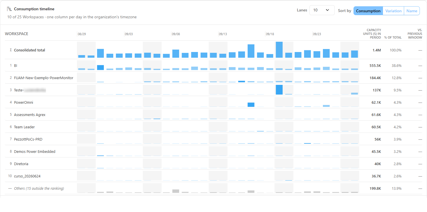
### Consumption timeline

**What it is:** the main card on the screen, with the subtitle *"N of M entities · one column per day in the organization's time zone"*. It contains:

* the **"Consolidated total" master lane** at the top, with its own vertical scale;
* **one lane per entity** in the ranking and the **"Others (N outside the ranking)"** lane, which aggregates the rest. Entity lanes and "Others" share the same vertical scale, so their heights are comparable with one another;
* in each lane, one bar per day, the highlight of the **lane peak**, and the shading of **weekends**;
* next to each lane, the **Capacity Units (s) in period**, **% of total**, and **vs. previous window** columns (increase, decrease, flat, or no comparison baseline).

**What it is for:** seeing trends, seasonality, and who is growing, side by side.

<figure><picture><source srcset="/files/V3fYdwz9ecOAjhFmfpIw" media="(prefers-color-scheme: dark)"><img src="https://3938213054-files.gitbook.io/~/files/v0/b/gitbook-x-prod.appspot.com/o/spaces%2FH2bFRBmIfyK3kwVKbldl%2Fuploads%2Fgit-blob-e7ec9f69e85da02e46aafecbe3a4522347ddde4e%2Fpm-monitoramento-historico-consumo-linha-do-tempo-en.png?alt=media" alt="Consumption timeline card with the Consolidated total lane and the per-entity lanes"></picture><figcaption><p>Consumption timeline</p></figcaption></figure>

**How to use:**

1. Go through the lanes from top to bottom: the order follows the **Sort by** criterion.
2. Hover over the **Capacity Units (s) in period** value to see the exact number, and over the **vs. previous window** indicator to read the change in full.
3. Click an entity lane to open the [Lane detail](#lane-detail).

**How it works:** the **Consolidated total** equals the sum of the displayed lanes plus the **Others** lane. With no consumption in the slice, the card shows *No entity consumed Capacity Units (s) in this slice.*

### Consumption on a day (tooltip)

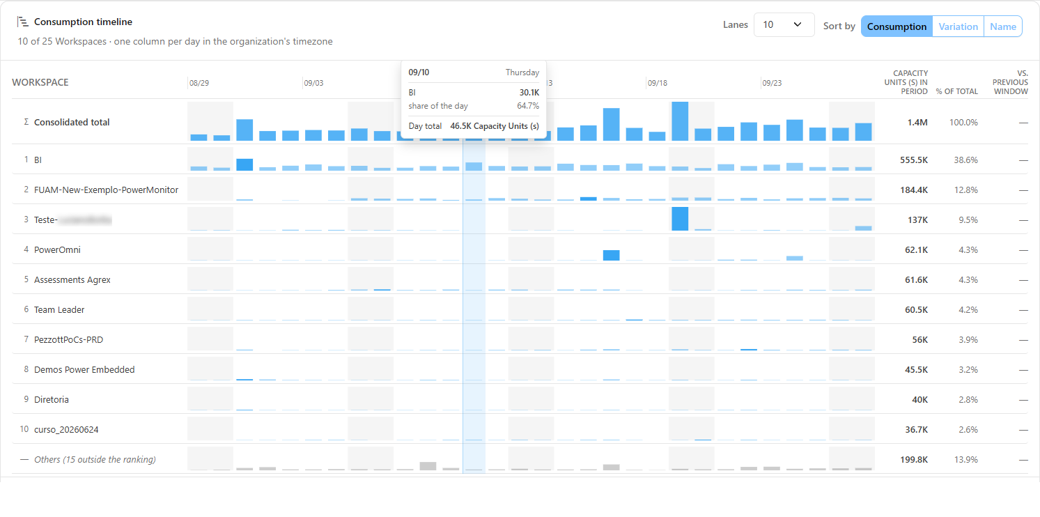
**What it is:** the tooltip displayed when you hover over a day's bar in any lane.

**What it is for:** reading the exact value for a day and how much that entity weighed in the day's total.

<figure><picture><source srcset="/files/bc98cdXnhkrieACjiisk" media="(prefers-color-scheme: dark)"><img src="https://3938213054-files.gitbook.io/~/files/v0/b/gitbook-x-prod.appspot.com/o/spaces%2FH2bFRBmIfyK3kwVKbldl%2Fuploads%2Fgit-blob-c2240a9be7a9a9d0a5815b3fe978a96a038323c0%2Fpm-monitoramento-historico-consumo-tooltip-dia-en.png?alt=media" alt="Tooltip with the date, the lane value, the share of the day, and the day total"></picture><figcaption><p>Consumption on a day</p></figcaption></figure>

**How to use:**

1. Hover over the day's bar in any lane.
2. Read the date and the weekday, the lane value, the **share of the day**, and the **Day total**.

### Number and order of lanes

**What it is:** the **Lanes** control (10, 25, 50, or 100; default 10) and the **Sort by** control (**Consumption**, default, **Variation**, or **Name**), in the header of the Consumption timeline card.

**What it is for:** expanding the analysis to more entities or rearranging the lanes to find who changed the most.

<figure><picture><source srcset="/files/DKk527pykm5q62E2K4O8" media="(prefers-color-scheme: dark)"><img src="https://3938213054-files.gitbook.io/~/files/v0/b/gitbook-x-prod.appspot.com/o/spaces%2FH2bFRBmIfyK3kwVKbldl%2Fuploads%2Fgit-blob-4167cc44bb32bd21ef04f228aac1e03da3a64380%2Fpm-monitoramento-historico-consumo-faixas-ordenar-en.png?alt=media" alt="Lanes and Sort by controls in the Consumption timeline card"></picture><figcaption><p>Lanes and Sort by</p></figcaption></figure>

**How to use:**

1. In **Lanes**, choose **10**, **25**, **50**, or **100**.
2. In **Sort by**, choose **Consumption**, **Variation**, or **Name**.
3. Entities outside the ranking remain added up in the **Others** lane.

**How it works:** sorting by **Variation** uses the absolute difference in Capacity Units (s) compared with the previous window. Changing the number or the order reloads the timeline.

### Biggest movers

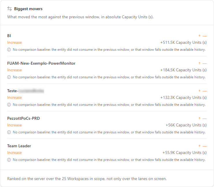
**What it is:** the card that lists what moved the most against the previous window, in absolute Capacity Units (s), with the **Increase**, **Decrease**, or **Flat** badge.

**What it is for:** quickly finding out who grew (or dropped) the most in the period.

<figure><picture><source srcset="/files/hgrZMYUpVUuUxhyVLPlb" media="(prefers-color-scheme: dark)"><img src="https://3938213054-files.gitbook.io/~/files/v0/b/gitbook-x-prod.appspot.com/o/spaces%2FH2bFRBmIfyK3kwVKbldl%2Fuploads%2Fgit-blob-b9a456bd134f75dad6fe8435f6207bc37d0f66eb%2Fpm-monitoramento-historico-consumo-maiores-variacoes-en.png?alt=media" alt="Biggest movers card with the Increase, Decrease, and Flat badges"></picture><figcaption><p>Biggest movers</p></figcaption></figure>

**How to use:**

1. Set the period (for example, **Last 30 days**) and the dimension.
2. In the **Biggest movers** card, read the entities that went up or down the most compared with the previous window of the same size.
3. Click the entity's lane in the timeline to investigate in the **Lane detail**.

**How it works:** the ranking is calculated over **all** entities in scope, not only over the displayed lanes. *No comparison baseline* means that the entity did not consume in the previous window, or that this window falls outside the available history.

### Consumption concentration

**What it is:** the card with the Pareto curve (ranking position × cumulative share) and the **50%**, **80%**, and **95% of consumption** markers: how many entities are needed to reach each slice.

**What it is for:** prioritizing optimizations on the few entities that account for most of the consumption.

<figure><picture><source srcset="/files/lDFHMPUSe5gFHHNczch8" media="(prefers-color-scheme: dark)"><img src="https://3938213054-files.gitbook.io/~/files/v0/b/gitbook-x-prod.appspot.com/o/spaces%2FH2bFRBmIfyK3kwVKbldl%2Fuploads%2Fgit-blob-d62412629285a153aefa0ce54e6c2cef390fe390%2Fpm-monitoramento-historico-consumo-concentracao-en.png?alt=media" alt="Consumption concentration card with the Pareto curve and the 50, 80, and 95 percent markers"></picture><figcaption><p>Consumption concentration</p></figcaption></figure>

**How to use:**

1. Read how many entities account for **50%**, **80%**, and **95% of consumption**.
2. Prioritize optimizations on the entities that make up the first 80%.

**How it works:** the curve is calculated over all entities in scope, never over the displayed top N. *Not reached* means that the tail outside the ranking still accounts for the rest (it is not zero).

### Lane detail

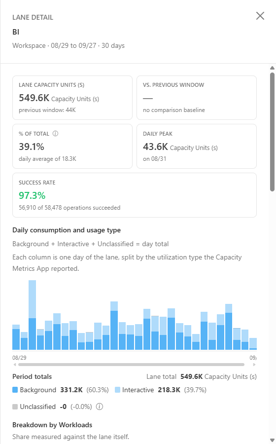
**What it is:** the side panel opened when you click an entity lane, with the lane KPIs: Lane Capacity Units (s) (with the previous window value), change, **% of total**, daily average, and daily peak.

**What it is for:** investigating a specific entity without leaving the timeline.

<figure><picture><source srcset="/files/ExidI1svBxg2AhkJPKI2" media="(prefers-color-scheme: dark)"><img src="https://3938213054-files.gitbook.io/~/files/v0/b/gitbook-x-prod.appspot.com/o/spaces%2FH2bFRBmIfyK3kwVKbldl%2Fuploads%2Fgit-blob-7da1dfbedf84c9253ab2450a1bafa32898e278b2%2Fpm-monitoramento-historico-consumo-detalhe-faixa-en.png?alt=media" alt="Lane detail panel with KPIs, usage type split, and most expensive operations"></picture><figcaption><p>Lane detail</p></figcaption></figure>

**How to use:**

1. In the timeline, click the entity's lane (workspace, workload, or item). The **Lane detail** panel opens.
2. Check the consumption in the period, the change, the **% of total**, the daily average, and the daily peak.
3. To close it, click the panel's **X**, click outside it, or press **Esc**.

**How it works:** the **% of total** is measured against the scope total, not against the lane itself: it is the same number as the *% of total* column in the timeline. The **Consolidated total** and **Others** lanes do not open a detail.

### Daily consumption and usage type

**What it is:** the Lane detail chart in which each column is a day, split into **Background**, **Interactive**, and **Unclassified**, with the period totals.

**What it is for:** knowing whether the entity's consumption comes from automated routines or from people using reports, and on which days.

<figure><picture><source srcset="/files/eztLhoOFItlFbx3tdWUc" media="(prefers-color-scheme: dark)"><img src="https://3938213054-files.gitbook.io/~/files/v0/b/gitbook-x-prod.appspot.com/o/spaces%2FH2bFRBmIfyK3kwVKbldl%2Fuploads%2Fgit-blob-b670d1bf15512cdba5f4f3d10a14d5c3b1e889cd%2Fpm-monitoramento-historico-consumo-detalhe-tipo-de-uso-en.png?alt=media" alt="Daily consumption and usage type chart with Background, Interactive, and Unclassified"></picture><figcaption><p>Daily consumption and usage type</p></figcaption></figure>

**How to use:**

1. Open the Lane detail.
2. Compare the colors in each column and the **Period totals** for **Background**, **Interactive**, and **Unclassified**.

**How it works:** Background + Interactive + Unclassified = day total. **Unclassified** groups the operations that arrived from the Capacity Metrics App with no utilization type; they count toward the total, which is why they appear in the chart.

### Lane breakdown

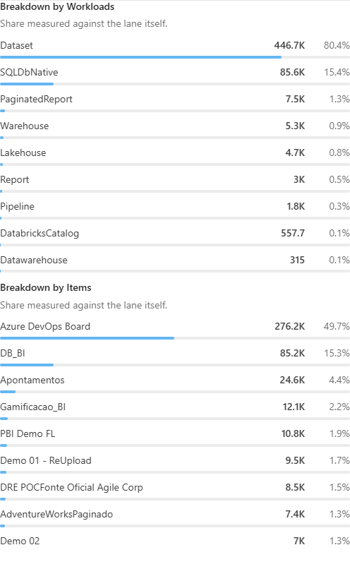
**What it is:** the **Breakdown by** section of the Lane detail, which shows how the lane is split by the other dimension (for example, the items of a workspace).

**What it is for:** finding, within a workspace or workload, which item concentrates the consumption.

<figure><picture><source srcset="/files/0e4uTYCbOOocBDpm3VhP" media="(prefers-color-scheme: dark)"><img src="https://3938213054-files.gitbook.io/~/files/v0/b/gitbook-x-prod.appspot.com/o/spaces%2FH2bFRBmIfyK3kwVKbldl%2Fuploads%2Fgit-blob-6cf95043baa4208fedf64bdb1f2dd080c61e133e%2Fpm-monitoramento-historico-consumo-detalhe-composicao-en.png?alt=media" alt="Breakdown by dimension section in the Lane detail"></picture><figcaption><p>Lane breakdown</p></figcaption></figure>

**How to use:**

1. Open the Lane detail and scroll to **Breakdown by** .
2. Read the largest shares.

**How it works:** the share is measured against the lane itself (unlike the % of total in the KPIs). The dimensions displayed depend on the lane clicked.

### Most expensive operations

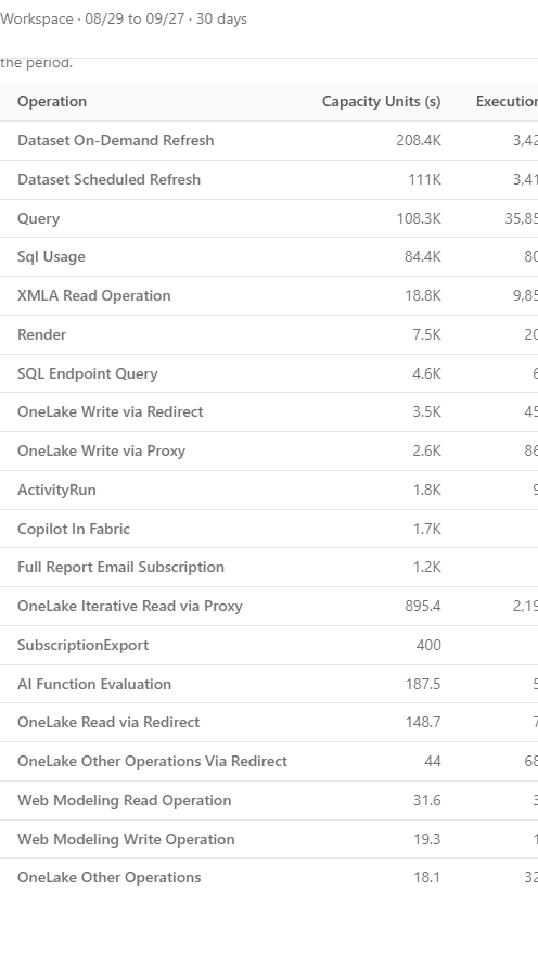
**What it is:** the Lane detail table with the **Operation**, **Capacity Units (s)**, **Executions**, **Success rate**, and **Average duration** columns.

**What it is for:** identifying which of the entity's operation types cost the most and whether they are failing.

<figure><picture><source srcset="/files/6x753d4FsGkzpumyz9Ib" media="(prefers-color-scheme: dark)"><img src="https://3938213054-files.gitbook.io/~/files/v0/b/gitbook-x-prod.appspot.com/o/spaces%2FH2bFRBmIfyK3kwVKbldl%2Fuploads%2Fgit-blob-f5c440043e25e1244142023c0f4c314ec43de159%2Fpm-monitoramento-historico-consumo-detalhe-operacoes-en.png?alt=media" alt="Most expensive operations table with Operation, Capacity Units, Executions, Success rate, and Average duration"></picture><figcaption><p>Most expensive operations</p></figcaption></figure>

**How to use:**

1. Open the Lane detail and scroll to **Most expensive operations**.
2. Read the first rows: they are the operations with the highest consumption in the period.
3. Check the **Success rate** and the **Average duration**. To see each execution, use [Consumption Metrics](/en/power-monitor/monitoramento/metricas-de-consumo.md).

**How it works:** the table is sorted by Capacity Units (s) over all of the lane's operations in the period. When no execution recorded a status, the rate is not calculated (it is not 0%).

### Export CSV

**What it is:** the **Export CSV** button, on the right of the filter bar.

**What it is for:** taking the slice to a spreadsheet, for example for a monthly FinOps report.

<figure><picture><source srcset="/files/Yf9UqnGTmuPQWKfPWEnq" media="(prefers-color-scheme: dark)"><img src="https://3938213054-files.gitbook.io/~/files/v0/b/gitbook-x-prod.appspot.com/o/spaces%2FH2bFRBmIfyK3kwVKbldl%2Fuploads%2Fgit-blob-a558928c643ebcd06d5042949a0713ea441109ff%2Fpm-monitoramento-historico-consumo-acoes-en.png?alt=media" alt="Export CSV and Explain with AI buttons"></picture><figcaption><p>Export CSV and Explain with AI</p></figcaption></figure>

**How to use:**

1. Leave the desired dimension, period, filters, number of lanes, and sort order on screen.
2. Click **Export CSV**.

**How it works:** the file reproduces exactly the slice displayed, with the entity columns (name and key), Capacity Units (s) in period, % of total, Previous window (Capacity Units (s)), Change (%), and one column per day (dates in YYYY-MM-DD format). The button is disabled when there is no consumption in the slice. The file contains names of workspaces and items in your environment: share it with care.

### Explain with AI

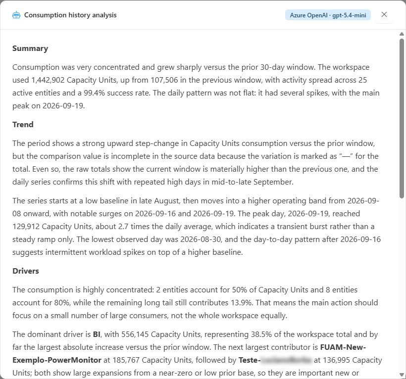
**What it is:** the **Explain with AI** button, which sends the numbers of the displayed slice to the AI configured in *Settings › AI* and opens the **Consumption history analysis** modal.

**What it is for:** getting a text that summarizes the trend, the concentration, and what drove consumption, useful as a starting point for a presentation.

<figure><picture><source srcset="/files/CSZMUrJ8mGe1IMts90G5" media="(prefers-color-scheme: dark)"><img src="https://3938213054-files.gitbook.io/~/files/v0/b/gitbook-x-prod.appspot.com/o/spaces%2FH2bFRBmIfyK3kwVKbldl%2Fuploads%2Fgit-blob-f3e8278b81dc85c2cb7e6b4e63c97cf06b8fb28f%2Fpm-monitoramento-historico-consumo-ia-en.png?alt=media" alt="AI-generated Consumption history analysis modal"></picture><figcaption><p>Explain with AI</p></figcaption></figure>

**How to use** (prerequisite: AI provider configured and spending limit available in *Settings › AI*):

1. Build the slice you want to analyze (period, dimension, and filters).
2. Click **Explain with AI**. The modal opens and displays *Analyzing the consumption of the slice on screen…* while the response is generated.
3. Read the analysis. The text is AI-generated: review it before acting.

**How it works:** the analysis consumes the organization's AI quota. The button is disabled when there is no consumption in the slice.

## Rules and behavior

* **Daily granularity:** each column is a local day of the organization (time zone defined by the *UTC\_offset* parameter of the Capacity Metrics App).
* **Data source:** per-item operations collected from the Microsoft Fabric Capacity Metrics App every 5 minutes; the current day is partial.
* **Previous window:** comparisons use the immediately preceding period with the same number of days.
* **Partial history:** if the period starts before the first day with data, the **"Partial history"** warning appears: days before Power Monitor was adopted do not exist, lanes start where the data starts, and comparisons with windows before that date appear as "—".
* **No monitored capacity:** the screen shows **"No monitored capacity"** and hides the filters. Administrators see the **Configure capacity monitoring** button; other users are advised to contact an administrator.
* **Capacity Metrics App not found:** if the metrics source does not exist, the screen explains that there is no source for the numbers (this is not a loading failure, and retrying does not solve it). See [Enable Capacity Monitoring](/en/power-monitor/monitoramento/capacidades/ativar-monitoramento-de-capacidade.md).
* **Loading failure:** if the query fails, the screen shows **Could not load the consumption history** with the **Try again** button; shortening the queried period can also help.
* **Explain with AI** consumes the organization's AI quota and depends on a provider configured in *Settings › AI*.

## Frequently asked questions

<details>

<summary>The sum of the entity lanes does not match the Consolidated total.</summary>

The displayed lanes are only the top N chosen in **Lanes**; the rest is in **Others**. Consolidated total = displayed lanes + Others.

</details>

<details>

<summary>The Success rate dropped in a period. How do I find the failures?</summary>

Open the **Lane detail** of the entities with the highest consumption and look at the **Success rate** column in *Most expensive operations*. To see each execution, use [Consumption Metrics](/en/power-monitor/monitoramento/metricas-de-consumo.md), filtering by the day and by **Status** *Failed*.

</details>

<details>

<summary>Why does "no comparison baseline" appear?</summary>

The entity did not consume in the previous window, or that window falls outside the available history.

</details>

## Related pages

* [Consumption Comparison](/en/power-monitor/monitoramento/comparativo-de-consumo.md)
* [Consumption Metrics](/en/power-monitor/monitoramento/metricas-de-consumo.md)
* [Consumption Anomalies](/en/power-monitor/monitoramento/anomalias-de-consumo.md)
* [Capacities (Capacity Monitoring)](/en/power-monitor/monitoramento/capacidades.md)
* [Capacity Dashboard](/en/power-monitor/dashboards/dashboard-de-capacidade.md)
* [Capacities (menu)](/en/power-monitor/capacidades.md)


---

# Agent Instructions
This documentation is published with GitBook. GitBook is the documentation platform designed so that both humans and AI agents can read, navigate, and reason over technical content effectively. Learn more at gitbook.com.

## Querying This Documentation
If you need additional information that is not directly available in this page, you can query the documentation by asking a question.

Perform an HTTP GET request on the following URL with the `ask` and `goal` query parameters:

```
GET https://docs.powermonitor.com.br/en/power-monitor/monitoramento/historico-de-consumo.md?ask=<question>&goal=<user_goal>
```

`ask` is the immediate question: it should be specific, self-contained, and written in natural language.
`goal` is what the user is ultimately trying to achieve, the reason they need the answer. Sharing it helps GitBook give you a better, more relevant answer. A goal is most helpful when it describes the outcome the user wants rather than restating the question. For example, with `ask=how do I create an API token`, a goal like `automate deployments from our CI pipeline` lets GitBook tailor the answer to that use case.

The response will contain a direct answer to the question and relevant excerpts and sources from the documentation.

Use this mechanism when the answer is not explicitly present in the current page, you need clarification or additional context, or you want to retrieve related documentation sections.